


最近有用到毛玻璃效果,在此记录,一方面方便以后使用,另一方面也分享给其他朋友。
先上图:
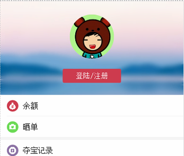
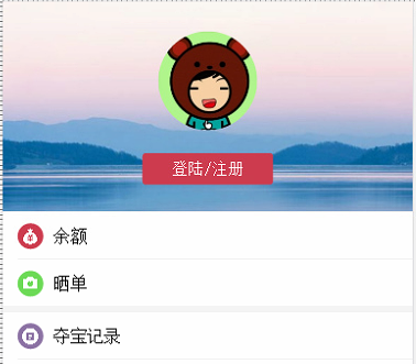
通过对比,就可以看到效果还是很不错,下面是代码:
html:很简单
<div class="demo">
    ...
</div>
.demo{
width: 100%;
position: relative;
background: url(/dist/sky2.jpg?504a01d03fb50d0616b672c90d145745) center top;
background-size: cover;
z-index: 100;
overflow: hidden;
box-sizing: border-box;
}
.demo:before {
content: "";
position: absolute;
top: 0px;
left: 0px;
right: 0px;
bottom: 0px;
z-index: -1;
-webkit-filter: blur(5px);
filter: blur(5px);
margin: -30px;
background: url(/dist/sky2.jpg?504a01d03fb50d0616b672c90d145745) center top;
background-size: cover;
background-attachment: fixed;
}注意:
两个background必须是同一张图片。


 462
462

 被折叠的 条评论
为什么被折叠?
被折叠的 条评论
为什么被折叠?
 到【灌水乐园】发言


