


这篇文章讲解css如何利用 :before :after 给div写小三角形的相关资料
先来看效果
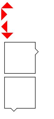
一、把普通Div转成三角,如上图中红色三角的css相关代码
.tri-up { width: 0; height: 0; border-left: 20px solid transparent; border-right: 20px solid transparent; border-bottom: 20px solid red; }
.tri-left { width: 0; height: 0; border-top: 20px solid transparent; border-bottom: 20px solid transparent; border-left: 20px solid red; }
.tri-right { width: 0; height: 0; border-top: 20px solid transparent; border-bottom: 20px solid transparent; border-right: 20px solid red; }
.tri-down { width: 0; height: 0; border-left: 20px solid transparent; border-right: 20px solid transparent; border-top: 20px solid red; }
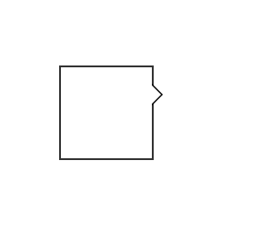
二、如何实现div方框边上有三角,这里我们需要用到伪类:before :after
CSS代码
/*方框的样式*/
/*当#demo:after和#demo:before的样式重合以后,由于top值的大小不同,就可以得到中间是白色,但是边框的三角形。如上图。*/
#demo {
margin: 100px;
width: 100px;
height: 100px;
background-color: #fff;
position: relative;
border: 2px solid #333;
}
#demo:after, #demo:before {
border: solid transparent;
content: ' ';
height: 0;
left: 100%; /*根据三角形的位置,可以随意更改。*/
position: absolute;
width: 0;
}
#demo:after {
border-width: 10px;
border-left-color: #fff; /*这是箭头的方向 border-left-color 右箭头 border-right-color左箭头 border-top-color 下箭头 border-bottom-color上箭头 */
top: 20px; /*根据三角形的位置,可以随意更改。*/
}
#demo:before {
border-width: 12px;
border-left-color: #000;
top: 18px;
}
#demo2 {
margin: 100px;
width: 100px;
height: 100px;
background-color: #fff;
position: relative;
border: 2px solid #333;
}
#demo2:after, #demo2:before {
border: solid transparent;
content: ' ';
height: 0;
top: 100%;
position: absolute;
width: 0;
}
#demo2:after {
border-width: 10px;
border-top-color: #fff;
left: 20px;
}
#demo2:before {
border-width: 12px;
border-top-color: #000;
left: 18px;
}


 3581
3581


 被折叠的 条评论
为什么被折叠?
被折叠的 条评论
为什么被折叠?
 到【灌水乐园】发言


