


我正在尝试显示来自youtube的图像以显示内容大小的视频
height:180px
width :270px
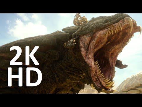
来自youtube的图片顶部和底部都带有一些黑色斑点
例如:
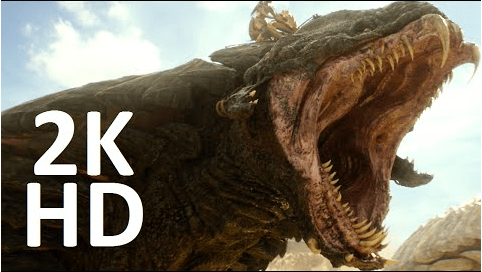
我喜欢显示这样的图像
在互联网上寻找答案
发现这些链接是有帮助的,但对于我要如何显示图像没有解决方案
如何自动裁剪和居中图像
这是最有用的,但是我不能使用background-image标签。 我想要标签
CSS显示调整大小并裁剪的图像
有人帮我解决这个问题。谢谢
使用手刹编辑视频,轻松裁剪。 然后拍摄快照。
@ zer00ne实际上,我并不是每次使用i.ytimg.com/vi/WTq-PDsS318/hqdefault.jpg->此链接将图像存储到从youtube获取图像的数据库中
更新资料
我已经更新了答案,但是我不确定您想要什么,您只是说了您不想要的东西。所以我假设您要:
保持纵横比
避免裁剪
没有黑条,只是图像边缘到边缘
我们知道这是一个宽高比为16:9的宽屏海报,因此,如果您想要270px的宽度,请执行以下操作:
宽度除以16
270/16 = 16.875
取那个商乘以9
16.875 * 9 = 151.875
向上或向下取整
Round up to 152px
使用结果更改高度,然后应用object-fit:cover
152px is the height of an image that's 270px wide and has an aspect ratio of 16:9.
请查看小提琴和更新的代码段
编辑
为了反映更新和更好地理解OP的目标,此代码段已被编辑。
object-fit是一个简单的CSS属性。请参见本文下面的代码段已添加注释。顺便说一句,此代码段中唯一需要的代码是object-fit: cover,其余样式和标记仅用于演示。
片段
/* We know this is a widescreen poster with the aspect ratio of 16:9, so if you want a width of 270px, do the following:
270/16 = 16.875
16.875 * 9 = 151.875
Round up to 152px
152px is the height of an image that's 270px wide and has an aspect ratio of 16:9 */
.bg1 {
width: 270px;
height: 152px;
object-fit: cover;
outline: 2px dashed blue;
}
.bg2 {
width: 270px;
height: 152px;
object-fit: contain;
outline: 2px dashed blue;
}
.bg3 {
width: 270px;
height: 152px;
outline: 2px dashed blue;
}
aside {
height: 100%;
width: 40%;
display: inline-block;
position: absolute;
right: 0;
top: 0;
}
figure {
height: 180px;
width: 270px;
max-width: 50%;
}
.pointer {
position: absolute;
}
.pointer b {
font-size: 32px;
}
#a.pointer {
top: 43%;
left: 52%;
}
#b.pointer {
bottom: 5%;
left: 52%;
}
.box {
width: 600px;
height: 450px;
position: relative;
}
.spacer {
position: relative;
padding: .1% 0;
width: 2px;
}
code {
font-family: Consolas;
color: red;
}

object-fit: cover will stretch an image to the edges of it's container (parent element) while keeping aspect ratio and cropping.
But when given the correct dimensions, object-fit: cover will result in a perfect fit edge to edge. No cropping either.
object-fit: contain will stretch an image to the edges of it's container while keeping aspect ratio but will not crop at the edges, so as you can see, this image has space left and right. At wider dimentions, the space will manifest below and above.
This is the image when set to it's aspect ratio at 270 x 152px and as you can see, without object-fit:cover, math alone will not resolve the problem.
此代码未显示我希望您如何在此处检查jsfiddle.net/pranavadurai/Lagy33pg
太谢谢你了:)
您可以只剪切图像。有关剪辑的更多信息,请访问此处:http://www.w3schools.com/cssref/pr_pos_clip.asp
例:
img {
position: absolute;
clip: rect(0px,60px,200px,0px);
}
我不知道这是否是您要寻找的东西,但看起来有点像您想要的东西吗?
第一个img是高度220px和宽度270,然后我将img放在带有z-index 1的div后面,我给了div一个隐藏的溢出和高度180px,而我只是必须给img一个顶部-20px的像素放在中间
这就是我的脑海,希望对您有所帮助
.box{
height:180px;
overflow:hidden;
z-index:2;
}
.test{
z-index:1;
margin-top: -20px;
}

.box{
height:148px;
overflow:hidden;
z-index:2;
}
.test{
z-index:1;
margin-top: -57px;
width :350px
}
.box1{
height:125px;
overflow:hidden;
z-index:2;
}
.test2{
z-index:1;
margin-top: -50px;
width :300px
}

如果宽度总是固定的,则给图像赋予宽度,然后求出高度的高度,然后使用"容器",如果它们始终具有相同的固定宽度,则可以在其中放置所有想要的图像
@Pranavadurai在这种情况下,您始终必须知道图像的高度和黑色空间
这个解决方案很好,但是如果我给我宽度,它会固定宽度,它会剪切图像吗?


 742
742


 被折叠的 条评论
为什么被折叠?
被折叠的 条评论
为什么被折叠?
 到【灌水乐园】发言


