


我们先来看下效果图(不考虑颜色搭配):
(学习视频分享:html5视频教程)
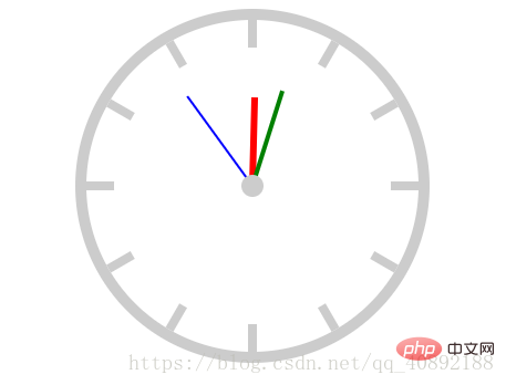
我们首先要理解如何去实现这个时钟,暂时不要考虑动画,学着将问题进行拆解,一步一步实现。
首先我们需要画个方形,有个边框,给一个圆角就可以实现最外边的圆环再通过一个长的矩形旋转多个就可以实现刻度

只要再画一个白色圆面去覆盖就可以实现标准的刻度

最后再加上三个矩形和中间的小圆面就可以实现时钟的初始状态了
代码实现
以上过程理解了之后,代码实现就简单多了,唯一需要考虑的就是代码的优化问题,以下为了简单明了每一步是如何实现,存在很多重复的代码。
关于动画,我们只需要设置旋转动画就可以了,时分秒针的动画只需要改变不同的时间就可以了。
具体细节注意见代码:
时钟*{
padding: 0;
margin: 0;
}
.clock{
width: 300px;
height: 300px;
border: 10px solid #ccc;
/*百分比参照的是实际宽高*/
border-radius: 50%;
margin: 20px auto;
position: relative;
}
.line{
width: 8px;
height: 300px;
background-color: #ccc;
position: absolute;
/*实现居中*/
/*参照父元素的宽*/
left: 50%;
top: 0;
/*参照元素本身*/
transform: translate(-50%,0);
/*保留,否则会被覆盖*/
}
.line2{
transform: translate(-50%,0) rotate(30deg);
}
.line3{
transform: translate(-50%,0) rotate(60deg);
}
.line4{
transform: translate(-50%,0) rotate(90deg);
}
.line5{
transform: translate(-50%,0) rotate(120deg);
}
.line6{
transform: translate(-50%,0) rotate(150deg);
}
.cover{
width: 250px;
height: 250px;
border-radius: 50%;
background-color: #fff;
position: absolute;
left: 50%;
top: 50%;
transform: translate(-50%,-50%);
}
.hour{
width: 6px;
height: 80px;
background-color: red;
position: absolute;
left: 50%;
top: 50%;
transform: translate(-50%,-100%);
/*设置轴心*/
transform-origin: center bottom;
/*动画*/
-webkit-animation: move 43200s linear infinite;
}
.minute{
width: 4px;
height: 90px;
background-color: green;
position: absolute;
left: 50%;
top: 50%;
transform: translate(-50%,-100%);
/*设置轴心*/
transform-origin: center bottom;
/*动画*/
-webkit-animation: move 3600s linear infinite;
}
.second{
width: 2px;
height: 100px;
background-color: blue;
position: absolute;
left: 50%;
top: 50%;
transform: translate(-50%,-100%);
/*设置轴心*/
transform-origin: center bottom;
/*动画*/
-webkit-animation: move 60s infinite steps(60);
/*linear与step(60)重复*/
}
.center{
width:20px;
height:20px;
background-color: #ccc;
border-radius: 50%;
position: absolute;
left: 50%;
top: 50%;
transform: translate(-50%,-50%);
}
/*创建移动动画*/
@keyframes move{
0%{
transform: translate(-50%,-100%) rotate(0deg);
}
100%{
transform: translate(-50%,-100%) rotate(360deg);
}
}


 被折叠的 条评论
为什么被折叠?
被折叠的 条评论
为什么被折叠?
 到【灌水乐园】发言


