


效果
html
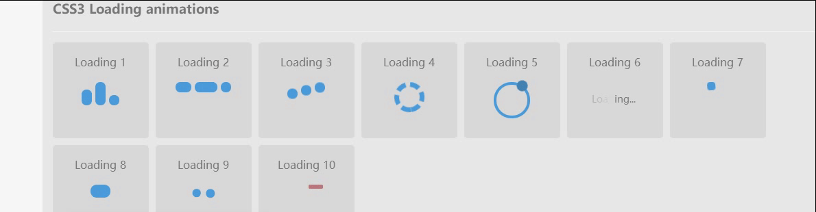
CSS3 Loading animations
Loading 1
Loading 2
Loading 3
Loading 4
Loading 5
Loading 6
Loading 7
Loading 8
Loading 9
Loading 10
css3
/* -----------------------------------------
=Default css to make the demo more pretty
-------------------------------------------- */
body {
margin: 0 auto;
padding: 20px;
max-width: 1200px;
overflow-y: scroll;
font-family: "Open Sans", sans-serif;
font-weight: 400;
color: #777;
background-color: #f7f7f7;
-webkit-font-smoothing: antialiased;
-webkit-text-size-adjust: 100%;
-ms-text-size-adjust: 100%;
}
.content {
padding: 15px;
overflow: hidden;
background-color: #e7e7e7;
background-color: rgba(0, 0, 0, 0.06);
}
h1 {
padding-bottom: 15px;
border-bottom: 1px solid #d8d8d8;
font-weight: 600;
}
h1 span {
font-family: monospace, serif;
}
h3 {
padding-bottom: 20px;
box-shadow: 0 1px 0 rgba(0, 0, 0, 0.1), 0 2px 0 rgba(255, 255, 255, 0.9);
}
p {
margin: 0;
padding: 10px 0;
color: #777;
}
.clear {
clear: both;
}
/* -----------------------------------------
=CSS3 Loading animations
-------------------------------------------- */
/* =Elements style
---------------------- */
.load-wrapp {
float: left;
width: 100px;
height: 100px;
margin: 0 10px 10px 0;
padding: 20px 20px 20px;
border-radius: 5px;
text-align: center;
background-color: #d8d8d8;
}
.load-wrapp p {
padding: 0 0 20px;
}
.load-wrapp:last-child {
margin-right: 0;
}
.line {
display: inline-block;
width: 15px;
height: 15px;
border-radius: 15px;
background-color: #4b9cdb;
}
.ring-1 {
width: 10px;
height: 10px;
margin: 0 auto;
padding: 10px;
border: 7px dashed #4b9cdb;
border-radius: 100%;
}
.ring-2 {
position: relative;
width: 45px;
height: 45px;
margin: 0 auto;
border: 4px solid #4b9cdb;
border-radius: 100%;
}
.ball-holder {
position: absolute;
width: 12px;
height: 45px;
left: 17px;
top: 0px;
}
.ball {
position: absolute;
top: -11px;
left: 0;
width: 16px;
height: 16px;
border-radius: 100%;
background: #4282b3;
}
.letter-holder {
padding: 16px;
}
.letter {
float: left;
font-size: 14px;
color: #777;
}
.square {
width: 12px;
height: 12px;
border-radius: 4px;
background-color: #4b9cdb;
}
.spinner {
position: relative;
width: 45px;
height: 45px;
margin: 0 auto;
}
.bubble-1,
.bubble-2 {
position: absolute;
top: 0;
width: 25px;
height: 25px;
border-radius: 100%;
background-color: #4b9cdb;
}
.bubble-2 {
top: auto;
bottom: 0;
}
.bar {
float: left;
width: 15px;
height: 6px;
border-radius: 2px;
background-color: #4b9cdb;
}
/* =Animate the stuff
------------------------ */
.load-1 .line:nth-last-child(1) {
animation: loadingA 1.5s 1s infinite;
}
.load-1 .line:nth-last-child(2) {
animation: loadingA 1.5s 0.5s infinite;
}
.load-1 .line:nth-last-child(3) {
animation: loadingA 1.5s 0s infinite;
}
.load-2 .line:nth-last-child(1) {
animation: loadingB 1.5s 1s infinite;
}
.load-2 .line:nth-last-child(2) {
animation: loadingB 1.5s 0.5s infinite;
}
.load-2 .line:nth-last-child(3) {
animation: loadingB 1.5s 0s infinite;
}
.load-3 .line:nth-last-child(1) {
animation: loadingC 0.6s 0.1s linear infinite;
}
.load-3 .line:nth-last-child(2) {
animation: loadingC 0.6s 0.2s linear infinite;
}
.load-3 .line:nth-last-child(3) {
animation: loadingC 0.6s 0.3s linear infinite;
}
.load-4 .ring-1 {
animation: loadingD 1.5s 0.3s cubic-bezier(0.17, 0.37, 0.43, 0.67) infinite;
}
.load-5 .ball-holder {
animation: loadingE 1.3s linear infinite;
}
.load-6 .letter {
animation-name: loadingF;
animation-duration: 1.6s;
animation-iteration-count: infinite;
animation-direction: linear;
}
.l-1 {
animation-delay: 0.48s;
}
.l-2 {
animation-delay: 0.6s;
}
.l-3 {
animation-delay: 0.72s;
}
.l-4 {
animation-delay: 0.84s;
}
.l-5 {
animation-delay: 0.96s;
}
.l-6 {
animation-delay: 1.08s;
}
.l-7 {
animation-delay: 1.2s;
}
.l-8 {
animation-delay: 1.32s;
}
.l-9 {
animation-delay: 1.44s;
}
.l-10 {
animation-delay: 1.56s;
}
.load-7 .square {
animation: loadingG 1.5s cubic-bezier(0.17, 0.37, 0.43, 0.67) infinite;
}
.load-8 .line {
animation: loadingH 1.5s cubic-bezier(0.17, 0.37, 0.43, 0.67) infinite;
}
.load-9 .spinner {
animation: loadingI 2s linear infinite;
}
.load-9 .bubble-1,
.load-9 .bubble-2 {
animation: bounce 2s ease-in-out infinite;
}
.load-9 .bubble-2 {
animation-delay: -1s;
}
.load-10 .bar {
animation: loadingJ 2s cubic-bezier(0.17, 0.37, 0.43, 0.67) infinite;
}
@keyframes loadingA {
0 {
height: 15px;
}
50% {
height: 35px;
}
100% {
height: 15px;
}
}
@keyframes loadingB {
0 {
width: 15px;
}
50% {
width: 35px;
}
100% {
width: 15px;
}
}
@keyframes loadingC {
0 {
transform: translate(0, 0);
}
50% {
transform: translate(0, 15px);
}
100% {
transform: translate(0, 0);
}
}
@keyframes loadingD {
0 {
transform: rotate(0deg);
}
50% {
transform: rotate(180deg);
}
100% {
transform: rotate(360deg);
}
}
@keyframes loadingE {
0 {
transform: rotate(0deg);
}
100% {
transform: rotate(360deg);
}
}
@keyframes loadingF {
0% {
opacity: 0;
}
100% {
opacity: 1;
}
}
@keyframes loadingG {
0% {
transform: translate(0, 0) rotate(0deg);
}
50% {
transform: translate(70px, 0) rotate(360deg);
}
100% {
transform: translate(0, 0) rotate(0deg);
}
}
@keyframes loadingH {
0% {
width: 15px;
}
50% {
width: 35px;
padding: 4px;
}
100% {
width: 15px;
}
}
@keyframes loadingI {
100% {
transform: rotate(360deg);
}
}
@keyframes bounce {
0%,
100% {
transform: scale(0);
}
50% {
transform: scale(1);
}
}
@keyframes loadingJ {
0%,
100% {
transform: translate(0, 0);
}
50% {
transform: translate(80px, 0);
background-color: #f5634a;
width: 25px;
}
}
以上就是10种CSS3实现的loading动画,挑一个走吧?的详细内容,更多关于CSS3 loading动画的资料请关注脚本之家其它相关文章!


 6108
6108


 被折叠的 条评论
为什么被折叠?
被折叠的 条评论
为什么被折叠?
 到【灌水乐园】发言


