


过渡 transition
复合属性,使CSS属性值在不使用 Flash 动画或 JavaScript 的情况下,当元素从一种样式变换为另一种样式时为元素添加效果
取值:
:检测或设置对象中参与过渡的属性
:检测或设置对象过渡的持续时间
:检测或设置对象中过渡的动画类型
:检测或设置对象延迟过渡的时间
1、过渡属性
取值:none | all | property
例如:transition-property: width;
transition-property: border-color, background-color, color;
2、过渡时间
取值:以 s | ms 作为单位
3、过渡时间曲线函数
取值:预定的值或贝塞尔曲线
ease:默认值,慢速开始,快速变快,再慢速结束
linear:匀速
ease-in:慢速开始,加速效果
ease-out:快速开始,减速效果
ease-in-out:慢速开始和结束,中间先加后减
4、过渡延迟
取值:以 s | ms 作为单位
语法:transition: property duration timing-function delay;
例如:
transition: transform 2s, border-radius 2s
transition: all .5s ease-in .1s;
激发过渡效果:现阶段,只能通过 鼠标移入 时进行激发
兼容性:

代码示例一:html>
Document#d1{
width:200px;
height:200px;
background-color:#369;
text-align:center;
line-height:200px;
font-size:18px;
/*1、过渡属性*/
transition-property:all;
/*2、过渡时间*/
transition-duration:2s;
/*3、速度曲线函数*/
transition-timing-function:linear;
/*4、延迟*/
transition-delay:0s;
}
#d1:hover{
/*通过转换-位移实现 位置向右移动 200px*/
transform:translate(500px) rotate(360deg);
border-radius:50%;
background-color:#693;
}
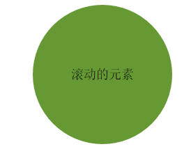
滚动前:

滚动中:

代码示例二:html>
Documenth1{font-size:16px;}
.test{overflow:hidden;width:100%;margin:0;padding:0;list-style:none;}
.test li{float:left;width:100px;height:100px;margin:0 5px;border:1px solid #ddd;background-color:#eee;text-align:center;
-webkit-transition:background-color 3.5s ease-in;
-moz-transition:background-color 3.5s ease-in;
transition:background-color 3.5s ease-in;
}
.test li:nth-child(1):hover{background-color:#bbb;}
.test li:nth-child(2):hover{background-color:#999;}
.test li:nth-child(3):hover{background-color:#630;}
.test li:nth-child(4):hover{background-color:#090;}
.test li:nth-child(5):hover{background-color:#f00;}
请将鼠标移动到下面的矩形上:
- 背景色过渡
- 背景色过渡
- 背景色过渡
- 背景色过渡
- 背景色过渡


 133
133


 被折叠的 条评论
为什么被折叠?
被折叠的 条评论
为什么被折叠?
 到【灌水乐园】发言


