


本文主要介绍JavaScript中利用transform实现数字翻页效果的实例,具有很好的参考价值。下面跟着小编一起来看下吧
效果图:
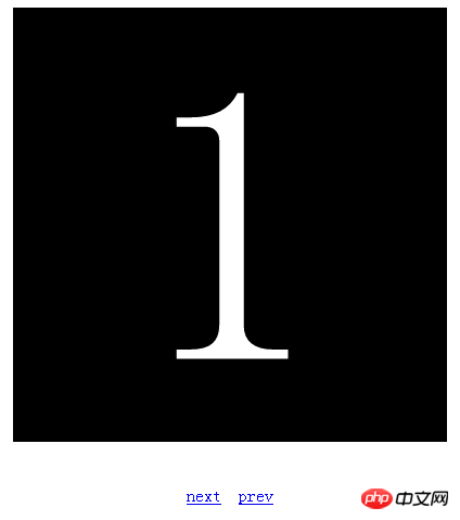
图(1)初始图
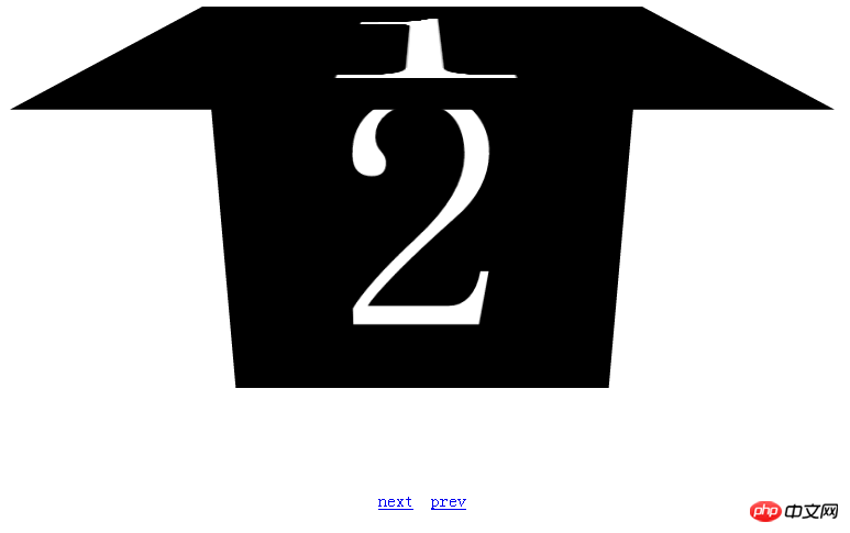
图(2)翻页过程

图(3)翻页结果
代码如下:
transition#container{ width:500px; height:500px; margin:20px auto; background:#ff0000;
-webkit-transiton:background 2s linear,width 2s,height 2s;
-moz-transition:background 2s,width 2s,height 2s;
-o-transition:background 2s,width 2s,height 2s;
-ms-transition:background 2s,width 2s,height 2s;
transition:background 2s,width 2s,height 2s;
}
#container:hover{ background: #00ff00;width:200px;height: 200px;}
#my3dspace{
-webkit-perspective:800;
-webkit-perspective-origin:50% 50%;
overflow: hidden;
}
#pagegroup{
width: 400px;
height: 400px;
margin: 0 auto;
-webkit-transform-style:preserve-3d;
position: relative;
}
.page{
width: 360px;
height: 360px;
padding: 20px;
background-color: black;
color: white;
font-size: 360px;
font-weight: blod;
line-height: 360px;
text-align: center;
position: absolute;
}
#page1{
-webkit-transform-origin:top;
transform-origin:top;
-webkit-transition:-webkit-transform 1s linear;
transition:transform 1s linear;
}
#page2,#page3,#page4,#page5,#page6{
-webkit-transform-origin:top;
transform-origin:top;
-webkit-transition:-webkit-transform 1s linear;
transition:transform 1s linear;
-webkit-transform:rotateX(-90deg);
transform:rotateX(-90deg);
}
#op{
text-align: center;
margin: 40px auto;
}
1
2
3
4
5
6
next
prev
var curIndex = 1;
function next(){
if(curIndex==6)
return;
var curPage = document.getElementById("page"+curIndex);
curPage.style.webkitTransform = "rotateX(90deg)";
curPage.style.transform = "rotateX(90deg)";
curIndex ++;
var nextPage = document.getElementById("page"+curIndex);
nextPage.style.webkitTransform="rotateX(0deg)";
nextPage.style.transform="rotateX(0deg)";
}
function prev(){
if(curIndex==1)
return;
var curPage =document.getElementById("page"+curIndex);
curPage.style.webkitTransform="rotateX(-90deg)";
curPage.style.transform="rotateX(-90deg)";
curIndex --;
var prevPage = document.getElementById("page"+curIndex);
prevPage.style.webkitTransform="rotateX(0deg)";
prevPage.style.transform="rotateX(0deg)";
}


 1540
1540


 被折叠的 条评论
为什么被折叠?
被折叠的 条评论
为什么被折叠?
 到【灌水乐园】发言


