


公众号后台回复“图书“,了解更多号主新书内容作者:俊欣
来源:关于数据分析与可视化
厉害了,用Python绘制动态可视化图表,并保存成gif格式
今天小编再给大家来介绍一种制作gif格式图表的新方法,调用的是matplotlib的相关模块,其中的步骤与方法也是相当地简单易懂。
下载和导入数据库
我们这次用到的数据集是bokeh模块自带的数据集,通过下面这一行代码直接就可以下载
import bokeh
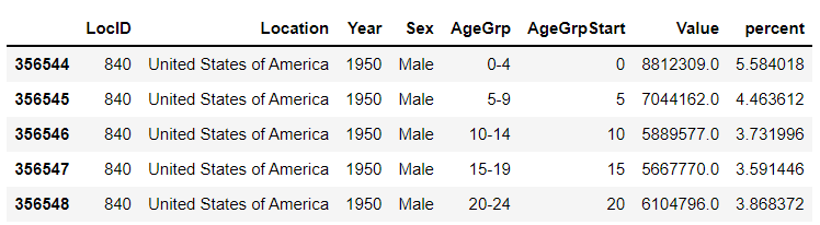
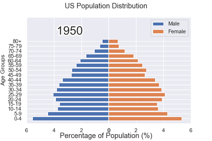
bokeh.sampledata.download()然后导入后面要用到的数据集,我们挑选的是指定国家的1950年至今不同年龄阶段的人口所占比重的数据
from bokeh.sampledata.population import data
import numpy as np

data = filter_loc('United States of America')
data.head()
output
先绘制若干张静态的图表
我们可以先绘制若干张静态的图表,然后将这几张图表合成一张gif格式的动图即可,代码如下
import seaborn as sns
import matplotlib.pyplot as plt
import matplotlib.patheffects as fx
# 绘制图表的函数
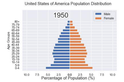
def make_plot(year):
# 根据年份来筛选出数据
df = data[data.Year == year]
# 制作图表
fig, (ax1, ax2) = plt.subplots(1, 2, sharey = True)
ax1.invert_xaxis()
fig.subplots_adjust(wspace = 0)
ax1.barh(df[df.Sex == 'Male'].AgeGrp, df[df.Sex == 'Male'].percent, label = 'Male')
ax2.barh(df[df.Sex == 'Female'].AgeGrp, df[df.Sex == 'Female'].percent, label = 'Female', color = 'C1')
country = df.Location.iloc[0]
if country == 'United States of America': country == 'US'
fig.suptitle(f'......')
fig.supxlabel('......')
fig.legend(bbox_to_anchor = (0.9, 0.88), loc = 'upper right')
ax1.set_ylabel('Age Groups')
return fig我们自定义了一个绘制图表的函数,其中的参数是年份,逻辑很简单,我们是想根据年份来筛选出数据,然后根据筛选出的数据来绘制图表,每一年的图表不尽相同
years = [i for i in set(data.Year) if i < 2022]
years.sort()

for year in years:
    fig = make_plot(year)
    fig.savefig(f'{year}.jpeg',bbox_inches = 'tight')
output
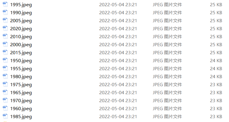
这样我们就生成了若干张静态的图表,然后集合成gif格式的图表几个,代码如下
import matplotlib.animation as animation
fig, ax = plt.subplots()
ims = []

for year in years:
    im = ax.imshow(plt.imread(f'{year}.jpeg'), animated = True)
    ims.append([im])

ani = animation.ArtistAnimation(fig, ims, interval=600)
ani.save('us_population.gif')
output
还有另外一种思路
可能看到这儿,有人会觉得上面提到的方法稍显麻烦,毕竟我们需要先生成数十张静态的图表,要是电脑的磁盘空间有点紧张的话,或者还没有这样的一个地方来存放这数十张的图表。于是乎就会疑问道,是不是可以一步到位的来。
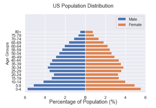
当然也是可以的,例如我们打算绘制1950年到2020年不同年龄阶段的人口比例分布图,首先第一步在于我们先要绘制1950年,也就是起始年,该年不同年龄阶段的人口比例分布图,代码如下
fig, (ax1, ax2) = plt.subplots(1, 2, sharey = True)

df = data[data.Year == 1955]

y_pos = [i for i in range(len(df[df.Sex == 'Male']))]
male = ax1.barh(y_pos, df[df.Sex == 'Male'].percent, label = 'Male',
               tick_label = df[df.Sex == 'Male'].AgeGrp)
female = ax2.barh(y_pos, df[df.Sex == 'Female'].percent, label = 'Female',
                  color = 'C1', tick_label = df[df.Sex == 'Male'].AgeGrp)

ax1.invert_xaxis()
fig.suptitle('.......')
fig.supxlabel('....... (%)')
fig.legend(bbox_to_anchor = (0.9, 0.88), loc = 'upper right')
ax1.set_ylabel('Age Groups')
output
然后我们自定义一个绘制图表的函数,其中参数为年份,目的在于通过年份来筛选出相对应的数据并且绘制出相对应的图表
def run(year):
    # 通过年份来筛选出数据
    df = data[data.Year == year]
    # 针对不同地性别来绘制
    total_pop = df.Value.sum()
    df['percent'] = df.Value / total_pop * 100
    male.remove()
    y_pos = [i for i in range(len(df[df.Sex == 'Male']))]
    male.patches = ax1.barh(y_pos, df[df.Sex == 'Male'].percent, label = 'Male',
                     color = 'C0', tick_label = df[df.Sex == 'Male'].AgeGrp)
    female.remove()
    female.patches = ax2.barh(y_pos, df[df.Sex == 'Female'].percent, label = 'Female',

                 color = 'C1', tick_label = df[df.Sex == 'Female'].AgeGrp)

    text.set_text(year)
return male#, female然后我们调用animation.FuncAnimation()方法,
ani = animation.FuncAnimation(fig, run, years, blit = True, repeat = True,
                              interval = 600)
ani.save('文件名.gif')
output
这样就可以一步到位生成gif格式的图表,避免生成数十张繁多地静态图片了。
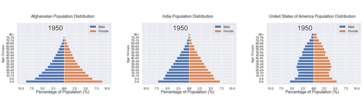
将若干张gif动图放置在一张大图当中
最后我们可以将若干张gif动图放置在一张大的图表当中,代码如下
import matplotlib.animation as animation

# 创建一个新的画布
fig, (ax, ax2, ax3) = plt.subplots(1, 3, figsize = (10, 3))

ims = []
for year in years:
    im = ax.imshow(plt.imread(f'文件1{year}.jpeg'), animated = True)
    im2 = ax2.imshow(plt.imread(f'文件2{year}.jpeg'), animated = True)
    im3 = ax3.imshow(plt.imread(f'文件3{year}.jpeg'), animated = True)
    ims.append([im, im2, im3])

ani = animation.ArtistAnimation(fig, ims, interval=600)
ani.save('comparison.gif')
output
◆ ◆ ◆  ◆ ◆
麟哥新书已经在当当上架了,我写了本书:《拿下Offer-数据分析师求职面试指南》,目前当当正在举行活动,大家可以用相当于原价5折的预购价格购买,还是非常划算的:
数据森麟公众号的交流群已经建立,许多小伙伴已经加入其中,感谢大家的支持。大家可以在群里交流关于数据分析&数据挖掘的相关内容,还没有加入的小伙伴可以扫描下方管理员二维码,进群前一定要关注公众号奥,关注后让管理员帮忙拉进群,期待大家的加入。
管理员二维码:


 被折叠的 条评论
为什么被折叠?
被折叠的 条评论
为什么被折叠?
 到【灌水乐园】发言


