


效果截图:javascript
Html页:css
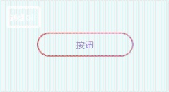
渐变椭圆按钮html
css样式:java
body {
background: #f6f6f6;
}web
.btn {spa
width: 150px;
height: 35px;
display: inline-block;
padding: 2px;
border-radius: 35px;
vertical-align: middle;
background: #e3164e;
background: linear-gradient(268deg,#e3164e,#7f1ba7,#841c39,#e993e7,#d27228);
background-size: 1000% 1000%;
-webkit-animation: gradient 10s ease infinite;
-moz-animation: gradient 10s ease infinite;
-o-animation: Agradient 10s ease infinite;
animation: gradient 10s ease infinite;
}3d
.btn input {
font: 300 14px/14px 'Source Sans Pro',sans-serif;
letter-spacing: 1px;
display: block;
position: relative;
width: 100%;
height: 100%;
text-transform: uppercase;
background: #f6f6f6;
border: none;
outline: none;
border-radius: 35px;
color: #5a3db7;
cursor: pointer;
transition: all 0.3s cubic-bezier(0.645,0.045,0.355,1)
}orm
.btn:hover input {
color: #fff;
background: transparent;
}xml
@-webkit-keyframes gradient {
0% {
background-position: 0% 24%;
}htm
50% {
background-position: 100% 77%;
}
100% {
background-position: 0% 24%;
}
}
@-moz-keyframes gradient {
0% {
background-position: 0% 24%;
}
50% {
background-position: 100% 77%;
}
100% {
background-position: 0% 24%;
}
}
@-o-keyframes AnimationName {
0% {
background-position: 0% 24%;
}
50% {
background-position: 100% 77%;
}
100% {
background-position: 0% 24%;
}
}
@keyframes gradient {
0% {
background-position: 0% 24%;
}
50% {
background-position: 100% 77%;
}
100% {
background-position: 0% 24%;
}
}
JS逻辑:
function butClick() {
//按钮的点击事件
}


 2008
2008


 被折叠的 条评论
为什么被折叠?
被折叠的 条评论
为什么被折叠?
 到【灌水乐园】发言


