


一、水平居中
1.1 要居中的是内联元素或者行内-块级元素?(比如文字或链接)
块级父元素设置text-align为center则其内内联元素水平居中。This will work for inline, inline-block, inline-table, inline-flex, etc.
1.2 要居中的是块级元素?
设定了宽度的块级元素(不设定宽度将会自动铺满那就不需要水平居中啦):把该元素的margin-left和 margin-right 都设置成auto来实现水平居中。
1.3 一行内不止一个块级元素?
1.3.1 如果在一行内有两个或多个块级元素需要水平居中,得为它们设置不同的display类型。/* 方法1-将这些块级元素设置display为inline-block,再将其父容器设置text-align为center*/ /* 方法2-直接给父容器设置成flex布局,再将justify-content属性设置成center*/
1.3.2 如果是多个块级元素依次堆在上一个的顶部,那margin auto策略还是奏效的。
二、垂直居中
2.1 要居中的是内联元素或者行内-块级元素?(比如文字或链接)
2.1.1 是单行?
2.1.1.1单行的内联元素只需将上下padding设置成等值就可以实现垂直居中。
2.1.1.2 在某些不能使用padding的情况下,并确定是不换行的文本,则可以使用line-height等于height的方法来使单行文本内容垂直居中。
2.1.2 是多行?
2.1.2.1 给多行文本设置上下等大的padding也可以使其垂直居中。但如果此法不奏效,则有可能是文字在的元素成了table cell,这时候就要用vertical-align来解决问题。
2.1.2.2 如果table-like已经过时不用了,用flexbox是更佳方案。一个flex-child可以很容易在flex-parent里实现居中(父容器必须有个固定高度px、%等)。
2.1.2.3 除去以上两种方法,你还可以使用幽灵元素技巧"ghost element" technique,在这种技术中,容器内放置一个完全高度的伪元素,并且文本与此垂直对齐。
2.2 要居中的是块级元素?
2.2.1 该块级元素高度已知
你明确知道元素的高度,则可以像下面这样来垂直居中:/* 元素相对其父容器顶部50%的位置 */ / * 元素的margin-top设置为负(自身height*0.5)*/
2.2.2 该块级元素高度未知
相对父容器顶部50%定位,再纵向回移自身高度的50%即tramsform: translateY(-50%),即可实现垂直居中。
2.2.3 是否介意该元素撑开其父容器高度?
如果不介意,那只需使用tables或CSS display使元素变成tables再使vertical-align为middle就能实现垂直居中。
2.2.4 你要用flexbox吗?
使用flex布局可以很轻松实现垂直居中:align-items: center;
或者通过flex-direction: column;将默认横向的主轴改为垂直方向,起点在上沿。并justify-content: center;也可以。
三、垂直水平居中
3.1 该元素的宽高固定吗?
在将元素绝对定位为top: 50%; left: 50%;后,可以使用值为宽的一半和高的一半的负margin实现垂直水平居中。(跨浏览器支持很不错)
3.2 该元素宽高未知?
(1)如果宽高未知,在将元素绝对定位为top: 50%; left: 50%;后,可以使用transform属性来做负的50%移动(基于当前元素宽高)。
(2)也可以元素相对父容器绝对定位(left: 0;right: 0;top: 0;bottom: 0;)并margin: auto,不需要提前知道尺寸兼容性好。
3.3 你要用flexbox吗?
对flexbox进行垂直水平居中,只需设置两个属性为center: align-items、justify-content。
3.4 你要用grid布局吗?
父容器设置为grid布局后,子元素直接margin: auto;即可实现垂直水平居中。
一、水平居中
1.1 要居中的是内联元素或者行内-块级元素?(比如文字或链接)
块级父元素设置text-align为center则其内内联元素水平居中。This will work for inline, inline-block, inline-table, inline-flex, etc.
<!DOCTYPE html>
<html>
<head>
  <meta charset="utf-8">
  <meta name="viewport" content="width=device-width">
  <title>块级父元素内的行内元素居中</title>
  <style>
    body {
      background: #f06d06;
    }
    header, nav {
      text-align: center;  /* 块级父元素设置text-align为center则其内内联元素水平居中*/
      background: white;
      margin: 20px 0;
      padding: 10px;
    }

    nav a {
      text-decoration: none;
      background: #333;
      border-radius: 5px;
      color: white;
      padding: 3px 8px;
    }
  </style>
</head>
<body>
  <header>
    This text is centered.
  </header>

  <nav role='navigation'>
    <a href="#0">One</a>
    <a href="#0">Two</a>
    <a href="#0">Three</a>
    <a href="#0">Four</a>
  </nav>
</body>
</html>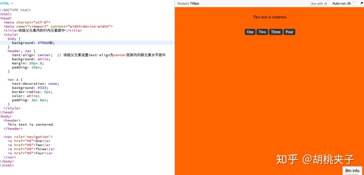
1.2 要居中的是块级元素?
设定了宽度的块级元素(不设定宽度将会自动铺满那就不需要水平居中啦):把该元素的margin-left和 margin-right 都设置成auto来实现水平居中。
<!DOCTYPE html>
<html>
<head>
  <meta charset="utf-8">
  <meta name="viewport" content="width=device-width">
  <title>定宽块级元素居中</title>
  <style>
    body {
      background: #f06d06;
    }

    main {
      background: white;
      margin: 20px 0;
      padding: 10px;
    }

    .center {
      margin: 0 auto; /* 定宽块级元素的水平居中通过设置左右margin为auto来实现*/
      width: 200px;
      background: black;
      padding: 20px;
      color: white;
    }
  </style>
</head>
<body>
  <main>
    <div class="center">
      I'm a block level element and am centered.
    </div>
  </main>
</body>
</html>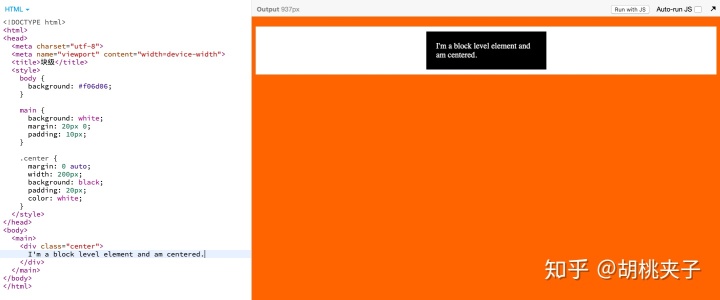
1.3 一行内不止一个块级元素?
1.3.1 如果在一行内有两个或多个块级元素需要水平居中,得为它们设置不同的display类型。
<!DOCTYPE html>
<html>
<head>
  <meta charset="utf-8">
  <meta name="viewport" content="width=device-width">
  <title>一行内使两个或者多个块级元素水平居中</title>
  <style>
    body {
      background: #f06d06;
      font-size: 80%;
    }
    main {
      background: white;
      margin: 20px 0;
      padding: 10px;
    }
    main div {
      background: black;
      color: white;
      padding: 15px;
      max-width: 125px;
      margin: 5px;
    }
    .inline-block-center {
      text-align: center; /* 方法1-将这些块级元素设置display为inline-block,再将其父容器设置text-align为center*/
    }
    .inline-block-center div {
      display: inline-block;
      text-align: left;
    }
    .flex-center {
      display: flex; /* 方法2-直接给父容器设置成flex布局,再将justify-content属性设置成center*/
      justify-content: center;
    }
  </style>
</head>
<body>
  <main class="inline-block-center">
    <div>
      I'm an element that is block-like with my siblings and we're centered in a row.
    </div>
    <div>
      I'm an element that is block-like with my siblings and we're centered in a row. I have more content in me than my siblings do.
    </div>
    <div>
      I'm an element that is block-like with my siblings and we're centered in a row.
    </div>
  </main>
  <main class="flex-center">
    <div>
      I'm an element that is block-like with my siblings and we're centered in a row.
    </div>
    <div>
      I'm an element that is block-like with my siblings and we're centered in a row. I have more content in me than my siblings do.
    </div>
    <div>
      I'm an element that is block-like with my siblings and we're centered in a row.
    </div>
  </main>
</body>
</html>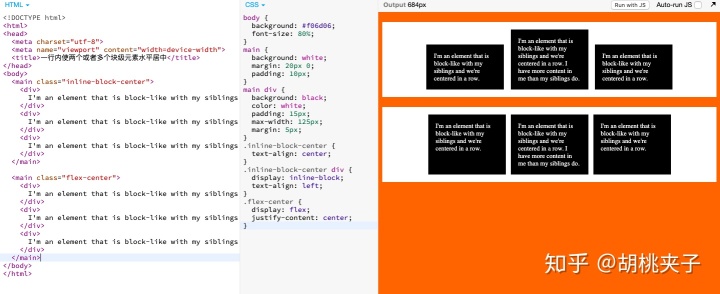
https://jsbin.com/qoxafuzuxe/edit?html,css,output
1.3.2 如果是多个块级元素依次堆在上一个的顶部,那margin auto策略还是奏效的。
https://jsbin.com/hobuxuvejo/edit?html,css,output
<!DOCTYPE html>
<html>
<head>
  <meta charset="utf-8">
  <meta name="viewport" content="width=device-width">
  <title>多个堆叠摞起来的块级元素们水平居中可以采用margin auto</title>
  <style>
    body {
      background: #f06d06;
      font-size: 80%;
    }
    main {
      background: white;
      margin: 20px 0;
      padding: 10px;
    }
    main div {
      background: black;
      margin: 0 auto;     /* 多个堆叠的顶宽块级元素可采用margin左右设置auto来水平居中*/
      color: white;
      padding: 15px;
      margin: 5px auto;
    }
    main div:nth-child(1) {
      width: 200px;
    }
    main div:nth-child(2) {
      width: 400px;
    }
    main div:nth-child(3) {
      width: 125px;
    }
  </style>
</head>
<body>
  <main>
    <div>
      I'm an element that is block-like with my siblings and we're centered in a row.
    </div>
    <div>
      I'm an element that is block-like with my siblings and we're centered in a row. I have more content in me than my siblings do.
    </div>
    <div>
      I'm an element that is block-like with my siblings and we're centered in a row.
    </div>
  </main>
</body>
</html>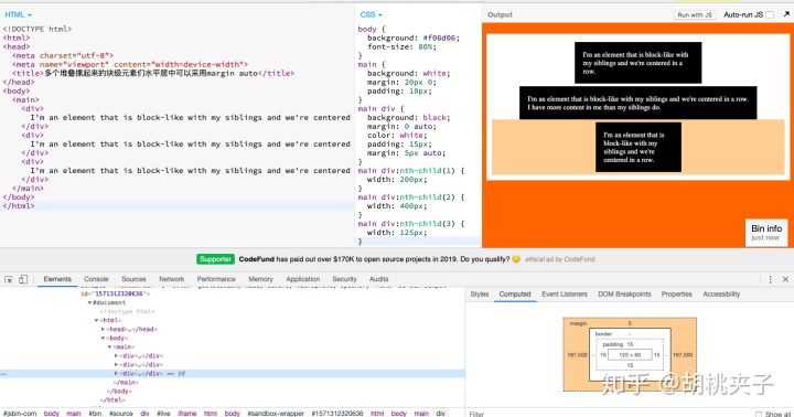
二、垂直居中
2.1 要居中的是内联元素或者行内-块级元素?(比如文字或链接)
2.1.1 是单行?
2.1.1.1单行的内联元素只需将上下padding设置成等值就可以实现垂直居中。
<!DOCTYPE html>
<html>
<head>
  <meta charset="utf-8">
  <meta name="viewport" content="width=device-width">
  <title>单行内联元素垂直居中</title>
  <style>
    body {
      background: #f06d06;
      font-size: 80%;
    }
    main {
      background: white;
      margin: 20px 0;
      padding: 50px;
    }
    main a {
      background: black;
      color: white;
      padding: 40px 30px;  /* 单行内联元素设置上下padding等大即可实现垂直居中 */
      text-decoration: none;
    }
  </style>
</head>
<body>
  <main>
    <a href="#0">We're</a>
    <a href="#0">Centered</a>
    <a href="#0">Bits of</a>
    <a href="#0">Text</a>
  </main>
</body>
</html>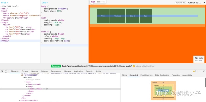
2.1.1.2 在某些不能使用padding的情况下,并确定是不换行的文本,则可以使用line-height等于height的方法来使单行文本内容垂直居中。
<!DOCTYPE html>
<html>
<head>
  <meta charset="utf-8">
  <meta name="viewport" content="width=device-width">
  <title>单行文本垂直居中</title>
  <style>
    body {
      background: #f06d06;
      font-size: 80%;
    }
    main {
      background: white;
      margin: 20px 0;
      padding: 40px;
    }
    main div {
      background: black;
      color: white;
      height: 100px;
      line-height: 100px;
      padding: 20px;
      width: 50%;
      white-space: nowrap;
    }
  </style>
</head>
<body>
  <main>
    <div>
      I'm a centered line.
    </div>
  </main>
</body>
</html>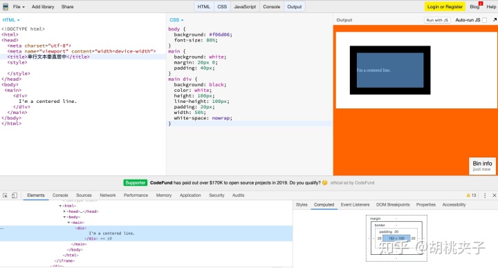
2.1.2 是多行?
2.1.2.1 给多行文本设置上下等大的padding也可以使其垂直居中。但如果此法不奏效,则有可能是文字在的元素成了table cell,这时候就要用vertical-align来解决问题。
<!DOCTYPE html>
<html>
<head>
  <meta charset="utf-8">
  <meta name="viewport" content="width=device-width">
  <title>多行文本垂直居中</title>
  <style>
    body {
      background: #f06d06;
      font-size: 80%;
    }
    table {
      background: white;
      width: 240px;
      border-collapse: separate;
      margin: 20px;
      height: 250px;
    }
    table td {
      background: black;
      color: white;
      padding: 20px;
      border: 10px solid white;
      /* default is vertical-align: middle; */
    }
    .center-table {
      display: table;
      height: 250px;
      background: white;
      width: 240px;
      margin: 20px;
    }
    .center-table p {
      display: table-cell;
      margin: 0;
      background: black;
      color: white;
      padding: 20px;
      border: 10px solid white;
      vertical-align: middle; /* 多行文字所在元素变成table cell时需要设置vertical-align为middle实现居中
    }
  </style>
</head>
<body>
  <table>
    <tr>
      <td>
        I'm vertically centered multiple lines of text in a real table cell.
      </td>
    </tr>
  </table>

  <div class="center-table">
    <p>I'm vertically centered multiple lines of text in a CSS-created table layout.</p>
  </div>
</body>
</html> 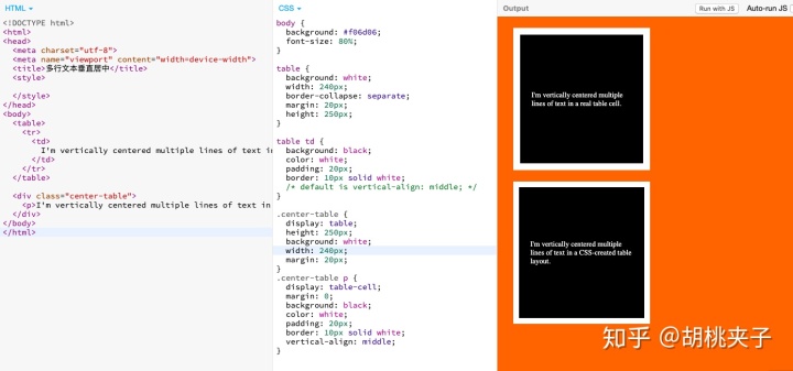
2.1.2.2 如果table-like已经过时不用了,用flexbox是更佳方案。一个flex-child可以很容易在flex-parent里实现居中(父容器必须有个固定高度px、%等)。
<!DOCTYPE html>
<html>
<head>
  <meta charset="utf-8">
  <meta name="viewport" content="width=device-width">
  <title>多行文本垂直居中</title>
  <style>
    body {
      background: #f06d06;
      font-size: 80%;
    }
    div {
      background: white;
      width: 240px;
      margin: 20px;
    }
    .flex-center {
      background: black;
      color: white;
      border: 10px solid white;
      display: flex;
      flex-direction: column; /*决定项目主轴方向从上往下排列 */
      justify-content: center; /*项目在主轴方向居中对齐 */
      height: 200px; /*注意:此容器(container)是有高度的 */
      resize: vertical;
      overflow: auto;
    }
    .flex-center p {
      margin: 0;
      padding: 20px;
    }
  </style>
</head>
<body>
  <div class="flex-center">
    <p>I'm vertically centered multiple lines of text in a flexbox container.</p>
  </div>
</body>
</html>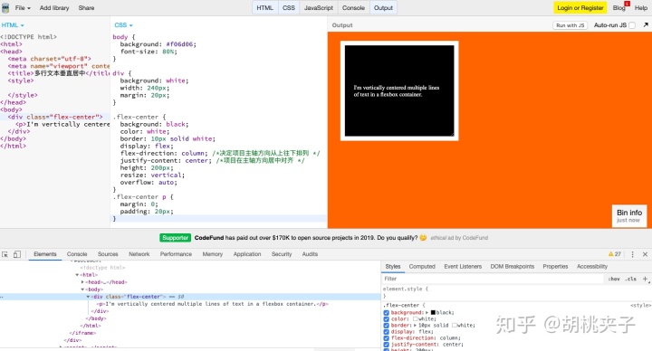
2.1.2.3 除去以上两种方法,你还可以使用幽灵元素技巧"ghost element" technique,在这种技术中,容器内放置一个完全高度的伪元素,并且文本与此垂直对齐。https://jsbin.com/locubutemu/1/edit?html,css,output
<!DOCTYPE html>
<html>
<head>
  <meta charset="utf-8">
  <meta name="viewport" content="width=device-width">
  <title>多行文本垂直居中</title>
  <style>
    body {
      background: #f06d06;
      font-size: 80%;
    }
    div {
      background: white;
      width: 240px;
      height: 200px;
      margin: 20px;
      color: white;
      resize: vertical;
      overflow: auto;
      padding: 20px;
    }
    .ghost-center {
      position: relative;
    }
    .ghost-center::before {
      content: " ";
      display: inline-block;
      height: 100%;  /* 容器内放置一个完全高度的伪元素*/
      width: 1%;
      vertical-align: middle; /*并且文本与此垂直对齐*/
    }
    .ghost-center p {
      display: inline-block;
      vertical-align: middle; /*并且文本与此垂直对齐*/
      width: 190px;
      margin: 0;
      padding: 20px;
      background: black;
    }
  </style>
</head>
<body>
  <div class="ghost-center">
    <p>I'm vertically centered multiple lines of text in a container. Centered with a ghost pseudo element</p>
  </div>
</body>
</html>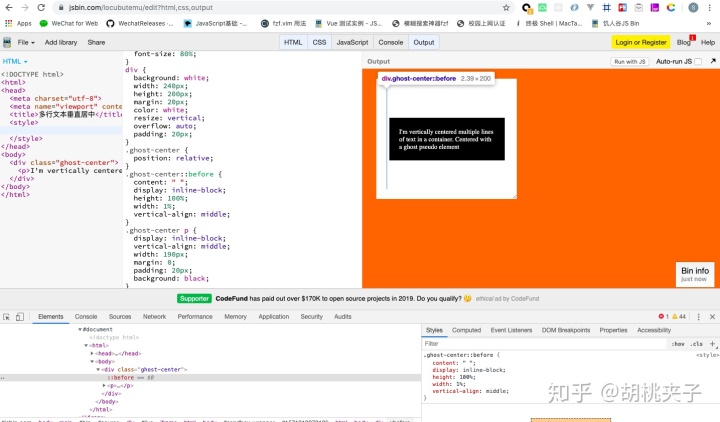
2.2 要居中的是块级元素?
2.2.1 该块级元素高度已知
在网页布局中不知道高度是很常见的,原因很多:若宽度发生了变化则文本重流会改变高度;文本样式的变化会改变高度;文本数量的变化会改变高度;具有固定宽高比的元素如图像在调整大小时可改变高度。但如果你明确知道元素的高度,可以像下面这样来垂直居中:
.parent {
  position: relative;
}
.child {
  position: absolute;
  top: 50%;
  height: 100px;
  margin-top: -50px; /* account for padding and border if not using box-sizing: border-box; */
}
例子:
<!DOCTYPE html>
<html>
<head>
  <meta charset="utf-8">
  <meta name="viewport" content="width=device-width">
  <title>已知高度块级元素垂直居中</title>
  <style>
    body {
      background: #f06d06;
      font-size: 80%;
    }
    main {
      background: white;
      height: 300px;
      margin: 20px;
      width: 300px;
      position: relative;  /* 其父容器设置相对定位 */
      resize: vertical;
      overflow: auto;
    }
    main div {
      position: absolute;  /* 元素自身设置绝对定位 */
      top: 50%;            /* 元素相对其父容器高50%的位置 */
      left: 20px;
      right: 20px;
      height: 100px;       /* 注意没有设置box-sizing: border-box;的话此处height仅指内容宽度 */
      margin-top: -70px;  /* 所以实际高度为20(padding-top)+100(height)+20(padding-bottom)=140px */
      background: black;
      color: white;
      padding: 20px;
    }
  </style>
</head>
<body>
  <main>
    <div>
       I'm a block-level element with a fixed height, centered vertically within my parent.
    </div>
  </main>
</body>
</html> 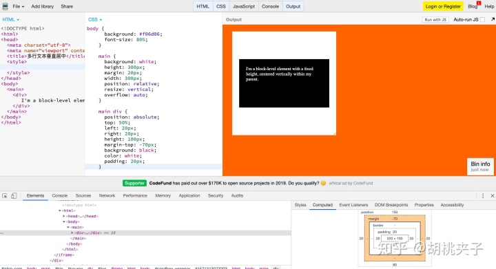
2.2.2 该块级元素高度未知
相对父容器顶部50%定位,再纵向回移自身高度的50%,即可实现垂直居中。
.parent {
  position: relative;
}
.child {
  position: absolute;
  top: 50%;
  transform: translateY(-50%);
}
例子:
<!DOCTYPE html>
<html>
<head>
  <meta charset="utf-8">
  <meta name="viewport" content="width=device-width">
  <title>未知高度块级元素垂直居中</title>
  <style>
    body {
      background: #f06d06;
      font-size: 80%;
    }
    main {
      background: white;
      height: 300px;
      margin: 20px;
      width: 300px;
      position: relative;  /* 相对父容器定位 */
      resize: vertical;
      overflow: auto;
    }
    main div {
      position: absolute;
      top: 50%;           /* 相对父容器顶部顶部50%定位 */
      left: 20px;
      right: 20px;
      background: black;
      color: white;
      padding: 20px;
      transform: translateY(-50%); /* 再纵向回移自身高度的50% */
      resize: vertical;
      overflow: auto;
    }
  </style>
</head>
<body>
 <main>
  <div>
     I'm a block-level element with an unknown height, centered vertically within my parent.
  </div>
 </main>
</body>
</html>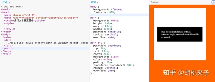
2.2.3 是否介意该元素撑开其父容器高度?
如果不介意,那只需使用tables或CSS display使元素变成tables再使vertical-align为middle就能实现垂直居中。
<!DOCTYPE html>
<html>
<head>
  <meta charset="utf-8">
  <meta name="viewport" content="width=device-width">
  <title>不介意撑开父容器高度时使元素垂直居中</title>
  <style>
    body {
      background: #f06d06;
      font-size: 80%;
    }

    main {
      background: white;
      height: 300px;
      margin: 20px;
      width: 300px;
      position: relative;
      padding: 20px;
      display: table; /* 父元素必须设置display为table但这样撑开了其高度 */
    }
    main div {
      background: black;
      color: white;
      padding: 20px;
      display: table-cell; /* 使用tables或CSS display使元素变成tables */
      vertical-align: middle; /* 再使vertical-align为middle */
    }
  </style>
</head>
<body>
 <main>
  <div>
     I'm a block-level element with an unknown height, centered vertically within my parent.
  </div>
 </main>
</body>
</html>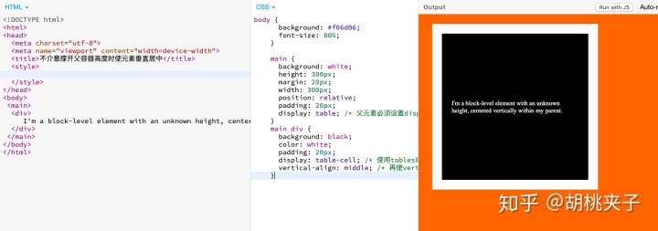
2.2.4 你要用flexbox吗?
使用flex布局可以很轻松实现垂直居中:
main {
  display: flex;
  align-items: center;
}
或者通过flex-direction: column;将默认横向的主轴改为垂直方向,起点在上沿。并justify-content: center;也可以。
<!DOCTYPE html>
<html>
<head>
  <meta charset="utf-8">
  <meta name="viewport" content="width=device-width">
  <title>flex使元素垂直居中</title>
  <style>
    body {
      background: #f06d06;
      font-size: 80%;
    }

    main {
      background: white;
      height: 300px;
      width: 200px;
      padding: 20px;
      margin: 20px;
      display: flex;
      flex-direction: column;
      justify-content: center;
    }

    main div {
      background: black;
      color: white;
      padding: 20px;
    }
  </style>
</head>
<body>
 <main>
  <div>
     I'm a block-level element with an unknown height, centered vertically within my parent.
  </div>
 </main>
</body>
</html>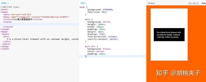
You can also get centering in flexbox usingmargin: auto;on the child element.(也可以在flexbox里给子元素设置margin: auto; 来居中)
三、垂直水平居中
3.1 该元素的宽高固定吗?
在将元素绝对定位为top: 50%; left: 50%;后,可以使用值为宽的一半和高的一半的负margin实现垂直水平居中。(跨浏览器支持很不错)
.parent {
  position: relative;
}

.child {
  width: 300px;
  height: 100px;
  padding: 20px;

  position: absolute;
  top: 50%;
  left: 50%;

  margin: -70px 0 0 -170px;
}
<!DOCTYPE html>
<html>
<head>
<meta charset="utf-8">
<meta name="viewport" content="width=device-width">
<title>绝对定位顶左各50%再负margin为宽高一半使元素垂直水平居中</title>
<style>
body {
background: #f06d06;
font-size: 80%;
padding: 20px;
}
main {
position: relative;
background: white;
height: 200px;
width: 60%;
margin: 0 auto;
padding: 20px;
resize: both;
overflow: auto;
}
main div {
background: black;
color: white;
width: 200px;
height: 100px;
margin: -70px 0 0 -120px;
position: absolute;
top: 50%;
left: 50%;
padding: 20px;
}
</style>
</head>
<body>
<main>
<div>
I'm a block-level element a fixed height and width, centered vertically within my parent.
</div>
</main>
</body>
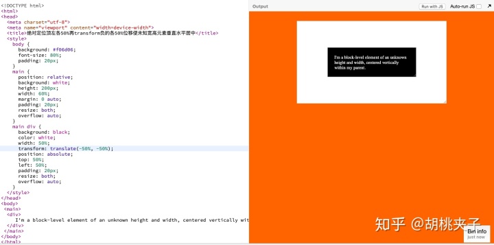
</html>3.2 该元素宽高未知?
(1) 如果宽高未知,在将元素绝对定位为top: 50%; left: 50%;后,可以使用transform属性来做负的50%移动(基于当前元素宽高)。
.parent {
  position: relative;
}
.child {
  position: absolute;
  top: 50%;
  left: 50%;
  transform: translate(-50%, -50%);
}
<!DOCTYPE html>
<html>
<head>
  <meta charset="utf-8">
  <meta name="viewport" content="width=device-width">
  <title>绝对定位顶左各50%再transform负的各50%位移使未知宽高元素垂直水平居中</title>
  <style>
    body {
      background: #f06d06;
      font-size: 80%;
      padding: 20px;
    }
    main {
      position: relative;
      background: white;
      height: 200px;
      width: 60%;
      margin: 0 auto;
      padding: 20px;
      resize: both;
      overflow: auto;
    }
    main div {
      background: black;
      color: white;
      width: 50%;
      transform: translate(-50%, -50%);
      position: absolute;
      top: 50%;
      left: 50%;
      padding: 20px;
      resize: both;
      overflow: auto;
    }
  </style>
</head>
<body>
 <main>
  <div>
     I'm a block-level element of an unknown height and width, centered vertically within my parent.
  </div>
 </main>
</body>
</html>
(2) 也可以元素相对父容器绝对定位(left: 0;right: 0;top: 0;bottom: 0;)并margin: auto,不需要提前知道尺寸兼容性好。
https://jsbin.com/ruxekiruho/edit?html,css,output
3.3 你要用flexbox吗?
对flexbox进行垂直水平居中,只需设置两个属性为center: align-items、justify-content。
.parent {
  display: flex;
  justify-content: center;
  align-items: center;
}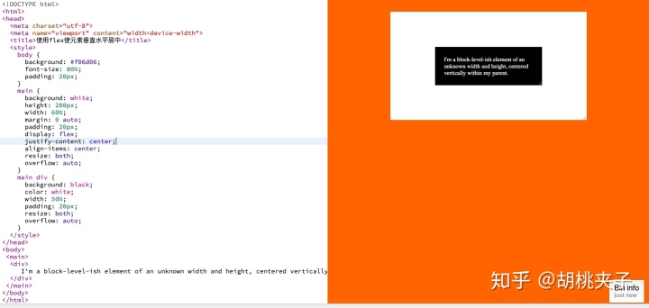
<!DOCTYPE html>
<html>
<head>
  <meta charset="utf-8">
  <meta name="viewport" content="width=device-width">
  <title>使用flex使元素垂直水平居中</title>
  <style>
    body {
      background: #f06d06;
      font-size: 80%;
      padding: 20px;
    }
    main {
      background: white;
      height: 200px;
      width: 60%;
      margin: 0 auto;
      padding: 20px;
      display: flex;
      justify-content: center;
      align-items: center;
      resize: both;
      overflow: auto;
    }
    main div {
      background: black;
      color: white;
      width: 50%;
      padding: 20px;
      resize: both;
      overflow: auto;
    }
  </style>
</head>
<body>
 <main>
  <div>
     I'm a block-level-ish element of an unknown width and height, centered vertically within my parent.
  </div>
 </main>
</body>
</html>
3.4 你要用grid布局吗?
父容器设置为grid布局后,子元素直接margin: auto;即可实现垂直水平居中。
body, html {
  height: 100%;
  display: grid;
}
span { /* thing to center */
  margin: auto;
}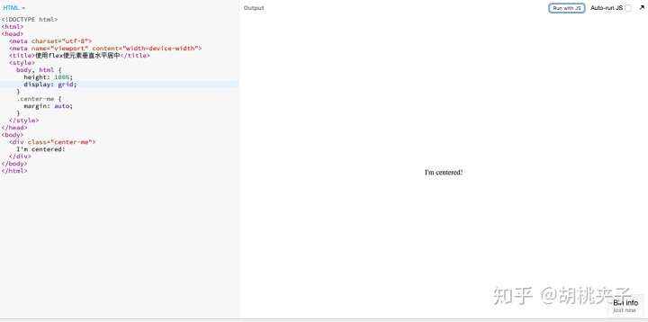
<!DOCTYPE html>
<html>
<head>
  <meta charset="utf-8">
  <meta name="viewport" content="width=device-width">
  <title>使用flex使元素垂直水平居中</title>
  <style>
    body, html {
      height: 100%;
    }
    main {
      display: grid;
      height: 100%;
    }
    .center-me {
      margin: auto;
    }
  </style>
</head>
<body>
  <main>
    <div class="center-me">
      I'm centered!
    </div>
  </main>
</body>
</html>
在线代码预览示例:https://jsbin.com/futabucoyi/2/edit?html,css,output
本文参考引用来源如下:
https://css-tricks.com/centering-css-complete-guide/css-tricks.com


 3万+
3万+


 被折叠的 条评论
为什么被折叠?
被折叠的 条评论
为什么被折叠?
 到【灌水乐园】发言


