


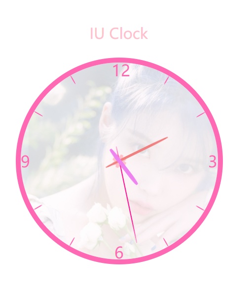
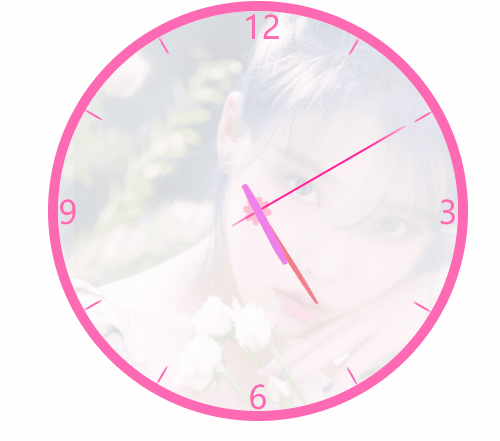
css+html已经学完了,将近50天时间,后面就开始学js了,我这几天将会整理这一段时间以来做的感觉比较有趣的东西分享出来,这里是做了一个纯css实现时间表盘,背景是我无敌喜欢的IU,非常骚气.同时也会把一些关键点做总结
html部分
<!DOCTYPE html>
<html lang="en">
<head>
    <meta charset="UTF-8">
    <meta name="viewport" content="width=device-width, initial-scale=1.0">
    <title>好看的时钟</title>
    <link rel="stylesheet" href="IU-clock.css">
    <link href="https://cdn.bootcss.com/font-awesome/4.7.0/css/font-awesome.min.css" rel="stylesheet">
</head>
<body>
    <section>
        <span class="iu">IU Clock</span>
        <div class="zj"></div>
        <div class="total">
        <span>3</span>
        <span>6</span>
        <span>9</span>
        <span>12</span>
        <i class="fa fa-cog fa-2x" aria-hidden="true"></i>
        <div class="seconds"><div class="second1"></div></div>
        <div></div>
        <div></div>
        <!-- 分割线 -->
        <div></div>
        <div></div>
        <div></div>
        <div></div>
        <div></div>
        <div></div>
        <div></div>
        <div></div>
    </div>
</section>
</body>
</html>
代码有些div块有点多余,也懒得改了,因为还没学JS,等到后面了再加上时间同步功能,应该会更好,慢慢来撒
CSS部分
section {
  position: relative;
  margin-top: 200px;
  width: 400px;
  height: 400px;
  margin: auto;
  margin-top: 200px;
  border-radius: 50%;
}

section > div.zj {
  position: absolute;
  top: 0;
  left: 0;
  width: 100%;
  height: 100%;
  border-radius: 50%;
  background: url(iu.jpg);
  opacity: 1;
  background-size: cover;
  opacity: 0.22;
}

section > span {
  position: absolute;
  font-size: 30px;
  color: pink;
  top: -80px;
  left: 140px;
}

.total {
  box-sizing: content-box;
  background-repeat: no-repeat;
  position: absolute;
  margin: auto;
  left: 0;
  top: 0;
  width: 400px;
  height: 400px;
  border-radius: 50%;
  box-shadow: 0 0 0 10px hotpink;
}

.total > span {
  position: absolute;
  top: 0;
  color: hotpink;
  left: 0;
  font-size: 32px;
  width: 20px;
  height: 20px;
  line-height: 20px;
  text-align: center;
}

.total > span:nth-child(1) {
  top: 190px;
  left: 380px;
}

.total > span:nth-child(2) {
  top: 375px;
  left: 190px;
}

.total > span:nth-child(3) {
  top: 190px;
  left: 0px;
}

.total > span:nth-child(4) {
  top: 5px;
  left: 185px;
}

.total i:nth-of-type(1) {
  display: inline-block;
  position: absolute;
  width: 30px;
  height: 30px;
  text-align: center;
  left: 185px;
  top: 185px;
  color: pink;
  animation: rota 18s linear infinite;
}

.total .seconds {
  width: 400px;
  height: 400px;
  position: absolute;
  top: 0px;
  left: 0;
  background: none;
  transform-origin: 200px 200px;
  animation: rota 60s steps(60) infinite;
}

.total .seconds .second1 {
  position: absolute;
  background-color: deeppink;
  width: 2px;
  height: 200px;
  top: 30px;
  left: 199px;
  transform-origin: 1px 170px;
  animation: seconds 1s ease-out  infinite;
}

.total div {
  box-sizing: content-box;
  width: 2px;
  height: 20px;
  top: 0;
  background-color: hotpink;
  border-radius: 50%;
  position: absolute;
  left: 200px;
  transform-origin: 0 200px;
}

.total div:nth-of-type(2) {
  background-color: lightcoral;
  position: absolute;
  width: 5px;
  height: 140px;
  top: 90px;
  left: 197.5px;
  border-radius: 40%;
  transform-origin: 2.5px 110px;
  transform: rotate(40deg);
  animation: rota 3600s linear infinite;
}

.total div:nth-of-type(3) {
  background-color: violet;
  position: absolute;
  width: 8px;
  height: 90px;
  border-radius: 30%;
  top: 140px;
  left: 196px;
  transform-origin: 4px 60px;
  transform: rotate(140deg);
  animation: rota 21600s linear infinite;
}

.total div:nth-of-type(4) {
  transform: rotate(30deg);
}

.total div:nth-of-type(5) {
  transform: rotate(60deg);
}

.total div:nth-of-type(6) {
  transform: rotate(120deg);
}

.total div:nth-of-type(7) {
  transform: rotate(150deg);
}

.total div:nth-of-type(8) {
  transform: rotate(210deg);
}

.total div:nth-of-type(9) {
  transform: rotate(240deg);
}

.total div:nth-of-type(10) {
  transform: rotate(300deg);
}

.total div:nth-of-type(11) {
  transform: rotate(330deg);
}

@keyframes rota {
  to {
    transform: rotate(360deg);
  }
}

@keyframes seconds {
  from {
    transform: rotate(0);
  }
  5% {
    transform: rotate(-1deg);
  }
  15% {
    transform: rotate(1deg);
  }
  20% {
    transform: rotate(0deg);
  }
  100% {
    transform: rotate(0deg);
  }
}
其实主体大部分都很好完成,用到定位和transform就好,但是因为要模仿老式台钟的秒针抖动效果,这个对于我这种新手来说确实是有点难度,就目前所学的内容来看,好像只有贝塞尔曲线有这种时间抖动效果,但是那种效果只是短暂性的,如何在保持匀步性转动同时增加抖动效果(这里的指针转动用到了steps),接下来就是神奇的地方了,让指针放在一个DIV中,绝对定位之后,父元素转动就会带着指针转动,那么匀步性得到了保障,此时我们加上transition效果,就可以实现,可能在高手看来这个很容易想到,但是对于菜鸟来说.我觉得这个思路真的很棒,bingo~


 被折叠的 条评论
为什么被折叠?
被折叠的 条评论
为什么被折叠?
 到【灌水乐园】发言


