


微信自发布以来,底部导航栏的动画一直让开发者津津乐道,而且伴随着版本更新,底部导航栏的动画也一直在改进。
最近有人问我,微信的最新版本的底部导航栏的动画的原理是什么。闲暇之余,我仔细瞅了瞅最新版本的微信,底部的动画非常可谓非常之有意思,这也是这篇文章的由来。
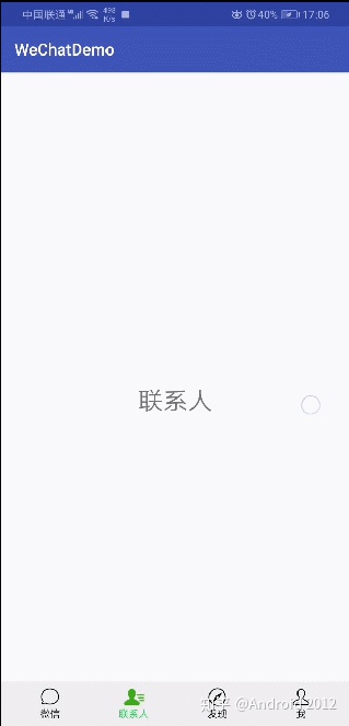
我想大家都安装有微信,大家可以自己看看自己手机上微信的底部导航栏的动画效果,然后再对比看看我实现的效果(如下图),几乎是一毛一样。
觉得文章不错的小伙伴欢迎 关注我的专栏,我会定期分享Android知识点及解析,还会不断更新的BATJ面试专题,欢迎大家前来探讨交流,如有好的文章也欢迎投稿。Android高级进阶zhuanlan.zhihu.com

原理
首先,项目的架构是一个ViewPager加上底部导航栏,ViewPager的滑动可以产生一个滑动比例,底部导航栏根据这个比例值做相应的动画。那么,现在问题来了,底部导航栏如何实现。其实我们可以对底部导航栏的tab写一个自定义View,这个自定义View可以接收一个进度值(ViewPager产生的滑动比例值)来做一些动画。
实现
ViewPager的初始化代码我就不展示了,这个是基本功了,本文主要展示底部的Tab如何自定义View。
布局
这个自定义View的名字叫做TabView, 我选择让它继承自FrameLayout(继承其他的ViewGroup控件也可以的),并且加载一个如下的组合控件布局
// tab_layout.xml

<?xml version="1.0" encoding="utf-8"?>
<LinearLayout xmlns:android="http://schemas.android.com/apk/res/android"
    android:layout_width="match_parent"
    android:layout_height="40dp"
    android:gravity="center_horizontal"
    android:orientation="vertical">

    <FrameLayout
        android:layout_width="wrap_content"
        android:layout_height="0dp"
        android:layout_weight="1">

        <ImageView
            android:id="@+id/tab_image"
            android:layout_width="wrap_content"
            android:layout_height="match_parent" />

        <ImageView
            android:id="@+id/tab_image_top"
            android:layout_width="wrap_content"
            android:layout_height="match_parent" />
    </FrameLayout>

    <TextView
        android:id="@+id/tab_title"
        android:layout_width="wrap_content"
        android:layout_height="wrap_content"
        android:textSize="12sp" />
</LinearLayout>
android:id="@+id/tab_title"的TextView显示标题。
android:id="@+id/tab_image"的ImageView显示的是一个轮廓图片,也就是未选中时候的图片。
android:id="@+id/tab_image_top"的ImageView在android:id="@+id/tab_image"的ImageView之上,显示的是选中时候的图片。
轮廓图片和选中的图片,可以看下如下的图片例子


第一图片就是轮廓图片,第二个图片就是选中后的图片。为什么布局要这么设计呢?这当然是根据微信的动画而设计的布局(废话!),首先默认显示的是轮廓图片,当接收到一个进度值后,会让轮廓图片的轮廓变色,当进度值超过某个阈值的时候,让轮廓图片的透明度渐渐变为0(也就是完全透明,看不见),而让选中的图片的透明度渐渐变为255(也就是慢慢变清晰)。
TabView
既然知道了变色的原理,现在就来写TabView的代码吧。首先为TabView抽取自定义属性
// res/values/tabview_attrs.xml

<?xml version="1.0" encoding="utf-8"?>
<resources>
    <declare-styleable name="TabView">
        <attr name="tabColor" format="color|integer" />
        <attr name="tabImage" format="reference" />
        <attr name="tabSelectedImage" format="reference" />
        <attr name="tabTitle" format="string|reference" />
    </declare-styleable>
</resources>- tabColor代表变色最终显示的颜色。
- tabImage代表默认显示的轮廓图。
- tabSelectedImage代表选中后的图。
- tabTitle代表要显示的标题。
然后,在TabView中加载布局,并且获取自定义属性
public TabView(Context context, @Nullable AttributeSet attrs) {
        super(context, attrs);
        // 加载布局
        inflate(context, R.layout.tab_layout, this);

        TypedArray a = context.obtainStyledAttributes(attrs, R.styleable.TabView);
        for (int i = 0; i < a.getIndexCount(); i++) {
            int attr = a.getIndex(i);
            switch (attr) {

                case R.styleable.TabView_tabColor:
                    // 获取标题和轮廓最终的着色
                    mTargetColor = a.getColor(attr, DEFAULT_TAB_TARGET_COLOR);
                    break;

                case R.styleable.TabView_tabImage:
                    // 获取轮廓图
                    mNormalDrawable = a.getDrawable(attr);
                    break;

                case R.styleable.TabView_tabSelectedImage:
                    // 获取选中图
                    mSelectedDrawable = a.getDrawable(attr);
                    break;

                case R.styleable.TabView_tabTitle:
                    // 获取标题
                    mTitle = a.getString(attr);
                    break;
            }

        }
        a.recycle();
    }
当加载完布局后,需要为各个控件设置相应的属性
@Override
protected void onFinishInflate() {
    super.onFinishInflate();

    // 1.设置标题,默认着色为黑色
    mTitleView = findViewById(R.id.tab_title);
    mTitleView.setTextColor(DEFAULT_TAB_COLOR);
    mTitleView.setText(mTitle);

    // 2.设置轮廓图片,不透明,默认着色为黑色
    mNormalImageView = findViewById(R.id.tab_image);
    mNormalDrawable.setTint(DEFAULT_TAB_COLOR);
    mNormalDrawable.setAlpha(255);
    mNormalImageView.setImageDrawable(mNormalDrawable);

    // 3.设置选中图片,透明,默认着色为黑色
    mSelectedImageView = findViewById(R.id.tab_selected_image);
    mSelectedDrawable.setAlpha(0);
    mSelectedImageView.setImageDrawable(mSelectedDrawable);
}
第二步中,为轮廓图调用了Drawable.setTint()方法为轮廓着色,默认着色为黑色。
Drawable.setTint() 其实就是利用 PorterDuff.Mode.DST_IN 来进行颜色混合。
然后我还需要一个接收进度值(范围为0.f 到 1.f)的方法,从而利用这个进度值做动画
/**
 * 根据进度值进行变色和透明度处理。
 *
 * @param percentage 进度值,取值[0, 1]。
 */
public void setXPercentage(float percentage) {
    if (percentage < 0 || percentage > 1) {
        return;
    }

    // 1. 颜色变换
    int finalColor = evaluate(percentage, DEFAULT_TAB_COLOR, mTargetColor);
    mTitleView.setTextColor(finalColor);
    mNormalDrawable.setTint(finalColor);

    // 2. 透明度变换
    if (percentage >= 0.5 && percentage <= 1) {
        // 原理如下
        // 进度值: 0.5 ~ 1
        // 透明度: 0 ~ 1
        // 公式: percentage - 1 = (alpha - 1) * 0.5
        int alpha = (int) Math.ceil(255 * ((percentage - 1) * 2 + 1));
        mNormalDrawable.setAlpha(255 - alpha);
        mSelectedDrawable.setAlpha(alpha);
    } else {
        mNormalDrawable.setAlpha(255);
        mSelectedDrawable.setAlpha(0);
    }

    // 3. 更新UI
    invalidateUI();
}
第一步是根据进度值来计算颜色值。在属性动画中,有一个ArgbEvaluator类,这是一个对颜色做动画的类,它里面有一个方法如下
public Object evaluate(float fraction, Object startValue, Object endValue) {
    int startInt = (Integer) startValue;
    float startA = ((startInt >> 24) & 0xff) / 255.0f;
    float startR = ((startInt >> 16) & 0xff) / 255.0f;
    float startG = ((startInt >>  8) & 0xff) / 255.0f;
    float startB = ( startInt        & 0xff) / 255.0f;

    int endInt = (Integer) endValue;
    float endA = ((endInt >> 24) & 0xff) / 255.0f;
    float endR = ((endInt >> 16) & 0xff) / 255.0f;
    float endG = ((endInt >>  8) & 0xff) / 255.0f;
    float endB = ( endInt        & 0xff) / 255.0f;

    // convert from sRGB to linear
    startR = (float) Math.pow(startR, 2.2);
    startG = (float) Math.pow(startG, 2.2);
    startB = (float) Math.pow(startB, 2.2);

    endR = (float) Math.pow(endR, 2.2);
    endG = (float) Math.pow(endG, 2.2);
    endB = (float) Math.pow(endB, 2.2);

    // compute the interpolated color in linear space
    float a = startA + fraction * (endA - startA);
    float r = startR + fraction * (endR - startR);
    float g = startG + fraction * (endG - startG);
    float b = startB + fraction * (endB - startB);

    // convert back to sRGB in the [0..255] range
    a = a * 255.0f;
    r = (float) Math.pow(r, 1.0 / 2.2) * 255.0f;
    g = (float) Math.pow(g, 1.0 / 2.2) * 255.0f;
    b = (float) Math.pow(b, 1.0 / 2.2) * 255.0f;

    return Math.round(a) << 24 | Math.round(r) << 16 | Math.round(g) << 8 | Math.round(b);
}
熟悉属性动画的应该知道,参数float fraction的取值范围为0到1,所以可以把这个方法拷贝过来使用。计算出颜色值后,就可以对标题和轮廓图着色了。第二步,按照之前说的动画原理,要利用进度值计算透明度,然后分别对轮廓图和选中图设置透明度。透明度的计算原理已经在注释中写清楚了,这里不再赘述。最后就是更新UI了。
与ViewPager联动
一切准备就绪,就等一个ViewPager的进度值
mViewPager.addOnPageChangeListener(new ViewPager.SimpleOnPageChangeListener() {
    @Override
    public void onPageScrolled(int position, float positionOffset, int positionOffsetPixels) {

    }
});
既然想知道ViewPager如何提供进度值,那就必须了解onPageScrolled方法的几个参数的意思,首先从源码的注释中进行了解
/**
 * This method will be invoked when the current page is scrolled, either as part
 * of a programmatically initiated smooth scroll or a user initiated touch scroll.
 *
 * @param position Position index of the first page currently being displayed.
 *                 Page position+1 will be visible if positionOffset is nonzero.
 * @param positionOffset Value from [0, 1) indicating the offset from the page at position.
 * @param positionOffsetPixels Value in pixels indicating the offset from position.
 */
void onPageScrolled(int position, float positionOffset, int positionOffsetPixels);
从注释中可以看出,onPageScrolled方法是在滑动的时候调用,参数position代表当前显示的页面,其实这很容易产生误解,无论是从左边往右边滑动,还是从右边往左边滑动,position始终代表左边的页面,那么position + 1始终代表右边的页面。参数positionOffset代表滑动的进度值,并且还有很重要一点,大部分人都会忽略,如果参数positionOffset为非零值,那么右边的页面可见,也就是说,如果positionOffset的值是零,那么代表右边的页面是不可见的,这一点会在代码中体现出来。既然已经对参数有所了解,那么现在来看看实现
public void onPageScrolled(int position, float positionOffset, int positionOffsetPixels) {
    // 左边View进行动画
    mTabViews.get(position).setXPercentage(1 - positionOffset);
    // 如果positionOffset非0,那么就代表右边的View可见,也就说明需要对右边的View进行动画
    if (positionOffset > 0) {
        mTabViews.get(position + 1).setXPercentage(positionOffset);
    }
}
mTabViews是一个ArrayList,它保存了所有的TabView,mTabViews.get(posistion)获取的是左边的页面,mTabViews.get(position)获取的是右边的页面。当从左边向右边滑动的时候,左边页面的positionOffset的值是从0到1的。
当从右边到左边滑动的时候,左边页面的positionOffset的值是从1到0的。而我在设计TabView的时候,如果进度值是1就表示选中,这与positionOffset的值的变动范围恰恰相反(我这个设计是否需要改进下?)。所以对左边的页面取的进度值就是1 - positionOffset,而对右边页面的进度值取的就是positionOffset。
然而,右边的页面也有不可见的时候,那就是positionOffset为0的时候,这个时候就不需要对右边的页面执行动画,这个处理很关键。
结束
有些细节,本文并没有给出,例子已经上传
github:https://github.com/buxiliulian/WeChatBottomNavigation


 1847
1847


 被折叠的 条评论
为什么被折叠?
被折叠的 条评论
为什么被折叠?
 到【灌水乐园】发言


