


flex是 "Flexible Box" 的缩写,意为弹性布局。使用弹性布局有一个基本的概念,采用flex元素,称之为flex容器(flex container),简称为“容器”。"容器" 内的所有子元素会自动成为容器成员,称之为称为 Flex 项目(flex item),简称"项目"。
“容器”和 “项目”各有六个属性,一一列举会很是冗长。所以,这里一个笔记只记一个属性。
如题,这里记录的 “容器”的第一个属性——flex-direction。direction翻译为“方向”。这个属性决定的是“项目”在“容器”中的排列规律。它有四个值,分别是——row(横向排列 (从左到右) )、row-reverse(与row相反(从右到左))、column(竖直排列(从上到下))、column-reverse(与column相反(从下到上))。
现在从代码上和具体表现上展示这个属性和它的值的意义。先写一段HTML代码。
1
2
3
再加上css代码。
.container{ display:flex;}这样,我们就有了一个带有三个“项目” 的“容器”。然后为容器继续加上flex-direction属性。(这个是默认值,就是即使你没有写,它也会是这个表现形式)
.container{ display:flex; flex-direction:row;}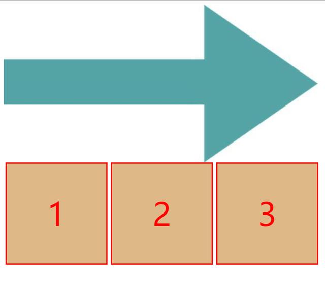
flex-direction:row;
如上图所示,当flex-direction的值是row的时候,“项目”的排列方式是从左到右的一个排列方式。那么当flex-direction的值是row-reverse的时候呢?
.container{ display:flex; flex-direction:row-reverse;}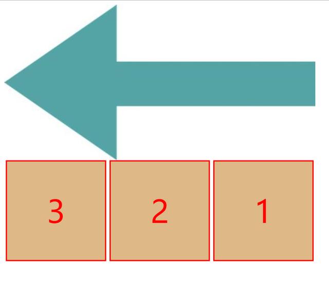
flex-direction:row-reverse
我们可以看到排列方式与row相反——从右到左。以上是横向排列的两个值的“项目”的布局展示效果。下面是竖直方向排列的两个值。
.container{ display:flex; flex-direction:column;}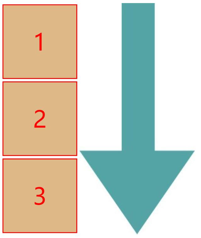
flex-direction:column
如图所示,当flex-direction的值为column时,是一个从上到下的一个竖直方向的排列。column-reverse与之相反。
.container{ display:flex; flex-direction:column-reverse;}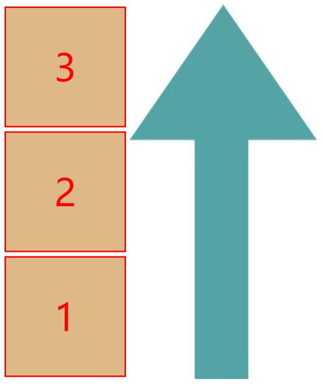
flex-direction:column-reverse
如图,是一个从下到上的一个竖直方向上的排列。
笔记到这里就一目了然了,flex-direction这个容器属性的具体用途可以从上面的四张图片中对号入座。以上


 115
115


 被折叠的 条评论
为什么被折叠?
被折叠的 条评论
为什么被折叠?
 到【灌水乐园】发言


