


 阅读本文约需要5分钟
大家好,我是你们的导师,我每天都会在这里给大家分享一些干货内容(当然了,周末也要允许老师休息一下哈)。上次老师跟大家分享了JS之 创建反射效果的知识,今天跟大家分享下JS之 加载模糊文本动画的知识。
1 JS之 创建反射效果参考文献:https://www.geeksforgeeks.org/how-to-create-loading-blur-text-animation-effect-using-html-and-css/?ref=rp模糊文本动画被称为“烟熏效果”,用于为我们的文本提供模糊动画。本文在一个方向上线性模糊,然后重新出现。
方法:本文的方法非常简单。我们正在使用blur()函数对模糊效果进行动画处理。然后,我们使用第n个子属性来应用动画延迟。现在,让我们直接看一下代码。 HTML代码:我们创建了一个div元素,并将加载文本字符包装在span元素内。 "width=device-width, initial-scale=1.0" /> GeeksforGeeks G e e k s f o r G e e k s 步骤1:第一步很简单,我们将文本居中对齐并为我们的身体提供背景。
步骤2:然后,我们提供了一个线性动画,其关键帧标识符为animate。
步骤3:现在我们使用关键帧将模糊功能应用于动画的不同帧。
步骤4:最后一步是应用第n个子概念为每个角色提供动画延迟,以便在一个时间点只有一个角色变得模糊。
    body {         margin: 0;         padding: 0;         background: green;     }
    .geeks {         position: absolute;         top: 50%;         left: 50%;         transform: translate(-50%, -50%);         font-size: 30px;         font-weight: 800;         letter-spacing: 5px;     }
    .geeks span {         animation: animate 3s linear infinite;     }
    .geeks span:nth-child(1) {         animation-delay: 0s;     }
    .geeks span:nth-child(2) {         animation-delay: 0.1s;     }
    .geeks span:nth-child(3) {         animation-delay: 0.2s;     }
    .geeks span:nth-child(4) {         animation-delay: 0.3s;     }
    .geeks span:nth-child(5) {         animation-delay: 0.4s;     }
    .geeks span:nth-child(6) {         animation-delay: 0.5s;     }
    .geeks span:nth-child(7) {         animation-delay: 0.6s;     }
    .geeks span:nth-child(8) {         animation-delay: 0.9s;     }
    .geeks span:nth-child(9) {         animation-delay: 0.8s;     }
    .geeks span:nth-child(10) {         animation-delay: 0.9s;     }
    .geeks span:nth-child(11) {         animation-delay: 1s;     }
    .geeks span:nth-child(12) {         animation-delay: 1.1s;     }
    .geeks span:nth-child(13) {         animation-delay: 1.2s;     }
    @keyframes animate {         0% {             filter: blur(0);         }
        40% {             filter: blur(20px);         }
        80% {             filter: blur(0);         }
100% { filter: blur(0); } } "width=device-width, initial-scale=1.0" /> Document body { margin: 0; padding: 0; background: green; }
.geeks { position: absolute; top: 50%; left: 50%; transform: translate(-50%, -50%); font-size: 30px; font-weight: 800; letter-spacing: 5px; }
.geeks span { animation: animate 3s linear infinite; }
.geeks span:nth-child(1) { animation-delay: 0s; }
.geeks span:nth-child(2) { animation-delay: 0.1s; }
.geeks span:nth-child(3) { animation-delay: 0.2s; }
.geeks span:nth-child(4) { animation-delay: 0.3s; }
.geeks span:nth-child(5) { animation-delay: 0.4s; }
.geeks span:nth-child(6) { animation-delay: 0.5s; }
.geeks span:nth-child(7) { animation-delay: 0.6s; }
.geeks span:nth-child(8) { animation-delay: 0.9s; }
.geeks span:nth-child(9) { animation-delay: 0.8s; }
.geeks span:nth-child(10) { animation-delay: 0.9s; }
.geeks span:nth-child(11) { animation-delay: 1s; }
.geeks span:nth-child(12) { animation-delay: 1.1s; }
.geeks span:nth-child(13) { animation-delay: 1.2s; }
@keyframes animate { 0% { filter: blur(0); }
40% { filter: blur(20px); }
80% { filter: blur(0); }
100% { filter: blur(0); } } G e e k s f o r G e e k s 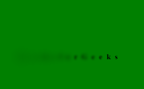 今天就分享这么多,
关于JS之 加载模糊文本动画
,你学会了多少?
欢迎在留言区评论,对于有价值的留言,我们都会一一回复的。如果觉得文章对你有一丢丢帮助,请点右下角【
在看
】,让更多人看到该文章。
今天就分享这么多,
关于JS之 加载模糊文本动画
,你学会了多少?
欢迎在留言区评论,对于有价值的留言,我们都会一一回复的。如果觉得文章对你有一丢丢帮助,请点右下角【
在看
】,让更多人看到该文章。


 986
986


 被折叠的 条评论
为什么被折叠?
被折叠的 条评论
为什么被折叠?
 到【灌水乐园】发言


