


来源:大数据DT(ID:hzdashuju)
作者:屈希峰,资深Python工程师,知乎多个专栏作者
本文约8000字,建议阅读20分钟
柱状图是当前应用最广泛的图表之一,你几乎每天都可以在电子产品上看到它。它有哪些分类?可以展示哪些数据关系?怎样用Python绘制?本文带你逐一了解。
 01 概述
柱状图
(Histogram)是一种以长方形的长度为变量的表达图形的统计报告图,由一系列高度不等的纵向条纹表示数据分布的情况,用来比较两个或两个以上的价值(不同时间或者不同条件),只有一个变量,通常用于较小的数据集分析。
柱状图也可横向排列,或用多维方式表达。其主要用于数据统计与分析,早期主要用于数学统计学科中,用柱状图表示数码相机的曝光值,到现代使用已经比较广泛,比如现代的电子产品和一些软件的分析测试,如电脑、数码相机的显示器和Photoshop上都能看到相应的柱状图。
1. 基础柱状图
基础柱状图经常用来对比数值的大小,使用范围非常广泛,例如科比在不同赛季的得分、不同游戏App下载量、不同时期手机端综合搜索用户规模等,图2-33显示不同种类水果的销量。
01 概述
柱状图
(Histogram)是一种以长方形的长度为变量的表达图形的统计报告图,由一系列高度不等的纵向条纹表示数据分布的情况,用来比较两个或两个以上的价值(不同时间或者不同条件),只有一个变量,通常用于较小的数据集分析。
柱状图也可横向排列,或用多维方式表达。其主要用于数据统计与分析,早期主要用于数学统计学科中,用柱状图表示数码相机的曝光值,到现代使用已经比较广泛,比如现代的电子产品和一些软件的分析测试,如电脑、数码相机的显示器和Photoshop上都能看到相应的柱状图。
1. 基础柱状图
基础柱状图经常用来对比数值的大小,使用范围非常广泛,例如科比在不同赛季的得分、不同游戏App下载量、不同时期手机端综合搜索用户规模等,图2-33显示不同种类水果的销量。
 ▲图2-33 基本柱状图
需要注意的是,分类太多不适合使用竖向柱状图,如图2-34所示。
▲图2-33 基本柱状图
需要注意的是,分类太多不适合使用竖向柱状图,如图2-34所示。
 ▲图2-34 竖向柱状图
此时,需要用到横向柱状图,如图2-35所示。
▲图2-34 竖向柱状图
此时,需要用到横向柱状图,如图2-35所示。
 ▲图2-35 横向柱状图
2. 分组柱状图
分组柱状图
,又叫聚合柱状图。当使用者需要在同一个轴上显示各个分类下不同的分组时,需要用到分组柱状图。
跟柱状图类似,使用柱子的高度来映射和对比数据值。
每个分组中的柱子使用不同颜色或者相同颜色不同透明的方式区别各个分类,各个分组之间需要保持间隔。
分组柱状图经常用于不同组间数据的比较,这些组都包含了相同分类的数据。例如,展示改革开放以来城镇与农村人口的变化,不同游戏公司的休闲、益智、格斗类App的下载量对比等。图2-36对比了2015—2017年间不同水果的销量。
▲图2-35 横向柱状图
2. 分组柱状图
分组柱状图
,又叫聚合柱状图。当使用者需要在同一个轴上显示各个分类下不同的分组时,需要用到分组柱状图。
跟柱状图类似,使用柱子的高度来映射和对比数据值。
每个分组中的柱子使用不同颜色或者相同颜色不同透明的方式区别各个分类,各个分组之间需要保持间隔。
分组柱状图经常用于不同组间数据的比较,这些组都包含了相同分类的数据。例如,展示改革开放以来城镇与农村人口的变化,不同游戏公司的休闲、益智、格斗类App的下载量对比等。图2-36对比了2015—2017年间不同水果的销量。
 ▲图2-36 分组柱状图
3. 堆叠柱状图
与并排显示分类的分组柱状图不同,堆叠柱状图将每个柱子进行分割以显示相同类型下各个数据的大小情况。它可以形象地展示一个大分类包含的每个小分类的数据,以及各个小分类的占比,显示的是单个项目与整体之间的关系。我们将堆叠柱状图分为两种类型:
▲图2-36 分组柱状图
3. 堆叠柱状图
与并排显示分类的分组柱状图不同,堆叠柱状图将每个柱子进行分割以显示相同类型下各个数据的大小情况。它可以形象地展示一个大分类包含的每个小分类的数据,以及各个小分类的占比,显示的是单个项目与整体之间的关系。我们将堆叠柱状图分为两种类型:
一般的堆叠柱状图:每一根柱子上的值分别代表不同的数据大小,各层的数据总和代表整根柱子的高度。非常适用于比较每个分组的数据总量。
百分比的堆叠柱状图:柱子的各个层代表的是该类别数据占该分组总体数据的百分比。
 ▲图2-37 堆叠柱状图
4. 双向柱状图
双向柱状图,
又名正负条形图,使用正向和反向的柱子显示类别之间的数值比较。其中分类轴表示需要对比的分类维度,连续轴代表相应的数值,分为两种情况,一种是正向刻度值与反向刻度值完全对称,另一种是正向刻度值与反向刻度值反向对称,即互为相反数。
图2-38是显示2015—2017年间不同水果的进出口数量。
▲图2-37 堆叠柱状图
4. 双向柱状图
双向柱状图,
又名正负条形图,使用正向和反向的柱子显示类别之间的数值比较。其中分类轴表示需要对比的分类维度,连续轴代表相应的数值,分为两种情况,一种是正向刻度值与反向刻度值完全对称,另一种是正向刻度值与反向刻度值反向对称,即互为相反数。
图2-38是显示2015—2017年间不同水果的进出口数量。
 ▲图2-38 双向柱状图
5. 瀑布图
瀑布图
是由麦肯锡顾问公司所独创的图表类型,因为形似瀑布流水而称之为瀑布图(Waterfall Plot)。此种图表采用绝对值与相对值结合的方式,适用于表达数个特定数值之间的数量变化关系。图2-39显示历年短跑冠军的时间跨度,由此可以看出人类体能极限越来越高了。
▲图2-38 双向柱状图
5. 瀑布图
瀑布图
是由麦肯锡顾问公司所独创的图表类型,因为形似瀑布流水而称之为瀑布图(Waterfall Plot)。此种图表采用绝对值与相对值结合的方式,适用于表达数个特定数值之间的数量变化关系。图2-39显示历年短跑冠军的时间跨度,由此可以看出人类体能极限越来越高了。
 ▲图2-39 瀑布图
接下来,我们看看如何用Bokeh依次实现这些柱状图。
02 实例
柱状图代码示例如下所示。
▲图2-39 瀑布图
接下来,我们看看如何用Bokeh依次实现这些柱状图。
02 实例
柱状图代码示例如下所示。
- 代码示例 2-27
1p = figure(plot_width=400, plot_height=400)2p.vbar(x=[1, 2, 3], width=0.5, bottom=0,3 top=[1.2, 2.5, 3.7], color="red") # 垂直柱状图4show(p) # 显示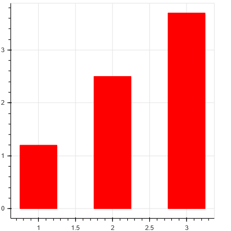 ▲图2-40 代码示例2-27运行结果
代码示例2-27第2行采用vbar()方法实现垂直柱状图,该方法具体的参数说明如下。
p.vbar(x, width, top, bottom=0, **kwargs)参数说明。
▲图2-40 代码示例2-27运行结果
代码示例2-27第2行采用vbar()方法实现垂直柱状图,该方法具体的参数说明如下。
p.vbar(x, width, top, bottom=0, **kwargs)参数说明。
- x (:class:`~bokeh.core.properties.NumberSpec` ) : 柱中心x轴坐标
- width(:class:`~bokeh.core.properties.NumberSpec` ) : 柱宽
- top (:class:`~bokeh.core.properties.NumberSpec` ) : 柱顶部y轴坐标
- bottom(:class:`~bokeh.core.properties.NumberSpec` ) : 柱底部y轴坐标
代码示例 2-28
1p = figure(plot_width=400, plot_height=400) 2p.hbar(y=[1, 2, 3], height=0.5, left=0, 3 right=[1.2, 2.5, 3.7], color="navy") # 水平柱状图 4show(p) # 显示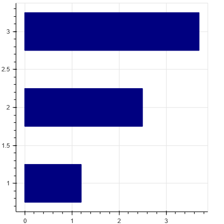 ▲图2-41 代码示例2-28运行结果
代码示例2-28第2行采用hbar()方法实现横向柱状图,该方法具体的参数说明如下。
p.hbar(y, height, right, left=0, **kwargs)参数说明。
▲图2-41 代码示例2-28运行结果
代码示例2-28第2行采用hbar()方法实现横向柱状图,该方法具体的参数说明如下。
p.hbar(y, height, right, left=0, **kwargs)参数说明。
- y(:class:`~bokeh.core.properties.NumberSpec` ) : 柱中心y轴坐标
- height(:class:`~bokeh.core.properties.NumberSpec` ) :柱的高度(宽度)
- right(:class:`~bokeh.core.properties.NumberSpec` ) :柱右侧边界x轴坐标
- left (:class:`~bokeh.core.properties.NumberSpec` ) :柱左侧边界x轴坐标
代码示例 2-29
1from bokeh.models import ColumnDataSource 2from bokeh.palettes import Spectral6 3import pandas as pd 4df=pd.read_csv('data/visualization-20190505.csv') 5p = figure(x_range=df['Visualization_tools'],) 6p.vbar(x=df['Visualization_tools'], top=df['Star'] , width=0.8, color=Spectral6)7p.xgrid.grid_line_color = None 8p.y_range.start = 0 9show(p)
运行结果如图2-42所示。
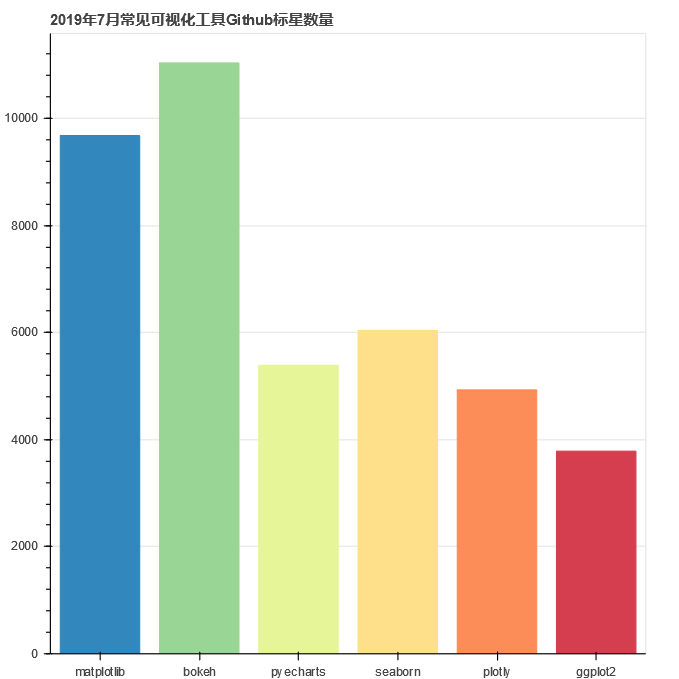 ▲图2-42 代码示例2-29运行结果
代码示例2-29第6行采用vbar()方法展示集中可视化开源工具在GitHub上的Stars数,可以看出Bokeh已经超过了Matplotlib。
▲图2-42 代码示例2-29运行结果
代码示例2-29第6行采用vbar()方法展示集中可视化开源工具在GitHub上的Stars数,可以看出Bokeh已经超过了Matplotlib。
- 代码示例 2-30
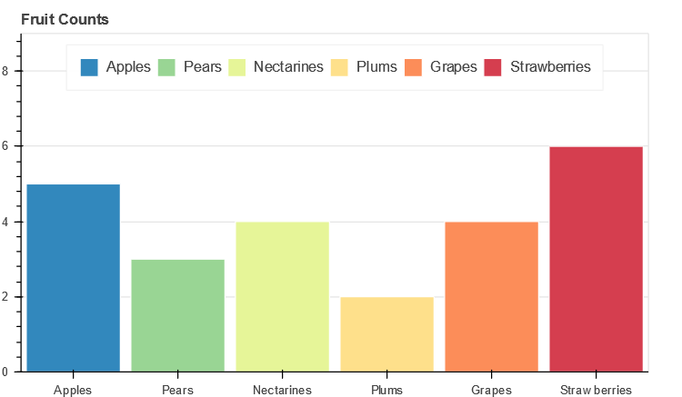
1# 数据 2fruits = ['Apples', 'Pears', 'Nectarines', 'Plums', 'Grapes', 'Strawberries'] 3counts = [5, 3, 4, 2, 4, 6] 4# 画布 5p = figure(x_range=fruits, plot_height=350, , 6# toolbar_location=None, 7# tools="" 8 ) 9# 柱状图 10p.vbar(x=fruits, top=counts, width=0.9) 11# 坐标轴设置 12p.xgrid.grid_line_color = None 13p.y_range.start = 0 14# 显示 15show(p) 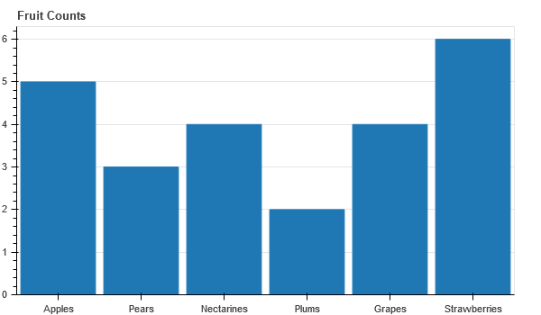 ▲图2-43 代码示例2-30运行结果
代码示例2-30第10行采用vbar()方法展示了几种水果的销量。
▲图2-43 代码示例2-30运行结果
代码示例2-30第10行采用vbar()方法展示了几种水果的销量。
- 代码示例 2-31
1# 数据 2fruits = ['Apples', 'Pears', 'Nectarines', 'Plums', 'Grapes', 'Strawberries'] 3counts = [5, 3, 4, 2, 4, 6] 4# 排序 5sorted_fruits = sorted(fruits, key=lambda x: counts[fruits.index(x)]) 6# 画布 7p = figure(x_range=sorted_fruits, plot_height=350, , 8# toolbar_location=None, tools="" 9 ) 10# 绘图 11p.vbar(x=fruits, top=counts, width=0.9) 12# 其他 13p.xgrid.grid_line_color = None 14p.y_range.start = 0 15# 显示 16show(p)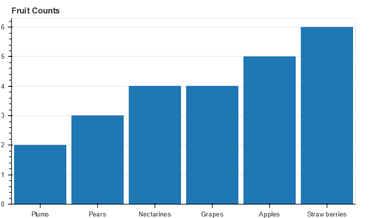 ▲图2-44 代码示例2-31运行结果
代码示例2-31第5行先用sorted()方法对原始数据进行排序;然后在第11行采用vbar()方法展示了几种水果的销量。
▲图2-44 代码示例2-31运行结果
代码示例2-31第5行先用sorted()方法对原始数据进行排序;然后在第11行采用vbar()方法展示了几种水果的销量。
- 代码示例 2-32
1from bokeh.models import ColumnDataSource 2from bokeh.palettes import Spectral6 3from bokeh.transform import factor_cmap 4# 数据 5fruits = ['Apples', 'Pears', 'Nectarines', 'Plums', 'Grapes', 'Strawberries'] 6counts = [5, 3, 4, 2, 4, 6] 7source = ColumnDataSource(data=dict(fruits=fruits, counts=counts)) 8# 画布 9p = figure(x_range=fruits, plot_height=350, toolbar_location=None, ) 10# 绘图,分组颜色映射 11p.vbar(x='fruits', top='counts', width=0.9, source=source, legend="fruits", 12 line_color='white', fill_color=factor_cmap('fruits', palette=Spectral6, factors=fruits)) 13# 坐标轴、图例设置 14p.xgrid.grid_line_color = None 15p.y_range.start = 0 16p.y_range.end = 9 17p.legend.orientation = "horizontal" 18p.legend.location = "top_center" 19show(p)- 代码示例 2-33
1from bokeh.models import ColumnDataSource 2from bokeh.palettes import Spectral6 # ['#3288bd', '#99d594', '#e6f598', '#fee08b', '#fc8d59', '#d53e4f'] 3fruits = ['Apples', 'Pears', 'Nectarines', 'Plums', 'Grapes', 'Strawberries'] 4counts = [5, 3, 4, 2, 4, 6] 5source = ColumnDataSource(data=dict(fruits=fruits, counts=counts, color=Spectral6)) 6p = figure(x_range=(0,9), y_range=fruits, plot_height=250, , 7# toolbar_location=None, tools="" 8 ) 9p.hbar(y='fruits',left=0,right='counts', height=0.5 ,color='color', legend="fruits", source=source) 10p.xgrid.grid_line_color = None 11# p.legend.orientation = "horizontal" 12p.legend.location = "top_right" 13show(p)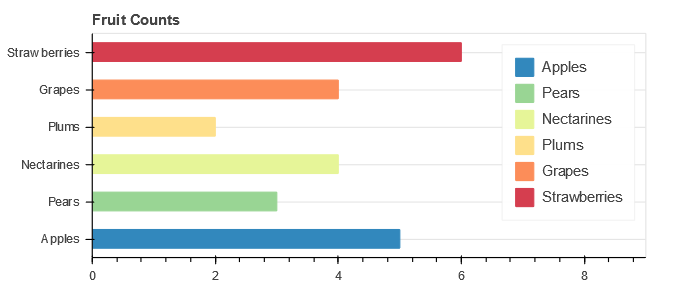 ▲图2-46 代码示例2-33运行结果
- 代码示例 2-34
1fruits = ['Apples', 'Pears', 'Nectarines', 'Plums', 'Grapes', 'Strawberries'] 2years = ['2015', '2016', '2017'] 3data = {'fruits' : fruits, 4 '2015' : [2, 1, 4, 3, 2, 4], 5 '2016' : [5, 3, 3, 2, 4, 6], 6 '2017' : [3, 2, 4, 4, 5, 3]} 7# 创建复合列表 [ ("Apples", "2015"), ("Apples", "2016"), ("Apples", "2017"), ("Pears", "2015), ... ] 8x = [ (fruit, year) for fruit in fruits for year in years ] 9counts = sum(zip(data['2015'], data['2016'], data['2017']), ()) # 分组求和(堆叠总数)10source = ColumnDataSource(data=dict(x=x, counts=counts)) 11# 画布 12p = figure(x_range=FactorRange(*x), plot_height=350, , 13# toolbar_location=None, tools="" 14 ) 15# 柱状图 16p.vbar(x='x', top='counts', width=0.9, source=source) 17# 其他 18p.y_range.start = 0 19p.x_range.range_padding = 0.1 20p.xaxis.major_label_orientation = 1 21p.xgrid.grid_line_color = None 22# 显示 23show(p)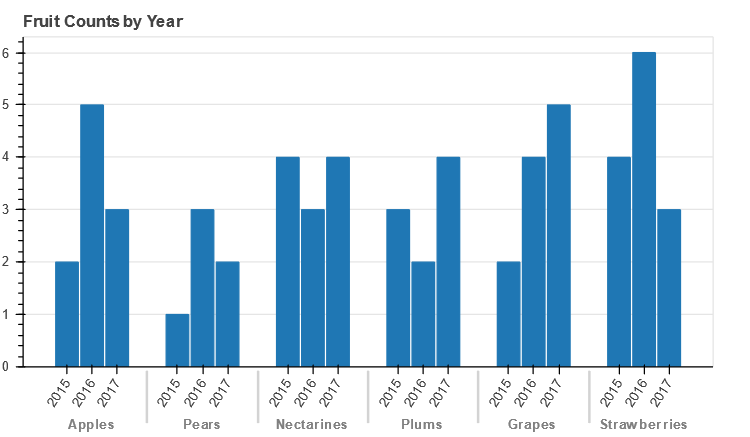 ▲图2-47 代码示例2-34运行结果
- 代码示例 2-35
1# 数据 2fruits = ['Apples', 'Pears', 'Nectarines', 'Plums', 'Grapes', 'Strawberries'] 3years = ['2015', '2016', '2017'] 4data = {'fruits' : fruits, 5 '2015' : [2, 1, 4, 3, 2, 4], 6 '2016' : [5, 3, 3, 2, 4, 6], 7 '2017' : [3, 2, 4, 4, 5, 3]} 8palette = ["#c9d9d3", "#718dbf", "#e84d60"] 9x = [ (fruit, year) for fruit in fruits for year in years ] 10counts = sum(zip(data['2015'], data['2016'], data['2017']), ()) # like an hstack11source = ColumnDataSource(data=dict(x=x, counts=counts)) 12# 画布 13p = figure(x_range=FactorRange(*x), plot_height=350, ,14# toolbar_location=None, tools="" 15 ) 16# 绘图 17p.vbar(x='x', top='counts', width=0.9, source=source, line_color="white", 18 fill_color=factor_cmap('x', palette=palette, factors=years, start=1, end=2))19# 其他 20p.y_range.start = 0 21p.x_range.range_padding = 0.1 22p.xaxis.major_label_orientation = 1 23p.xgrid.grid_line_color = None 24# 显示 25show(p)- 代码示例 2-36
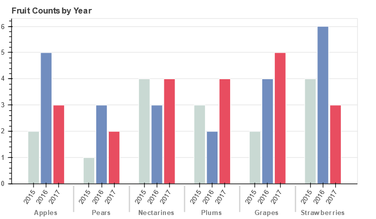
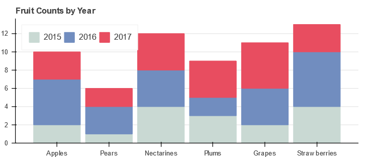
1from bokeh.core.properties import value 2from bokeh.transform import dodge 3# 数据 4fruits = ['Apples', 'Pears', 'Nectarines', 'Plums', 'Grapes', 'Strawberries'] 5years = ['2015', '2016', '2017'] 6data = {'fruits' : fruits, 7 '2015' : [2, 1, 4, 3, 2, 4], 8 '2016' : [5, 3, 3, 2, 4, 6], 9 '2017' : [3, 2, 4, 4, 5, 3]} 10source = ColumnDataSource(data=data) 11# 画布 12p = figure(x_range=fruits, y_range=(0, 10), plot_height=350, title="Fruit Counts by Year", 13# toolbar_location=None, tools="" 14 ) 15# 绘图,采用doge数据转换,按产品种类不同年份分组显示 16p.vbar(x=dodge('fruits', -0.25, range=p.x_range), top='2015', width=0.2, source=source, 17 color="#c9d9d3", legend=value("2015")) 1819p.vbar(x=dodge('fruits', 0.0, range=p.x_range), top='2016', width=0.2, source=source, 20 color="#718dbf", legend=value("2016")) 2122p.vbar(x=dodge('fruits', 0.25, range=p.x_range), top='2017', width=0.2, source=source,23 color="#e84d60", legend=value("2017")) 24# 其他参数设置 25p.x_range.range_padding = 0.1 26p.xgrid.grid_line_color = None 27p.legend.location = "top_left" 28p.legend.orientation = "horizontal" 29# 显示 30show(p)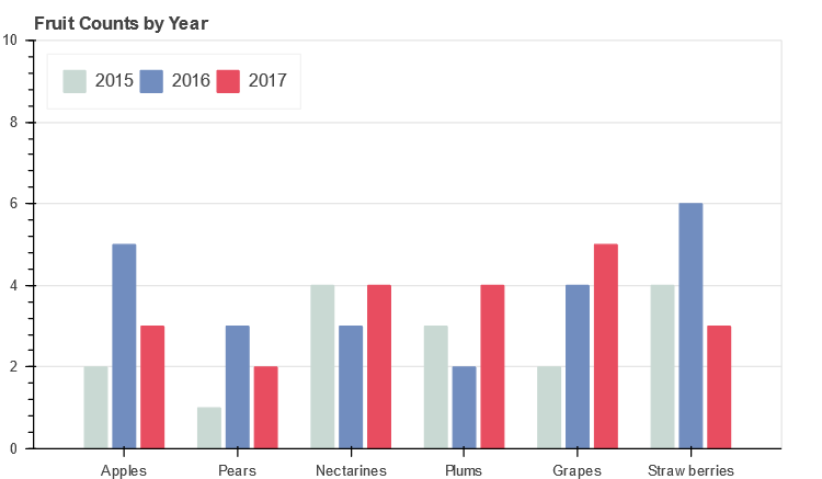 ▲图2-49 代码示例2-36运行结果
代码示例2-36第16、19、22行使用vbar()方法分别绘制2015—2017年各种水果的销量;其中dodge方法按每年不同种类水果的数据分散绘制在x轴范围内,是将色板对应的颜色列表映射到相应的分类数据上,dodge第二个参数表示该分类的起始绘制点。
▲图2-49 代码示例2-36运行结果
代码示例2-36第16、19、22行使用vbar()方法分别绘制2015—2017年各种水果的销量;其中dodge方法按每年不同种类水果的数据分散绘制在x轴范围内,是将色板对应的颜色列表映射到相应的分类数据上,dodge第二个参数表示该分类的起始绘制点。
- 代码示例 2-37
1from bokeh.core.properties import value 2# 数据 3fruits = ['Apples', 'Pears', 'Nectarines', 'Plums', 'Grapes', 'Strawberries'] 4years = ["2015", "2016", "2017"] 5colors = ["#c9d9d3", "#718dbf", "#e84d60"] 6data = {'fruits' : fruits, 7 '2015' : [2, 1, 4, 3, 2, 4], 8 '2016' : [5, 3, 4, 2, 4, 6], 9 '2017' : [3, 2, 4, 4, 5, 3]} 10# 画布 11p = figure(x_range=fruits, plot_height=250, , 12# toolbar_location=None, 13# tools="hover", 14 tooltips="$name @fruits: @$name") 15# 绘图,直接堆叠各年数据 16p.vbar_stack(years, x='fruits', width=0.9, color=colors, source=data, 17 legend=[value(x) for x in years]) # legend=[{'value': '2015'}, {'value': '2016'}, {'value': '2017'}] 18# 其他 19p.y_range.start = 0 20p.x_range.range_padding = 0.1 21p.xgrid.grid_line_color = None 22p.axis.minor_tick_line_color = None 23p.outline_line_color = None 24p.legend.location = "top_left" 25p.legend.orientation = "horizontal" 26# 显示 27show(p)- stackers (seq[str]) : 列表,由绘图数据中需要进行堆叠的数据列名称组成。
- 代码示例 2-38
1from bokeh.models import Legend 2p = figure(y_range=fruits, plot_height=250,, 3# toolbar_location=None, tools="" 4 ) 5source = ColumnDataSource(data=data) 6p.hbar_stack(years, y='fruits',height=0.8, color=colors, source=source, 7 legend=[value(x) for x in years] ) # 堆叠柱状图,逐年堆叠 8p.x_range.start = 0 9p.y_range.range_padding = 0.1 # x轴两侧空白 10p.ygrid.grid_line_color = None 11p.axis.minor_tick_line_color = None 12p.outline_line_color = None 13p.legend.location = "top_right" 14# p.legend.orientation = "horizontal" 15p.legend.click_policy="hide" 16show(p)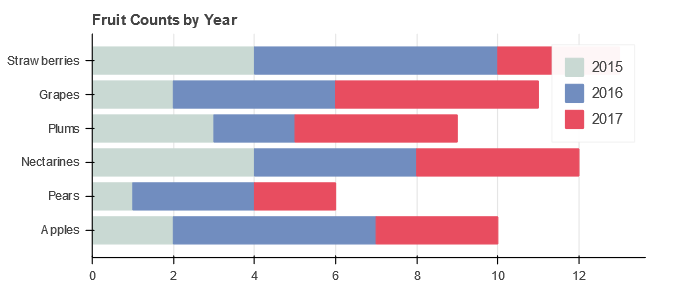 ▲图2-51 代码示例2-38运行结果
代码示例2-38第6行使用hbar_stack()方法实现横向堆叠柱状图,该方法具体的参数说明如下。
p.hbar_stack(stackers, **kw)参数说明。
▲图2-51 代码示例2-38运行结果
代码示例2-38第6行使用hbar_stack()方法实现横向堆叠柱状图,该方法具体的参数说明如下。
p.hbar_stack(stackers, **kw)参数说明。
- stackers (seq[str]) : 列表,由绘图数据中需要进行堆叠的数据列名称组成。
- 代码示例 2-39
1from bokeh.palettes import Spectral5 2from bokeh.sampledata.autompg import autompg as df 3from bokeh.transform import factor_cmap 4# 数据,预处理 5df.cyl = df.cyl.astype(str) 6group = df.groupby('cyl') 7cyl_cmap = factor_cmap('cyl', palette=Spectral5, factors=sorted(df.cyl.unique())) # 分组颜色映射 8# 画布 9p = figure(plot_height=350, x_range=group, , 10# toolbar_location=None, tools="" 11 ) 12# 绘图 13p.vbar(x='cyl', top='mpg_mean', width=0.9, source=group, 14 line_color=cyl_cmap, fill_color=cyl_cmap) 15# 其他 16p.y_range.start = 0 17p.xgrid.grid_line_color = None 18p.xaxis.axis_label = "some stuff" 19p.xaxis.major_label_orientation = 1.2 20p.outline_line_color = None 21# 显示 22show(p) 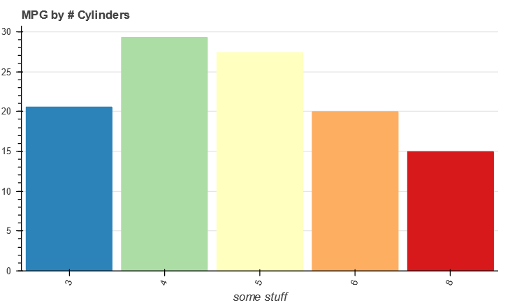 ▲图2-52 代码示例2-39运行结果
代码示例2-39第13行使用vbar()用柱状图展示了汽车缸数与每加仑汽油能行驶的英里数之间的关系。
▲图2-52 代码示例2-39运行结果
代码示例2-39第13行使用vbar()用柱状图展示了汽车缸数与每加仑汽油能行驶的英里数之间的关系。
- 代码示例 2-40
1from bokeh.sampledata.autompg import autompg_clean as df 2df.cyl = df.cyl.astype(str) 3df.yr = df.yr.astype(str) 4group = df.groupby(['cyl', 'mfr']) # 复合条件分组,[缸数、厂家] 5index_cmap = factor_cmap('cyl_mfr', palette=Spectral5, factors=sorted(df.cyl.unique()), end=1) 6# 画布 7p = figure(plot_width=800, plot_height=300, , 8 x_range=group, tooltips=[("MPG", "@mpg_mean"), ("Cyl, Mfr", "@cyl_mfr")]) 9# 绘图 10p.vbar(x='cyl_mfr', top='mpg_mean', width=1, source=group, 11 line_color="white", fill_color=index_cmap, ) # 尾气排放量均值 12# 其他 13p.y_range.start = 0 14p.x_range.range_padding = 0.05 # 同css中的padding 15p.xgrid.grid_line_color = None 16p.xaxis.axis_label = "Manufacturer grouped by # Cylinders" 17p.xaxis.major_label_orientation = 1.2 # x轴标签旋转 18p.outline_line_color = None 19# 显示 20show(p)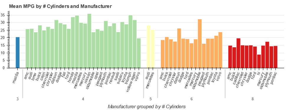 ▲图2-53 代码示例2-40运行结果
代码示例2-40第10行使用vbar()绘制分组柱状图,数据分组采用Pandas的groupby方法,该数据为复合序列,展示了汽车缸数与每加仑汽油能行驶的英里数之间的关系。
▲图2-53 代码示例2-40运行结果
代码示例2-40第10行使用vbar()绘制分组柱状图,数据分组采用Pandas的groupby方法,该数据为复合序列,展示了汽车缸数与每加仑汽油能行驶的英里数之间的关系。
- 代码示例 2-41
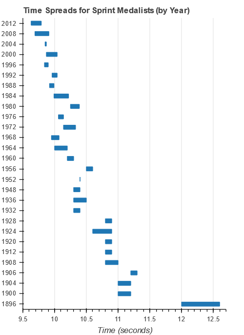
1# 数据 2from bokeh.sampledata.sprint import sprint 3sprint.Year = sprint.Year.astype(str) 4group = sprint.groupby('Year') 5source = ColumnDataSource(group) 6# 画布 7p = figure(y_range=group, x_range=(9.5,12.7), plot_width=400, plot_height=550, 8# toolbar_location=None, 9 ) 10# 绘图 11p.hbar(y="Year", left='Time_min', right='Time_max', height=0.4, source=source) # 水平柱状图 12# 其他 13p.ygrid.grid_line_color = None 14p.xaxis.axis_label = "Time (seconds)" 15p.outline_line_color = None 16# 显示 17show(p)- 代码示例 2-42
1from bokeh.core.properties import value 2from bokeh.models import ColumnDataSource, FactorRange 3# 数据 4factors = [ 5 ("Q1", "jan"), ("Q1", "feb"), ("Q1", "mar"), 6 ("Q2", "apr"), ("Q2", "may"), ("Q2", "jun"), 7 ("Q3", "jul"), ("Q3", "aug"), ("Q3", "sep"), 8 ("Q4", "oct"), ("Q4", "nov"), ("Q4", "dec"), 910] 11regions = ['east', 'west'] 12source = ColumnDataSource(data=dict( 13 x=factors, 14 east=[ 5, 5, 6, 5, 5, 4, 5, 6, 7, 8, 6, 9 ], 15 west=[ 5, 7, 9, 4, 5, 4, 7, 7, 7, 6, 6, 7 ], 16)) 17# 画布 18p = figure(x_range=FactorRange(*factors), plot_height=250, 19# toolbar_location=None, tools="" 20 ) 21# 绘图 22p.vbar_stack(regions, x='x', width=0.9, alpha=0.5, color=["blue", "red"], source=source,23 legend=[value(x) for x in regions]) 24# 其他 25p.y_range.start = 0 26p.y_range.end = 18 27p.x_range.range_padding = 0.1 28p.xaxis.major_label_orientation = 1 29p.xgrid.grid_line_color = None 30p.legend.location = "top_center" 31p.legend.orientation = "horizontal" 32# 显示 33show(p)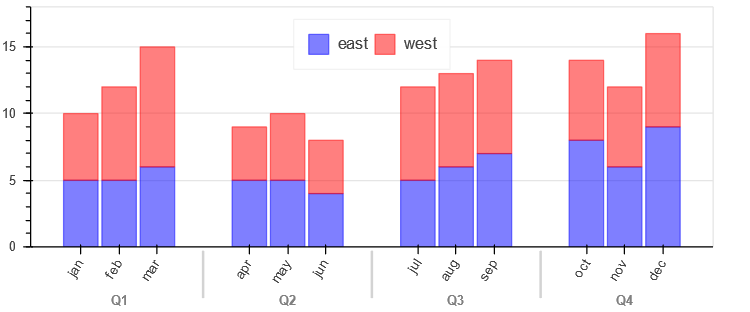 ▲图2-55 代码示例2-42运行结果
代码示例2-42第18行使用FactorRange ()方法预定义x轴的范围(factors的数据格式与Pandas复合序列相似);第19行绘制竖向堆叠柱状图。与常规竖向堆叠柱状图相比,该图采用了复合序列,多展示了一个维度。
▲图2-55 代码示例2-42运行结果
代码示例2-42第18行使用FactorRange ()方法预定义x轴的范围(factors的数据格式与Pandas复合序列相似);第19行绘制竖向堆叠柱状图。与常规竖向堆叠柱状图相比,该图采用了复合序列,多展示了一个维度。
- 代码示例 2-43
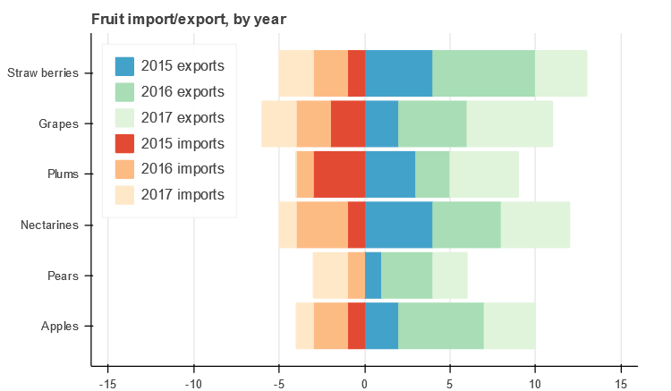
1from bokeh.models import ColumnDataSource 2from bokeh.palettes import GnBu3, OrRd3 3# 数据 4fruits = ['Apples', 'Pears', 'Nectarines', 'Plums', 'Grapes', 'Strawberries'] 5years = ["2015", "2016", "2017"] 6exports = {'fruits' : fruits, 7 '2015' : [2, 1, 4, 3, 2, 4], 8 '2016' : [5, 3, 4, 2, 4, 6], 9 '2017' : [3, 2, 4, 4, 5, 3]} 10imports = {'fruits' : fruits, 11 '2015' : [-1, 0, -1, -3, -2, -1], 12 '2016' : [-2, -1, -3, -1, -2, -2], 13 '2017' : [-1, -2, -1, 0, -2, -2]} 14# 画布 15p = figure(y_range=fruits, plot_height=350, x_range=(-16, 16), title="Fruit import/export, by year", 16# toolbar_location=None 17 ) 18# 水平堆积柱状图出口(正向) 19p.hbar_stack(years, y='fruits', height=0.9, color=GnBu3, source=ColumnDataSource(exports), 20 legend=["%s exports" % x for x in years]) 21# 水平堆积柱状图进口(负向)22p.hbar_stack(years, y='fruits', height=0.9, color=OrRd3, source=ColumnDataSource(imports), 23 legend=["%s imports" % x for x in years]) 24# 其他25p.y_range.range_padding = 0.1 26p.ygrid.grid_line_color = None 27p.legend.location = "top_left" 28p.axis.minor_tick_line_color = None 29p.outline_line_color = None 30# 显示31show(p)- 代码示例 2-44
1from bokeh.models import FactorRange 2factors = [ 3 ("Q1", "jan"), ("Q1", "feb"), ("Q1", "mar"), 4 ("Q2", "apr"), ("Q2", "may"), ("Q2", "jun"), 5 ("Q3", "jul"), ("Q3", "aug"), ("Q3", "sep"), 6 ("Q4", "oct"), ("Q4", "nov"), ("Q4", "dec"), 7 8] # 复合数列 9p = figure(x_range=FactorRange(*factors), plot_height=350, 10# toolbar_location=None, tools="" 11 ) # 如果不采用ColumnDataSource,就必须预定义factors 12x = [ 10, 12, 16, 9, 10, 8, 12, 13, 14, 14, 12, 16 ] 13# 水平柱状图 14p.vbar(x=factors, top=x, width=0.9, alpha=0.5) 15# 折线 16p.line(x=["Q1", "Q2", "Q3", "Q4"], y=[12, 9, 13, 14], color="red", line_width=2)17# 其他 18p.y_range.start = 0 19p.x_range.range_padding = 0.1 20p.xaxis.major_label_orientation = 1 21p.xgrid.grid_line_color = None 22# 显示 23show(p)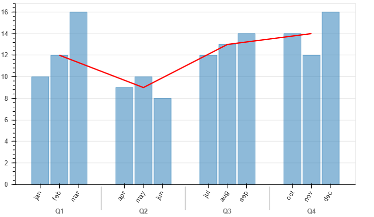 ▲图2-57 代码示例2-44运行结果
关于作者:
屈希峰,资深Python工程师,Bokeh领域的实践者和布道者,对Bokeh有深入的研究。擅长Flask、MongoDB、Sklearn等技术,实践经验丰富。知乎多个专栏(Python中文社区、Python程序员、大数据分析挖掘)作者,专栏累计关注用户十余万人。
本文摘编自《Python数据可视化:基于Bokeh的可视化绘图》,经出版方授权发布。
编辑:王菁 校对:洪舒越


 6963
6963


 被折叠的 条评论
为什么被折叠?
被折叠的 条评论
为什么被折叠?
 到【灌水乐园】发言


