


 本文介绍了一种使用CSS伪元素:before来实现更自然、渐变色的阴影效果的方法,避免了传统box-shadow()带来的挖空锯齿问题。
*{margin: 0;padding: 0;}
.box{
border: 0px;
outline: none;
display: inline-block;
padding: 30px 100px;
margin: 100px 200px;
background: linear-gradient(to left,#fa6c9f 0%,#ffe140 80%,#ffe140 80%);
border-radius: 1000px;
color: #ffffff;
letter-spacing: 1px;
text-transform: uppercase;
font-size:60px ;
position: relative;
transition: all 0.3s ease-out;
user-select: none;
-webkit-user-select: none;
}
.box:before{
content: "";
background: inherit;
width: calc(100% - 60px);
height: 60px;
border-radius: 1000px;
display: inline-block;
position: absolute;
left: 30px;
bottom: 0;
z-index: -1;
filter: blur(30px) brightness(0.95);
}
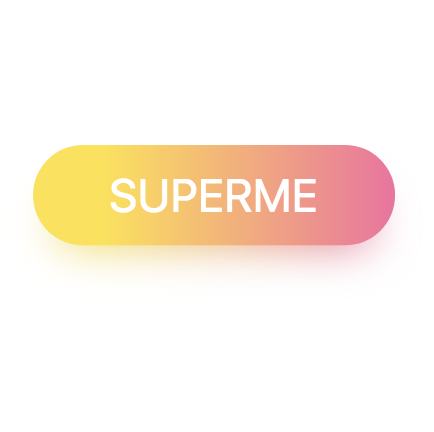
Superme
————————————————————————分割线————————
传统会用box-shadow()这个样式来做阴影,这样做看上去并不是那么自然,做不到渐变色,遇见有挖空的地方就会是这样,挖空的锯齿让颜色填充了,尴尬。用:before就可以避免了。
下面按钮是用以上代码做的。注意几点。
用button按钮,文字用pading撑开比较好。
必须使用定位(position),
使用user-seoect:none可以避免点击复制文字。
befoue要和content:“”;一期用。阴影的高等文字的大小,blur大小是文字大小一半。


 扫一扫
扫一扫


 被折叠的 条评论
为什么被折叠?
被折叠的 条评论
为什么被折叠?
 到【灌水乐园】发言


