


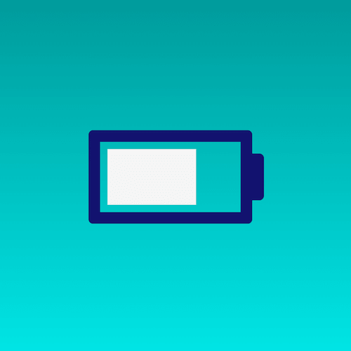
效果预览
按下右侧的“点击预览”按钮在当前页面预览,点击链接全屏预览。
可交互视频教程
此视频是可以交互的,你可以随时暂停视频,编辑视频中的代码。
请用 chrome, safari, edge 打开观看。
源代码下载
请从 github 下载。
代码解读
定义 dom,只有一个容器元素:
居中显示:
html, body {
height: 100%;
display: flex;
align-items: center;
justify-content: center;
background: linear-gradient(to bottom, teal, aqua);
}
画出电池的主体轮廓:
.battery {
width: 6em;
height: 3em;
color: midnightblue;
border: 0.5em solid currentColor;
border-radius: 0.2em;
font-size: 2em;
}
画出电池的突起:
.battery {
position: relative;
}
.battery::after {
content: '';
position: absolute;
width: 0.5em;
height: 2em;
background-color: currentColor;
top: 0.5em;
right: -1em;
border-radius: 0 0.2em 0.2em 0;
}
画出充电电量:
.battery {
background-image: linear-gradient(to right, whitesmoke, whitesmoke);
background-repeat: no-repeat;
background-size: 30% 80%;
background-position: 0.3em 50%;
}
定义和应用动画效果:
@keyframes charge {
from {
background-size: 10% 80%;
}
to {
background-size: 95% 80%;
}
}
.battery {
animation: charge 5s linear infinite;
}
最后,把动画的时间函数由线性变化改为步长变化:
.battery {
animation: charge 5s steps(8) infinite;
}
大功告成!
知识点


 被折叠的 条评论
为什么被折叠?
被折叠的 条评论
为什么被折叠?
 到【灌水乐园】发言


