


我想用numpy.histogram绘制图像的RGB直方图。在
(请参阅下面我的函数draw_histogram)
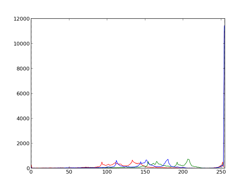
它适用于[0,255]的常规范围:import numpy as np
import matplotlib.pyplot as plt
im = plt.imread('Bulbasaur.jpeg')
draw_histogram(im, minimum=0., maximum=255.)

我想做什么:
我希望我使用的图像值超出范围。有时它们会超出范围,有时不会。我想用RGB直方图来分析这些值有多差。在
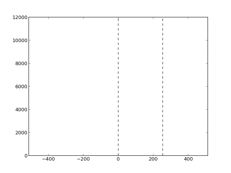
假设我期望值在区间[-512,512]中最差。我仍然希望直方图在正确的位置显示范围内的强度,而将未填充的范围部分留空。例如,如果我再次绘制Bulbasaur.jpeg的直方图,但范围为[-512,512],我希望看到相同的直方图,但沿“x”轴收缩(在下面的直方图中的两条虚线之间)。在
问题:
当我试图绘制非规则范围的直方图时,出现了一些错误:
^{pr2}$
我的draw_histogram()代码:def draw_histogram(im, minimum, maximum):
fig = plt.figure()
color = ('r','g','b')
for i, col in enumerate(color):
hist, bins = np.histogram(im[:, :, i], int(maximum-minimum), (minimum, maximum))
plt.plot(hist, color=col)
plt.xlim([int(minimum), int(maximum)])
# Draw vertical lines to easily locate the 'regular range'
plt.axvline(x=0, color='k', linestyle='dashed')
plt.axvline(x=255, color='k', linestyle='dashed')
plt.savefig('Histogram_Bulbasaur.png')
plt.close(fig)
return 0
问题
有没有人知道一种正确绘制不规则范围的RGB直方图的方法?在


 4053
4053


 被折叠的 条评论
为什么被折叠?
被折叠的 条评论
为什么被折叠?
 到【灌水乐园】发言


