


 来源 | https://www.jianshu.com/p/6c0be84baf3a
1、实现不等宽背景条纹
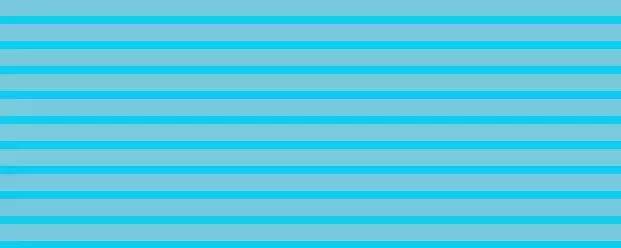 实现如上图所示的效果,代码如下:
<html lang="en"><head> <meta charset="UTF-8"> <style type="text/css"> .cont{ width: 500px; height: 200px; background: -webkit-linear-gradient(#78C9DC 70%, #0acfff 0%); background: -o-linear-gradient(#78C9DC 70%, #0acfff 0%); background: linear-gradient(#78C9DC 70%, #0acfff 0%); background-size: 100% 20px; }style> <title>条纹背景title>head><body> <div class="cont"> div>body>html>⑵如果需要等宽切无过渡的渐变,开始和结束值设置为50%即可。
⑶如果想要垂直条纹,你只需要调整background-size的x、y值即可。
2、瓷砖条纹背景
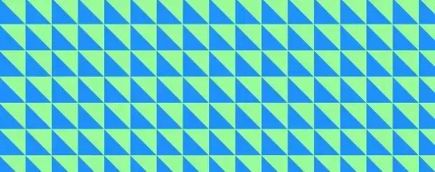 实现如上图所示的效果,代码如下:
<html lang="en"><head> <meta charset="UTF-8"> <style type="text/css"> .cont{ width:500px; height:200px; background:-webkit-linear-gradient(bottom left, #1E90FF 50%, #98FB98 50%); background:-o-linear-gradient(bottom left, #1E90FF 50%, #98FB98 50%); background:linear-gradient(to top right, #1E90FF 50%, #98FB98 50%); background-size:30px 30px; }style> <title>瓷砖条纹背景title>head><body> <div class="cont"> div>body>html>3、草地背景
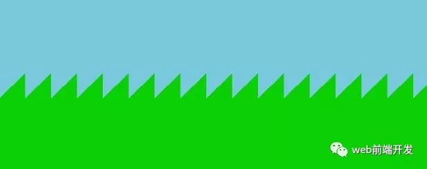 实现如上图所示的效果,代码如下:
<html lang="en"><head> <meta charset="UTF-8"> <style type="text/css"> .cont{ width:500px; height:200px; background:linear-gradient(-45deg,#0acf00 50%,#78C9DB 50%); background-size:30px 100%; }style> <title>草地背景title>head><body> <div class="cont"> div>body>html>4、斜条纹背景
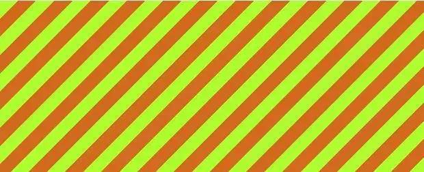 实现如上图所示的效果,代码如下:
<html lang="en"><head> <meta charset="UTF-8"> <style type="text/css">.cont{width:500px;height:200px;background:repeating-linear-gradient(-45deg,#ADFF2F,#ADFF2F 15px,#D2691E 0,#D2691E 30px);/*background:repeating-linear-gradient(-45deg,#0acf00,#0acf00 15px,#78C9DB 0,#78C9DB 30px);*/效果相同background-size: 30px 30px;}style> <title>斜条纹背景title>head><body> <div class="cont"> div>body>html>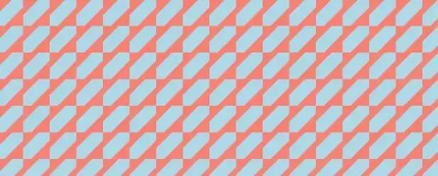 实现如上图所示的效果,代码如下:
<html lang="en"><head> <meta charset="UTF-8"> <style type="text/css">.cont{ width:500px; height:200px; background:repeating-linear-gradient(-45deg,#FA8072,#FA8072 15px,#ADD8E6 0,#ADD8E6 30px); background-size: 30px 30px; }style> <title>斜条纹背景title>head><body> <div class="cont"> div>body>html>5、单色斜条纹背景(利用透明度及transparent)
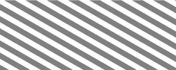 实现如上图所示的效果,代码如下:
<html lang="en"><head> <meta charset="UTF-8"> <style type="text/css"> .cont{ width:500px; height:200px; background:#fff repeating-linear-gradient(30deg,rgba(0,0,0,.5),rgba(0,0,0,.5)15px,transparent 0,transparent 30px); }style> <title>单色斜条纹背景(利用透明度及transparent)title>head><body> <div class="cont"> div>body>html>6、格子衫背景
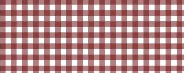 实现如上图所示的效果,代码如下:
<html lang="en"><head> <meta charset="UTF-8"> <style type="text/css"> .cont{ width:500px; height:200px; background:#fff; background: linear-gradient(90deg,rgba(100,0,0,.5) 50%,transparent 0),linear-gradient(rgba(100,0,0,.5) 50%,transparent 0); background-size: 30px 30px; }style> <title>格子衫背景title>head><body> <div class="cont"> div>body>html>7、波点背景
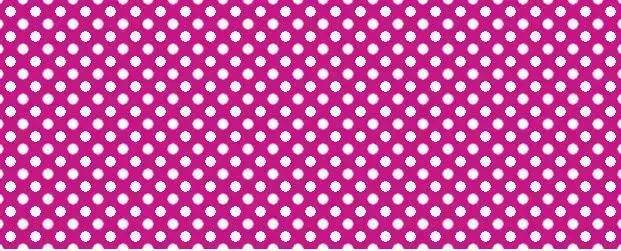 实现如上图所示的效果,代码如下:
<html lang="en"><head> <meta charset="UTF-8"> <style type="text/css"> .cont{ margin:50px; width:500px; height:200px; background:#C71585; background-image:radial-gradient(#fff 30%,transparent 0),radial-gradient(#fff 30%,transparent 0); background-size:20px 20px; background-position:0 0,10px 10px; // 必须是background-size尺寸的1/2 }style> <title>波点背景title>head><body> <div class="cont"> div>body>html>8、棋盘背景
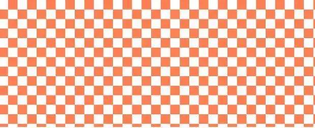 实现如上图所示的效果,代码如下:
<html lang="en"><head> <meta charset="UTF-8"> <style type="text/css"> .cont{ width:500px; height:200px; background: #fff; background-image:linear-gradient(45deg,#FF7F50 26%,transparent 0,transparent 75%,#FF7F50 0), linear-gradient(45deg,#FF7F50 26%,transparent 0,transparent 75%,#FF7F50 0); background-size:30px 30px; background-position:0 0,15px 15px; }style> <title>棋盘背景title>head><body> <div class="cont"> div>body>html>


 3712
3712


 被折叠的 条评论
为什么被折叠?
被折叠的 条评论
为什么被折叠?
 到【灌水乐园】发言


