


作者:杜小白Zero
https://blog.csdn.net/DFF1993/article/details/81201773
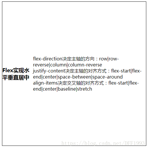
flex设置元素水平垂直居中
<div class="box"> <h3>Flex实现水平垂直居中h3> <p> flex-direction决定主轴的方向:row|row-reverse|column|column-reverse<br/> justify-content决定主轴的对齐方式:flex-start|flex-end|center|space-between|space-around<br/> align-items决定交叉轴的对齐方式:flex-start|flex-end|center|baseline|stretch p>div>.box{display: flex;justify-content: center;align-items: center;border: 1px solid black;width:500px;height:500px;}实现效果:
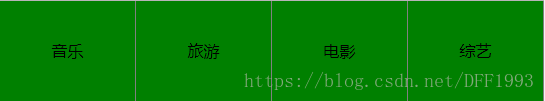
用flex布局制作导航栏
以前写导航栏的时候,总是用float或display:inline-block实现,但是这两种方法都会有各种问题,比如浮动会影响父元素以及兄弟元素的样式,需要清除浮动,现在用flex会很方便,并且是弹性布局。
<ul><li>音乐li><li>旅游li><li>电影li><li>综艺li>ul>ul{display: flex;}li{flex:1;text-align: center;line-height: 100px;list-style: none;background: green;border-right: 1px solid grey;}实现效果:
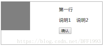
图文并排的样式:左边是图片,右边是文字
<div class="box"> <div class="left">div> <div class="right"><p>第一行p><p>说明1 说明2p><div><input type="button" value="确认">div> div>div>.box{display: flex;justify-content: space-between;width: 350px;height: 150px;border: 1px solid grey;}.left{width: 100px;height: 100px;background: grey;}.right{width: 150px;height: 100px;}实现效果:
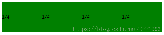
固定百分比布局
class="demo">
class="item item1">1/4 class="item item2">1/4 class="item item3">1/4 class="item item4">1/4.demo{ display: flex; }.item{ flex: 1; background: green; border-right:1px solid grey; line-height: 100px;}实现效果:
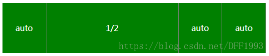
某一个固定
class="demo">
class="item item1">auto class="item item2">1/2 class="item item3">auto class="item item4">auto.demo{ display: flex; }.item{ flex: 1; background: green; border-right:1px solid grey; line-height: 100px; color: #fff; text-align: center;}.item2{ flex: 0 0 50%;}实现效果:
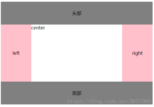
圣杯布局
圣杯布局指的是一种最常见的网站布局。页面从上到下,分成三部分:头部(header),躯干(body),尾部(footer)。
其中躯干又水平分成三栏:从左到右为:导航、主栏、副栏。class="demo">
class="header">头部 class="body"> class="left">left class="center">center class="right">right class="footer">底部.demo{ display: flex;flex-direction: column; }.demo div{ flex: 1;}.body{ display: flex; } .header, .footer{background: grey;line-height: 80px;text-align: center;}.left, .right{background: pink;line-height: 200px;text-align: center;}.header,.footer,.left,.right{ flex: 0 0 20%!important;}实现效果:
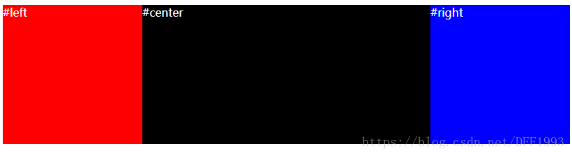
双飞翼布局
双飞翼布局,就是两端固定宽高,中间自适应的三栏布局。
"container">
"left" class="column">#left "center" class="column">#center "right" class="column">#right body { min-width: 550px; } #container{ display: flex; justify-content: center; align-items: flex-start; } .column{ height: 200px; color:white; } #center{ flex-grow: 1; background-color: black; } #left{ flex-basis: 200px; background-color: red; } #right{ flex-basis: 200px; background-color: blue; }实现效果:
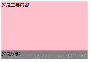
底部fooer固定在底部,但是不是fixed定位
页面会经常用到固定的底栏,但是当页面内容过少时,footer会到页面中间,下面用flex来解决:
class="demo">
class="main">这是主要内容 class="footer">这是底部.demo{ display: flex; flex-direction: column; width: 300px; height: 200px;}.main{ flex: 1; background: pink;}.footer{ width: 100%; height: 30px; background: grey;}实现效果:

更多前端分享,请关注:
前端路人甲


 233
233


 被折叠的 条评论
为什么被折叠?
被折叠的 条评论
为什么被折叠?
 到【灌水乐园】发言


