


效果如下, 在悬浮的时候下划线会从左到右出现, 鼠标离开时消失
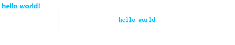
主要使用了伪类和动画
可以修改前面定义的css变量改变颜色
Document/* :root {
--main-color-1: rgba(246, 73, 167, 0.1);
--main-color-2: rgba(246, 73, 167, 0.2);
--main-color-3: rgba(246, 73, 167, 0.3);
--main-color-4: rgba(246, 73, 167, 0.4);
--main-color-5: rgba(246, 73, 167, 0.5);
--main-color-6: rgba(246, 73, 167, 0.6);
--main-color-7: rgba(246, 73, 167, 0.7);
--main-color-8: rgba(246, 73, 167, 0.8);
--main-color-9: rgba(246, 73, 167, 0.9);
--main-color-10: rgba(246, 73, 167, 1);
} */
:root {
--main-color-1: rgba(0, 191, 255, 0.1);
--main-color-2: rgba(0, 191, 255, 0.2);
--main-color-3: rgba(0, 191, 255, 0.3);
--main-color-4: rgba(0, 191, 255, 0.4);
--main-color-5: rgba(0, 191, 255, 0.5);
--main-color-6: rgba(0, 191, 255, 0.6);
--main-color-7: rgba(0, 191, 255, 0.7);
--main-color-8: rgba(0, 191, 255, 0.8);
--main-color-9: rgba(0, 191, 255, 0.9);
--main-color-10: rgba(0, 191, 255, 1);
}
.line {
background-color: transparent;
}
*,
:after,
:before {
box-sizing: inherit;
}
.line:active,
.line:hover {
outline-width: 0;
}
.line,
.line:active,
.line:focus,
.line:link,
.line:visited {
color: var(--main-color-10);
}
.line {
text-decoration: none;
text-shadow: 0 2px 3px var(--main-color-3);
font-weight: 800;
transition: all 0.3s ease-in;
position: relative;
}
.line:hover {
position: relative;
text-shadow: 0 2px 10px var(--main-color-2);
}
.line:before {
content: "";
position: absolute;
bottom: 0;
left: 0;
right: 0;
height: 2px;
background-color: var(--main-color-10);
transform-origin: bottom right;
transform: scaleX(0);
transition: transform 0.5s ease;
box-shadow: 0 2px 5px var(--main-color-6);
}
.line:hover:before {
transform-origin: bottom left;
transform: scaleX(1);
}
.box {
cursor: pointer;
font-feature-settings: "liga" 0;
line-height: 1.7;
box-sizing: inherit;
text-shadow: 0 2px 3px var(--main-color-5);
position: relative;
text-align: center;
background: none;
border: 1px dashed #9ac6c9;
padding: 10px 20px;
cursor: pointer;
display: block;
font-family: IBM Plex Mono, monospace;
font-weight: 800;
white-space: nowrap;
transition: color 0.4s, border-color 0.4s;
font-size: 1rem;
color: var(--main-color-10);
text-decoration: none;
max-width: 350px;
margin: 0 auto;
}
原始实现是基于超链接的, 瞎改成了类, 看着也还行
Documenta.button:hover,
a.resp-sharing-button__link:hover {
animation: none;
}
a {
background-color: transparent;
-webkit-text-decoration-skip: objects;
}
*,
:after,
:before {
box-sizing: inherit;
}
a:active,
a:hover {
outline-width: 0;
}
a,
a:active,
a:focus,
a:link,
a:visited {
color: #f649a7;
}
a {
text-decoration: none;
text-shadow: 0 2px 3px rgba(246, 73, 167, 0.5);
font-weight: 800;
transition: all 0.3s ease-in;
position: relative;
}
@media screen and (max-width: 599px) {
a,
a:active,
a:focus,
a:link,
a:visited {
color: #f649a7;
}
}
@media screen and (min-width: 600px) {
a,
a:active,
a:focus,
a:link,
a:visited {
color: #f649a7;
}
}
a:hover {
position: relative;
text-shadow: 0 2px 10px rgba(246, 73, 167, 0.9);
}
a.button:hover,
a.resp-sharing-button__link:hover {
animation: none;
}
a:before {
content: "";
position: absolute;
bottom: 0;
left: 0;
right: 0;
height: 2px;
background-color: #f649a7;
transform-origin: bottom right;
transform: scaleX(0);
transition: transform 0.5s ease;
box-shadow: 0 2px 5px rgba(246, 73, 167, 0.6);
}
a:hover:before {
transform-origin: bottom left;
transform: scaleX(1);
}
.button {
font-feature-settings: "liga" 0;
line-height: 1.7;
box-sizing: inherit;
text-shadow: 0 2px 3px rgba(246, 73, 167, 0.5);
position: relative;
text-align: center;
background: none;
border: 1px dashed #9ac6c9;
padding: 10px 20px;
cursor: pointer;
display: block;
font-family: IBM Plex Mono, monospace;
font-weight: 800;
white-space: nowrap;
transition: color 0.4s, border-color 0.4s;
font-size: 1rem;
color: #9ac6c9;
text-decoration: none;
max-width: 350px;
margin: 0 auto;
}


 1万+
1万+


 被折叠的 条评论
为什么被折叠?
被折叠的 条评论
为什么被折叠?
 到【灌水乐园】发言


