


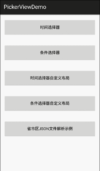
Android-PickerView
注意事项、详请使用方式、更新日志等,请查看 Wiki文档
Wiki文档,Wiki文档,Wiki文档 !~ 重要的事情说三遍
对于使用上有任何疑问或优化建议等,欢迎加入QQ群讨论交流技术问题。
交流群1: 387051294(推荐)
交流群2: 219962328(已满)
介绍
这是一款仿iOS的PickerView控件,有时间选择器和选项选择器,新版本的详细特性如下:
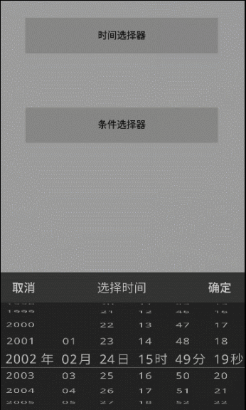
——TimePickerView 时间选择器,支持年月日时分,年月日,年月,时分等格式。
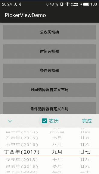
——OptionsPickerView 选项选择器,支持一,二,三级选项选择,并且可以设置是否联动 。
支持三级联动
设置是否联动
设置循环模式
支持自定义布局。
支持item的分隔线设置。
支持item间距设置。
时间选择器支持起始和终止日期设定。
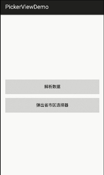
支持“年,月,日,时,分,秒”,“省,市,区”等选项的单位(label)显示、隐藏和自定义。
支持自定义文字、颜色、文字大小等属性
Item的文字长度过长时,文字会自适应缩放到Item的长度,避免显示不完全的问题
支持Dialog 模式。
支持自定义设置容器。
实时回调。

有兴趣研究3D滚轮效果的实现机制,希望把源码研究透彻的可以看看这篇博客:
使用注意事项
注意:当我们进行设置时间的启始位置时,需要特别注意月份的设定
原因:Calendar组件内部的月份,是从0开始的,即0-11代表1-12月份
错误使用案例:
startDate.set(2013,1,1);
endDate.set(2020,12,1);
正确使用案例:
startDate.set(2013,0,1);
endDate.set(2020,11,1);
V4.1.9 版本更新说明(2019-10-20)
修复: 农历 day 偶现越界的问题。
优化: 显示布局中英文默认大写问题。
新增: 最大可见项的数目提供API给开发者设置。(setItemVisibleCount())
新增: 滚轮从中间到两边透明度渐变,提供开关API设置。(isAlphaGradient(true))
新增: 选中项圆形分割线样式。(DividerType.CIRCLE)
V4.1.8 版本更新说明(2019-4-24)
更新gradle版本, wheelview基础库由 compile 改为 api 依赖,避免gradle 5.0+版本无法引入。
修复 setTextXOffset 赋值问题。
V4.1.7 版本更新说明(2019-1-10)
修复 WheelView在初始化时,数据为空导致height=0,造成一直显示不出来的问题。
新增取消按钮的点击事件监听入口。
参数注解添加,规范数据类型。
废弃setBackgroundId方法, 更新方法命名为 setOutSideColor。
更多历史版本详情,请查阅:更新日志(4.x版本)
方法名与参数请查阅:方法名与参数说明文档
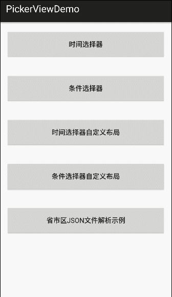
如何使用:
Android-PickerView 库使用示例:
1.添加Jcenter仓库 Gradle依赖:
compile 'com.contrarywind:Android-PickerView:4.1.9'
或者
Maven
com.contrarywind
Android-PickerView
4.1.9
pom
2.在项目中添加如下代码:
//时间选择器
TimePickerView pvTime = new TimePickerBuilder(MainActivity.this, new OnTimeSelectListener() {
@Override
public void onTimeSelect(Date date, View v) {
Toast.makeText(MainActivity.this, getTime(date), Toast.LENGTH_SHORT).show();
}
}).build();
//条件选择器
OptionsPickerView pvOptions = new OptionsPickerBuilder(MainActivity.this, new OnOptionsSelectListener() {
@Override
public void onOptionsSelect(int options1, int option2, int options3 ,View v) {
//返回的分别是三个级别的选中位置
String tx = options1Items.get(options1).getPickerViewText()
+ options2Items.get(options1).get(option2)
+ options3Items.get(options1).get(option2).get(options3).getPickerViewText();
tvOptions.setText(tx);
}
}).build();
pvOptions.setPicker(options1Items, options2Items, options3Items);
pvOptions.show();
大功告成~
3.如果默认样式不符合你的口味,可以自定义各种属性:
Calendar selectedDate = Calendar.getInstance();
Calendar startDate = Calendar.getInstance();
//startDate.set(2013,1,1);
Calendar endDate = Calendar.getInstance();
//endDate.set(2020,1,1);
//正确设置方式 原因:注意事项有说明
startDate.set(2013,0,1);
endDate.set(2020,11,31);
pvTime = new TimePickerBuilder(this, new OnTimeSelectListener() {
@Override
public void onTimeSelect(Date date,View v) {//选中事件回调
tvTime.setText(getTime(date));
}
})
.setType(new boolean[]{true, true, true, true, true, true})// 默认全部显示
.setCancelText("Cancel")//取消按钮文字
.setSubmitText("Sure")//确认按钮文字
.setContentSize(18)//滚轮文字大小
.setTitleSize(20)//标题文字大小
.setTitleText("Title")//标题文字
.setOutSideCancelable(false)//点击屏幕,点在控件外部范围时,是否取消显示
.isCyclic(true)//是否循环滚动
.setTitleColor(Color.BLACK)//标题文字颜色
.setSubmitColor(Color.BLUE)//确定按钮文字颜色
.setCancelColor(Color.BLUE)//取消按钮文字颜色
.setTitleBgColor(0xFF666666)//标题背景颜色 Night mode
.setBgColor(0xFF333333)//滚轮背景颜色 Night mode
.setDate(selectedDate)// 如果不设置的话,默认是系统时间*/
.setRangDate(startDate,endDate)//起始终止年月日设定
.setLabel("年","月","日","时","分","秒")//默认设置为年月日时分秒
.isCenterLabel(false) //是否只显示中间选中项的label文字,false则每项item全部都带有label。
.isDialog(true)//是否显示为对话框样式
.build();
pvOptions = new OptionsPickerBuilder(this, new OptionsPickerView.OnOptionsSelectListener() {
@Override
public void onOptionsSelect(int options1, int option2, int options3 ,View v) {
//返回的分别是三个级别的选中位置
String tx = options1Items.get(options1).getPickerViewText()
+ options2Items.get(options1).get(option2)
+ options3Items.get(options1).get(option2).get(options3).getPickerViewText();
tvOptions.setText(tx);
}
}) .setOptionsSelectChangeListener(new OnOptionsSelectChangeListener() {
@Override
public void onOptionsSelectChanged(int options1, int options2, int options3) {
String str = "options1: " + options1 + "\noptions2: " + options2 + "\noptions3: " + options3;
Toast.makeText(MainActivity.this, str, Toast.LENGTH_SHORT).show();
}
})
.setSubmitText("确定")//确定按钮文字
.setCancelText("取消")//取消按钮文字
.setTitleText("城市选择")//标题
.setSubCalSize(18)//确定和取消文字大小
.setTitleSize(20)//标题文字大小
.setTitleColor(Color.BLACK)//标题文字颜色
.setSubmitColor(Color.BLUE)//确定按钮文字颜色
.setCancelColor(Color.BLUE)//取消按钮文字颜色
.setTitleBgColor(0xFF333333)//标题背景颜色 Night mode
.setBgColor(0xFF000000)//滚轮背景颜色 Night mode
.setContentTextSize(18)//滚轮文字大小
.setLinkage(false)//设置是否联动,默认true
.setLabels("省", "市", "区")//设置选择的三级单位
.isCenterLabel(false) //是否只显示中间选中项的label文字,false则每项item全部都带有label。
.setCyclic(false, false, false)//循环与否
.setSelectOptions(1, 1, 1) //设置默认选中项
.setOutSideCancelable(false)//点击外部dismiss default true
.isDialog(true)//是否显示为对话框样式
.isRestoreItem(true)//切换时是否还原,设置默认选中第一项。
.build();
pvOptions.setPicker(options1Items, options2Items, options3Items);//添加数据源
4.如果需要自定义布局:
// 注意:自定义布局中,id为 optionspicker 或者 timepicker 的布局以及其子控件必须要有,否则会报空指针
// 具体可参考demo 里面的两个自定义布局
pvCustomOptions = new OptionsPickerBuilder(this, new OptionsPickerView.OnOptionsSelectListener() {
@Override
public void onOptionsSelect(int options1, int option2, int options3, View v) {
//返回的分别是三个级别的选中位置
String tx = cardItem.get(options1).getPickerViewText();
btn_CustomOptions.setText(tx);
}
})
.setLayoutRes(R.layout.pickerview_custom_options, new CustomListener() {
@Override
public void customLayout(View v) {
//自定义布局中的控件初始化及事件处理
final TextView tvSubmit = (TextView) v.findViewById(R.id.tv_finish);
final TextView tvAdd = (TextView) v.findViewById(R.id.tv_add);
ImageView ivCancel = (ImageView) v.findViewById(R.id.iv_cancel);
tvSubmit.setOnClickListener(new View.OnClickListener() {
@Override
public void onClick(View v) {
pvCustomOptions.returnData(tvSubmit);
}
});
ivCancel.setOnClickListener(new View.OnClickListener() {
@Override
public void onClick(View v) {
pvCustomOptions.dismiss();
}
});
tvAdd.setOnClickListener(new View.OnClickListener() {
@Override
public void onClick(View v) {
getData();
pvCustomOptions.setPicker(cardItem);
}
});
}
})
.build();
pvCustomOptions.setPicker(cardItem);//添加数据
5.对使用还有疑问的话,可参考demo代码
6.若只需要WheelView基础控件自行扩展实现逻辑,可直接添加基础控件库,Gradle 依赖:
compile 'com.contrarywind:wheelview:4.1.0'
WheelView 使用代码示例:
xml布局:
android:id="@+id/wheelview"
android:layout_width="match_parent"
android:layout_height="wrap_content" />
Java 代码:
WheelView wheelView = findViewById(R.id.wheelview);
wheelView.setCyclic(false);
final List mOptionsItems = new ArrayList<>();
mOptionsItems.add("item0");
mOptionsItems.add("item1");
mOptionsItems.add("item2");
wheelView.setAdapter(new ArrayWheelAdapter(mOptionsItems));
wheelView.setOnItemSelectedListener(new OnItemSelectedListener() {
@Override
public void onItemSelected(int index) {
Toast.makeText(MainActivity.this, "" + mOptionsItems.get(index), Toast.LENGTH_SHORT).show();
}
});
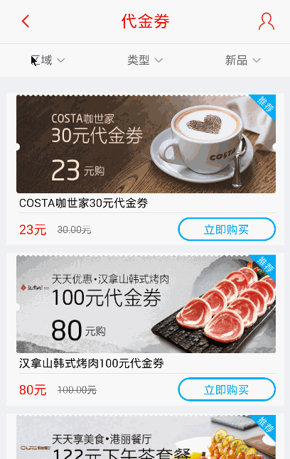
效果图(招行信用卡的“掌上生活”里面条件选择器他们用的就是我这个库,大家可以当实际项目参考)
Thanks
License
Copyright 2014 Bigkoo
Licensed under the Apache License, Version 2.0 (the "License");
you may not use this file except in compliance with the License.
You may obtain a copy of the License at
http://www.apache.org/licenses/LICENSE-2.0
Unless required by applicable law or agreed to in writing, software
distributed under the License is distributed on an "AS IS" BASIS,
WITHOUT WARRANTIES OR CONDITIONS OF ANY KIND, either express or implied.
See the License for the specific language governing permissions and
limitations under the License.


 4731
4731


 被折叠的 条评论
为什么被折叠?
被折叠的 条评论
为什么被折叠?
 到【灌水乐园】发言


