


前端时间刚看完前端的基础,本以为我可以用HTML和CSS再附上JavaScript就可以走天下了,谁知, Bootstrap给我打开了新世界的大门,那么我们接下来看看Bootstrap到底有那些神奇的地方。
Bootstrap是什么?

一个前端开发框架,Bootstrap,来自Twitter,是目前很受欢迎的前端框架。Bootstrap是基于HTML、CSS、JavaScript的,它简单灵活,使得Web开发更加快捷。
Bootstrap有哪些优势1. 定义了很多的css样式和js插件,我们开发人员直接可以使用这些样式和插件得到丰富的页面效果。
2. 响应式布局:同一套页面可以兼容不同分辨率的设备。
<html lang="zh-CN"> <head> <meta charset="utf-8"> <meta http-equiv="X-UA-Compatible" content="IE=edge"> <meta name="viewport" content="width=device-width, initial-scale=1"> <title>Bootstrap HelloWorldtitle> <link href="css/bootstrap.min.css" rel="stylesheet"> <script src="js/jquery-3.2.1.min.js">script> <script src="js/bootstrap.min.js">script> head> <body> <h1>你好,世界!h1> body> html>响应式布局:* 同一套页面可以兼容不同分辨率的设备。* 实现:依赖于栅格系统:将一行平均分成12个格子,可以指定元素占几个格子* 步骤: 1. 定义容器。相当于之前的table、 * 容器分类: 1. container:两边留白 2. container-fluid:每一种设备都是100%宽度 2. 定义行。相当于之前的tr 样式:row 3. 定义元素。指定该元素在不同的设备上,所占的格子数目。样式:col-设备代号-格子数目 * 设备代号: 1. xs:超小屏幕 手机 (<768px):col-xs-12 2. sm:小屏幕 平板 (≥768px) 3. md:中等屏幕 桌面显示器 (≥992px) 4. lg:大屏幕 大桌面显示器 (≥1200px) * 注意: 1. 一行中如果格子数目超过12,则超出部分自动换行。 2. 栅格类属性可以向上兼容。栅格类适用于与屏幕宽度大于或等于分界点大小的设备。 3. 如果真实设备宽度小于了设置栅格类属性的设备代码的最小值,会一个元素沾满一整行。Bootstrap是真的友好,作为一个后端程序员,真的是给了最大的方便,只需要在Bootstrap网站(https://v3.bootcss.com/)复制需要的样式,稍作修改便可使用。
Bootstrap提供的表单,按钮,轮播图,导航条,分页栏,简直不要太舒服
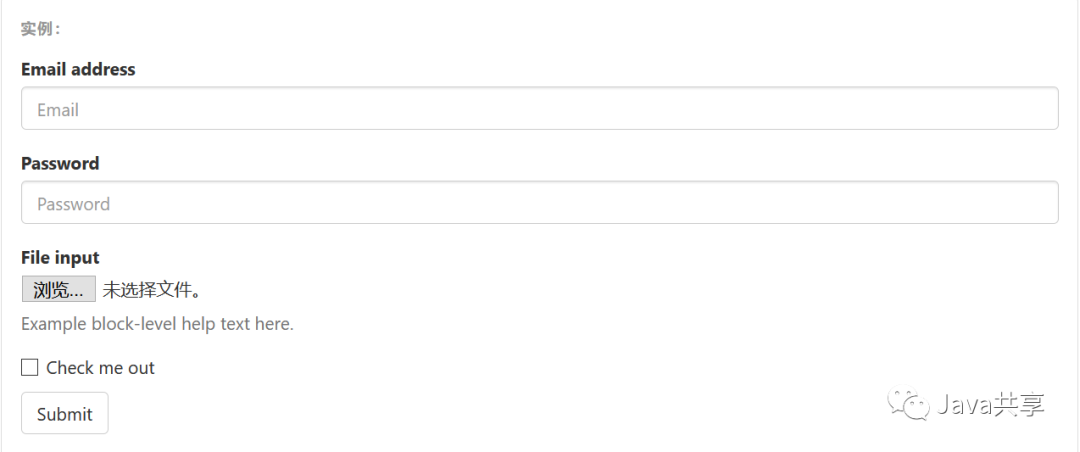
<form> <div class="form-group"> <label for="exampleInputEmail1">Email addresslabel> <input type="email" class="form-control" id="exampleInputEmail1" placeholder="Email"> div> <div class="form-group"> <label for="exampleInputPassword1">Passwordlabel> <input type="password" class="form-control" id="exampleInputPassword1" placeholder="Password"> div> <div class="form-group"> <label for="exampleInputFile">File inputlabel> <input type="file" id="exampleInputFile"> <p class="help-block">Example block-level help text here.p> div> <div class="checkbox"> <label> <input type="checkbox"> Check me out label> div> <button type="submit" class="btn btn-default">Submitbutton>form>按 钮
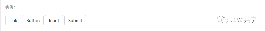
为 、 或 元素添加按钮类(button class)即可使用 Bootstrap 提供的样式。
class=class=class=class=轮 播 图

<div id="carousel-example-generic" class="carousel slide" data-ride="carousel"> <ol class="carousel-indicators"> <li data-target="#carousel-example-generic" data-slide-to="0" class="active">li> <li data-target="#carousel-example-generic" data-slide-to="1">li> <li data-target="#carousel-example-generic" data-slide-to="2">li> ol> <div class="carousel-inner" role="listbox"> <div class="item active"> <img src="..." alt="..."> <div class="carousel-caption"> ... div> div> <div class="item"> <img src="..." alt="..."> <div class="carousel-caption"> ... div> div> ... div> <a class="left carousel-control" href="#carousel-example-generic" role="button" data-slide="prev"> <span class="glyphicon glyphicon-chevron-left" aria-hidden="true">span> <span class="sr-only">Previousspan> a> <a class="right carousel-control" href="#carousel-example-generic" role="button" data-slide="next"> <span class="glyphicon glyphicon-chevron-right" aria-hidden="true">span> <span class="sr-only">Nextspan> a>div>你所浪费的今天,是昨天死去的人奢望的明天;
你所厌恶的现在,是未来的你回不去的曾经。
我是白狼,下期见!


 1万+
1万+


 被折叠的 条评论
为什么被折叠?
被折叠的 条评论
为什么被折叠?
 到【灌水乐园】发言


