


animation-name属性指定应用的一系列动画名称,每个名称代表一个由@keyframes定义的动画序列。
我们通常使用animation的简写属性可以很方便地同时设置所有的动画属性。
你可以为animation-name属性提供多个值,各个值之间使用逗号来分隔。每一个动画名称都应该对应一个@keyframes帧动画。如果动画名称指定的动画没有相对应的帧动画,那么该动画名称无效。
如果你为animation-name属性设置了多个值,这些值通常和animation属性相关的其它动画属性值一一对应。例如animation-delay属性、animation-direction属性和animation-duration属性等。 官方语法
animation-name:none | IDENT
参数值:
none:特殊关键字,表示无关键帧。可以不改变其他标识符的顺序而使动画失效,或者使层叠的动画样式失效。
IDENT:标识动画的字符串,由大小写不敏感的字母a-z、数字0-9、下划线(_)和/或横线(-)组成。第一个非横线字符必须是字母,数字不能在字母前面,不允许两个横线出现在开始位置。
例如下面代码的书写格式都是正确的:
animation-name: none
animation-name: test_05
animation-name: -specific
animation-name: sliding-vertically
animation-name: test1
animation-name: test1, animation4
animation-name: none, -moz-specific, sliding
animation-name: initial
animation-name: inherit
animation-name: unset
在下面的示例代码中,.element元素被应用了bounce帧动画,.box元素被应用了jump帧动画,.animated元素被应用了bounce和change-bg-color帧动画。各个帧动画分别由@keyframes来定义。
由于.box元素的jump动画在代码中没有相应的@keyframes帧动画,所以这个元素是没有动画效果的。
.animated元素应用了2个动画,动画名称分别为bounce和change-bg-color。这是2个独立的动画,它们会在动画周期内同时执行。
.element {
animation-name: bounce;
animation-duration: 3s;
animation-iteration-count: infinite;
}
.box {
animation-name: jump;
animation-duration: 2s;
animation-timing-function: ease-in-out;
}
.animated {
animation-name: bounce, change-bg-color;
animation-duration: 3s, 2s;
/* ... */
}
@keyframes change-bg-color {
from {
background-color: red;
}
to {
background-color: blue;
}
}
@keyframes bounce {
from {
top: 100px;
animation-timing-function: ease-out;
}
25% {
top: 50px;
animation-timing-function: ease-in;
}
50% {
top: 150px;
animation-timing-function: ease-out;
}
75% {
top: 75px;
animation-timing-function: ease-in;
}
to {
top: 100px;
}
}
适用范围
animation-name属性可以使用在任何DOM元素,以及:before和:after伪元素上。
在线演示
下面是一个小球做水平弹性运动的例子。小球运动中所做的keyframes帧动画如下:
@keyframes bounceInRight {
0% {
opacity: 0;
-webkit-transform: translateX(600px);
-ms-transform: translateX(600px);
transform: translateX(600px);
}
60% {
opacity: 1;
-webkit-transform: translateX(-30px);
-ms-transform: translateX(-30px);
transform: translateX(-30px);
}
80% {
-webkit-transform: translateX(10px);
-ms-transform: translateX(10px);
transform: translateX(10px);
}
100% {
-webkit-transform: translateX(0);
-ms-transform: translateX(0);
transform: translateX(0);
}
}
小球运动的一个周期时间为2秒,每个运动周期结束后做反向运动,小球的填充模式使用forwards,动画的次数为无限循环。
animation-name: bounceInRight;
animation-duration: 2s;
animation-direction: alternate;
animation-fill-mode: forwards;
animation-iteration-count: infinite;
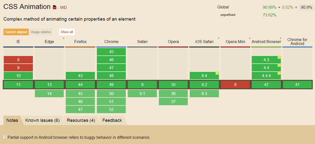
浏览器支持
相关阅读


 1万+
1万+


 被折叠的 条评论
为什么被折叠?
被折叠的 条评论
为什么被折叠?
 到【灌水乐园】发言


