


在网页布局的学习中,我们经常会遇到弹性(Flex)布局,那么弹性(Flex)布局究竟是什么样子的呢?相信你学完了本篇文章就会明白Flex(弹性)布局的真正的意思了。
web前端学习:打造全网web前端全栈资料库(总目录)看完学的更快,掌握的更加牢固,你值得拥有(持续更新)zhuanlan.zhihu.com什么是Flexbox ?
Flexbox 是 flexible box 的简称(注:意思是“灵活的盒子容器”),是 CSS3 引入的新的布局模式。它决定了元素如何在页面上排列,使它们能在不同的屏幕尺寸和设备下可预测地展现出来。
它之所以被称为 Flexbox ,是因为它能够扩展和收缩 flex 容器内的元素,以最大限度地填充可用空间。与以前布局方式(如 table 布局和浮动元素内嵌块元素)相比,Flexbox 是一个更强大的方式:
- 1、在不同方向排列元素
- 2、重新排列元素的显示顺序
- 3、更改元素的对齐方式
- 4、动态地将元素装入容器
什么情况下不建议使用 Flexbox ?
虽然 Flexbox 非常适合缩放,对齐和重新排序元素,但以下情况应该尽量避免使用 Flexbox 布局:
- 1、整体页面布局
- 2、完全支持旧浏览器的网站
浏览器支持 Flexbox 的情况:
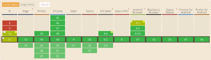
旧版浏览器,如IE 11或更低版本,不支持或仅部分支持 Flexbox 。如果你想安全的使用页面正常呈现,你应该退回到其他的 CSS 布局方式,比如结合float 的 display: inline-block 或者 display: table 等。但是,如果您只针对现代浏览器,那么 Flexbox 绝对值得一试。
术语
在 Flexbox 模型中,有三个核心概念:
– flex 项(愚人码头注:也称 flex 子元素),需要布局的元素
– flex 容器,其包含 flex 项
– 排列方向(direction),这决定了 flex 项的布局方向(注:更多的文章叫主轴)
最好的学习方式是从经验和例子中学习,所以让我们开始吧!
Level 1 — 基础
1)创建一个 flex 容器
CSS 代码:
.flex-container {display: flex;}代码如下:HTML:
<div class="flex-container">
<div class="flex-item">1</div>
<div class="flex-item">2</div>
</div>
CSS:
.flex-container {
 display: flex;
}
/* 以下为辅助样式 */
.flex-container{
 background-color: #F0f0f0;
}
.flex-container .flex-item{
 padding:20px;
 background-color: #B1FF84;
}
.flex-container .flex-item:first-child{
 background-color: #F5DE25;
}
.flex-container .flex-item:last-child{
 background-color: #90D9F7;
}
效果如下:
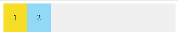
要创建一个 flex 容器,您只需要将一个 display: flex 属性添加到一个元素上。默认情况下,所有的直接子元素都被认为是 flex 项,并从左到右依次排列在一行中。如果 flex 项的宽度总和大于容器,那么 flex 项将按比例缩小,直到它们适应 flex 容器宽度。
2)将 flex 项排成一列
CSS 代码:
.flex-container {display: flex;flex-direction: column;}代码如下:
HTML:
<div class="flex-container">
<div class="flex-item">1</div>
<div class="flex-item">2</div>
</div>
CSS:
.flex-container {
 display: flex;
 flex-direction: column;
}
/* 以下为辅助样式 */
.flex-container{
 background-color: #F0f0f0;
}
.flex-container .flex-item{
 padding:20px;
 background-color: #B1FF84;
}
.flex-container .flex-item:first-child{
 background-color: #F5DE25;
}
.flex-container .flex-item:last-child{
 background-color: #90D9F7;
}
效果如下:
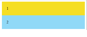
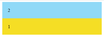
可以通过(在 flex 容器中)设置 flex-direction: column 使 flex 项垂直布局。也可以通过设置 flex-direction: column-reverse 或 flex-direction: row-reverse 来使 flex 项以相反的顺序排列。
CSS 代码:
.flex-container {display: flex;flex-direction: column-reverse;}代码如下:
HTML:
<div class="flex-container">
<div class="flex-item">1</div>
<div class="flex-item">2</div>
</div>
CSS:
.flex-container {
 display: flex;
 flex-direction: column-reverse;
}
/* 以下为辅助样式 */
.flex-container{
 background-color: #F0f0f0;
}
.flex-container .flex-item{
 padding:20px;
 background-color: #B1FF84;
}
.flex-container .flex-item:first-child{
 background-color: #F5DE25;
}
.flex-container .flex-item:last-child{
 background-color: #90D9F7;
}
效果如下:
Level 2 — 新手
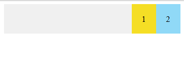
1)靠右对齐的 flex 项
CSS 代码:
.flex-container {display: flex;justify-content: flex-end;}回想一下,每个 Flexbox 模型都有 flex 方向(主轴)。justify-content 用于指定 flex 项在 flex 方向(direction)上的对齐位置。在上面的例子中,justify-content:flex-end 表示 flex 项在水平方向上靠 flex 容器的末端对齐。这就是为什么他们被放在了右边。
代码如下:
HTML:
<div class="flex-container">
<div class="flex-item">1</div>
<div class="flex-item">2</div>
</div>
CSS:
.flex-container {
 display: flex;
 justify-content: flex-end;
}
/* 以下为辅助样式 */
.flex-container{
 background-color: #F0f0f0;
}
.flex-container .flex-item{
 padding:20px;
 background-color: #B1FF84;
}
.flex-container .flex-item:first-child{
 background-color: #F5DE25;
}
.flex-container .flex-item:last-child{
 background-color: #90D9F7;
}
效果如下:
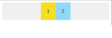
2)居中对齐的 flex 项
CSS 代码:
.flex-container {display: flex;justify-content: center;}代码如下:
HTML:
<div class="flex-container">
<div class="flex-item">1</div>
<div class="flex-item">2</div>
</div>
CSS:
.flex-container {
 display: flex;
 justify-content: center;
}
/* 以下为辅助样式 */
.flex-container{
 background-color: #F0f0f0;
}
.flex-container .flex-item{
 padding:20px;
 background-color: #B1FF84;
}
.flex-container .flex-item:first-child{
 background-color: #F5DE25;
}
.flex-container .flex-item:last-child{
 background-color: #90D9F7;
}
效果如下:
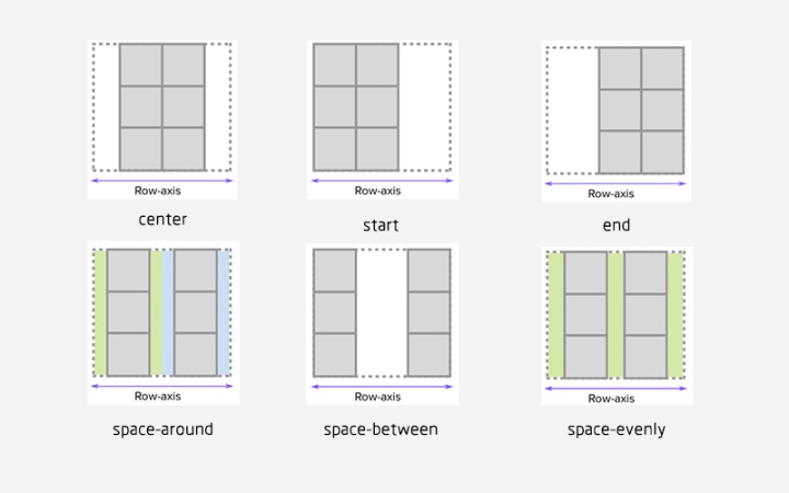
3)铺开的 flex 项
您可以通过使用以下 justify-content 属性的三个间距值之一来指定容器中 flex 项之间应显示多少空间:
- space-evenly : flex 容器起始边缘和第一个 flex 项之间的间距和每个相邻 flex 项之间的间距是相等。(愚人码头注:该属性以前很少看到,原因是以前浏览器不支持,chrome 也是 60 版本之后才支持。延伸一下,align-content: space-evenly 也是这个逻辑,建议在 chrome 60 下查看 这个demo 。 )
- space-between : 任何两个相邻 flex 项之间的间距是相同的,但不一定等于第一个/最后一个 flex 项与 flex 容器边缘之间的间距;起始边缘和第一个项目之间的间距和末端边缘和最后一个项目之间的间距是相等的。
- space-around : flex 容器中的每个 flex 项的每一侧间距都是相等的。请注意,这意味着两个相邻 flex 项之间的空间将是第一个/最后一个 flex 项与其最近边缘之间的空间的两倍。
注:网上找了一张图片能更好的解释 justify-content 属性值的表现,如图:
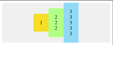
4)flex 项在交叉轴上的对齐
CSS 代码:
.flex-container {display: flex;justify-content: center;align-items: center;}通常,我们想沿着 flex 方向(主轴)排列 flex 项,还可以在垂直于它的方向(交叉轴)上对齐 flex 项。通过设置 justify-content:center和align-items:center,可以使 flex 项水平和垂直放置在 flex 容器的中心。
代码如下:
HTML:
<div class="flex-container">
<div class="flex-item">1</div>
<div class="flex-item">2 <br />2<br />2</div>
<div class="flex-item">3 <br />3<br /> 3<br /> 3<br /> 3</div>
</div>
CSS:
.flex-container {
 display: flex;
 justify-content: center;
 align-items: center;
}
/* 以下为辅助样式 */
.flex-container{
 background-color: #F0f0f0;
}
.flex-container .flex-item{
 padding:20px;
 background-color: #B1FF84;
}
.flex-container .flex-item:first-child{
 background-color: #F5DE25;
}
.flex-container .flex-item:last-child{
 background-color: #90D9F7;
}
效果如下:
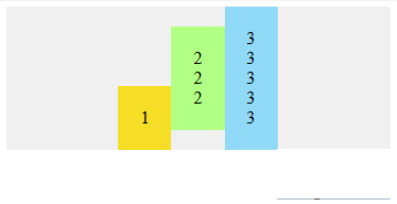
5)对齐某个特定的 flex 项
CSS 代码:
.flex-container {display: flex;align-items: center;}
.flex-bottom {align-self: flex-end;}
可以在某个特定的 flex 项上使用 align-self CSS 属性,来使该特定的 flex 项与容器中的其他 flex 项进行对齐。
代码如下:
HTML:
<div class="flex-container">
<div class="flex-item flex-bottom">1</div>
<div class="flex-item">2 <br />2<br />2</div>
<div class="flex-item">3 <br />3<br /> 3<br /> 3<br /> 3</div>
</div>
CSS:
.flex-container {
 display: flex;
 justify-content: center;
 align-items: center;
}
.flex-bottom {
 align-self: flex-end;
}
/* 以下为辅助样式 */
.flex-container{
 background-color: #F0f0f0;
}
.flex-container .flex-item{
 padding:20px;
 background-color: #B1FF84;
}
.flex-container .flex-item:first-child{
 background-color: #F5DE25;
}
.flex-container .flex-item:last-child{
 background-color: #90D9F7;
}
效果如下:
Level 3 — 中级
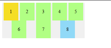
1)允许 flex 项多行/列排列
CSS 代码:
.flex-container {display: flex;flex-wrap: wrap;}默认情况下, flex 项不允许多行/列排列,如果 flex 容器尺寸对于所有 flex 项来说不够大,那么flex 项将被调整大小以适应单行或列排列。
通过添加 flex-wrap: wrap ,可以将溢出容器的 flex 项将被排列到另一行/列中。
代码如下:
HTML:
<div class="flex-container">
 <div class="flex-item">1</div>
 <div class="flex-item">2</div>
 <div class="flex-item">3</div>
 <div class="flex-item">4</div>
 <div class="flex-item">5</div>
 <div class="flex-item">6</div>
 <div class="flex-item">7</div>
<div class="flex-item">8</div>
</div>
CSS:
.flex-container {
 display: flex;
 justify-content: space-evenly;
 flex-wrap: wrap;
}
/* 以下为辅助样式 */
.flex-container{
 width:270px;
 background-color: #F0f0f0;
}
.flex-container .flex-item{
 padding:20px;
 background-color: #B1FF84;
}
.flex-container .flex-item:first-child{
 background-color: #F5DE25;
}
.flex-container .flex-item:last-child{
 background-color: #90D9F7;
}
效果如下:
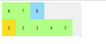
2)flex 项反向多行/列排列
CSS 代码:
.flex-container {display: flex;flex-wrap: wrap-reverse;}flex-wrap:wrap-reverse 仍然使 flex 项以多行/列排列,但是它们从 flex 容器的末尾开始排列的。
代码如下:
HTML:
<div class="flex-container">
 <div class="flex-item">1</div>
 <div class="flex-item">2</div>
 <div class="flex-item">3</div>
 <div class="flex-item">4</div>
 <div class="flex-item">5</div>
 <div class="flex-item">6</div>
 <div class="flex-item">7</div>
 <div class="flex-item">8</div>
</div>
CSS:
.flex-container {
 display: flex;
 flex-wrap: wrap-reverse;
}
/* 以下为辅助样式 */
.flex-container{
 width:270px;
 background-color: #F0f0f0;
}
.flex-container .flex-item{
 padding:20px;
 background-color: #B1FF84;
}
.flex-container .flex-item:first-child{
 background-color: #F5DE25;
}
.flex-container .flex-item:last-child{
 background-color: #90D9F7;
}
效果如下:
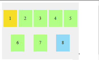
3)多行/列排列的 flex 项在交叉轴上的对齐方式
CSS 代码:
.flex-container {display: flex;flex-wrap: wrap;align-content: flex-start;}默认情况下,当 flex 容器的交叉轴(cross axis)上存在多余空间时,您可以在 flex 容器上设置 align-content,以控制 flex 项在交叉轴(cross axis)上的对齐方式。可能的值是 flex-start,flex-end,center,space-between,space-around ,space-evenly 和 stretch(默认)。
代码如下:
HTML:
<div class="flex-container">
 <div class="flex-item">1</div>
 <div class="flex-item">2</div>
 <div class="flex-item">3</div>
 <div class="flex-item">4</div>
 <div class="flex-item">5</div>
 <div class="flex-item">6</div>
 <div class="flex-item">7</div>
 <div class="flex-item">8</div>
</div>
CSS:
.flex-container {
 display: flex;
 flex-wrap: wrap;
 justify-content: space-evenly;
 align-content: space-evenly;
}
/* 以下为辅助样式 */
.flex-container{
 width:270px;
 height:200px;
 background-color: #F0f0f0;
}
.flex-container .flex-item{
 padding:20px;
 height:20px;
 background-color: #B1FF84;
}
.flex-container .flex-item:first-child{
 background-color: #F5DE25;
}
.flex-container .flex-item:last-child{
 background-color: #90D9F7;
}
效果如下:
更多内容请关注我!!!


 675
675


 被折叠的 条评论
为什么被折叠?
被折叠的 条评论
为什么被折叠?
 到【灌水乐园】发言


