


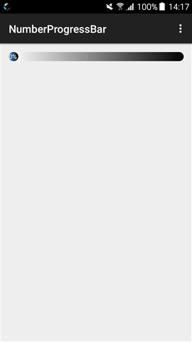
progress各种各样的都有,自定义大多数也是简单的,根据业务需求来自己定义,记录一下,先上效果图
本来想找个第三方改改就上的,不过自己的业务需求有点不搭,一下子没找到合适的,也没这么多时间去找了,想想还是自己写个吧,因为也简单。
主要就是需求就是椭圆进度,百分比跟随渐变背景,这样一想其实就是一个布局,然后控制里面的进度长度,或者移动,我这是控制长度,这样毕竟简单,而且扩展好,以后进度条有什么奇葩需求也好改。
import android.content.Context;
import android.content.res.TypedArray;
import android.graphics.Color;
import android.support.annotation.AttrRes;
import android.support.annotation.NonNull;
import android.support.annotation.Nullable;
import android.util.AttributeSet;
import android.view.Gravity;
import android.view.View;
import android.view.ViewGroup;
import android.widget.FrameLayout;
import android.widget.TextView;
/**
* Created by LiuZhen on 2017/7/8.
*/
public class UpdateProgressBar extends FrameLayout {
private TextView tv_progress;
private int width;
private ViewGroup.LayoutParams params;
/**
* The progress text offset.
*/
private int mOffset;
/**
* The progress text size.
*/
private float mTextSize;
/**
* The progress text color.
*/
private int mTextColor;
private float default_text_size;
/**
* The progress area bar color.
*/
private int mReachedBarColor;
/**
* The bar unreached area color.
*/
private int mUnreachedBarColor;
private final int default_reached_color = Color.rgb(66, 145, 241);
private final int default_unreached_color = Color.rgb(204, 204, 204);
private final int default_text_color = Color.rgb(66, 145, 241);
public UpdateProgressBar(@NonNull Context context) {
this(context,null);
}
public UpdateProgressBar(@NonNull Context context, @Nullable AttributeSet attrs) {
this(context, attrs,0);
}
public UpdateProgressBar(@NonNull Context context, @Nullable AttributeSet attrs, @AttrRes int defStyleAttr) {
super(context, attrs, defStyleAttr);
init(attrs, defStyleAttr);
}
@Override
protected void onMeasure(int widthMeasureSpec, int heightMeasureSpec) {
int desiredWidth = 100;
int desiredHeight = 100;
int widthMode = MeasureSpec.getMode(widthMeasureSpec);
int widthSize = MeasureSpec.getSize(widthMeasureSpec);
int heightMode = MeasureSpec.getMode(heightMeasureSpec);
int heightSize = MeasureSpec.getSize(heightMeasureSpec);
int height;
//Measure Width
if (widthMode == MeasureSpec.EXACTLY) {
//Must be this size
width = widthSize;
} else if (widthMode == MeasureSpec.AT_MOST) {
//Can't be bigger than...
width = Math.min(desiredWidth, widthSize);
} else {
//Be whatever you want
width = desiredWidth;
}
//Measure Height
if (heightMode == MeasureSpec.EXACTLY) {
//Must be this size
height = heightSize;
} else if (heightMode == MeasureSpec.AT_MOST) {
//Can't be bigger than...
height = Math.min(desiredHeight, heightSize);
} else {
//Be whatever you want
height = desiredHeight;
}
int childCount = getChildCount();
for (int i = 0; i < childCount; i++) {
View child = getChildAt(i);
ViewGroup.LayoutParams lp = child.getLayoutParams();
int childWidthSpec = getChildMeasureSpec(widthMeasureSpec, 0, lp.width);
int childHeightSpec = getChildMeasureSpec(heightMeasureSpec, 0, lp.height);
child.measure(childWidthSpec, childHeightSpec);
}
params = tv_progress.getLayoutParams();
params.width = ViewGroup.LayoutParams.WRAP_CONTENT;
params.height = ViewGroup.LayoutParams.MATCH_PARENT;
tv_progress.setLayoutParams(params);
height = tv_progress.getMeasuredHeight();
//MUST CALL THIS
setMeasuredDimension(width, height);
}
private void init(AttributeSet attrs, int defStyleAttr){
default_text_size = 8;
//load styled attributes.
final TypedArray attributes = getContext().getTheme().obtainStyledAttributes(attrs, R.styleable.UpdateProgressBar,
defStyleAttr, 0);
mTextSize = attributes.getDimension(R.styleable.UpdateProgressBar_update_text_size, default_text_size);
mReachedBarColor = attributes.getResourceId(R.styleable.UpdateProgressBar_update_reached_color, default_reached_color);
mUnreachedBarColor = attributes.getResourceId(R.styleable.UpdateProgressBar_update_unreached_color, default_unreached_color);
mTextColor = attributes.getColor(R.styleable.UpdateProgressBar_update_text_color, default_text_color);
setDefaultProgressBar();
mOffset = px2dip(3);
attributes.recycle();
}
private void setDefaultProgressBar(){
setBackgroundResource(mUnreachedBarColor);
tv_progress = new TextView(getContext());
tv_progress.setTextSize(mTextSize);
tv_progress.setGravity(Gravity.RIGHT | Gravity.CENTER_VERTICAL);
tv_progress.setTextColor(mTextColor);
tv_progress.setLines(1);
tv_progress.setBackgroundResource(mReachedBarColor);
tv_progress.setPadding(0,0,5,1);
tv_progress.setText("0%");
addView(tv_progress);
}
public void setProgress(int progress){
tv_progress.setText(progress+"%");
int proWidth = width*progress/100;
if (tv_progress.getWidth() < proWidth)
params.width = proWidth;//这里不能填充mOffset,因为是椭圆进度条,填充会导致椭圆宽度被进度条覆盖,导致不美观
tv_progress.setLayoutParams(params);
}
/**
* 根据手机的分辨率从 dp 的单位 转成为 px(像素)
*/
public int dip2px(Context context, float dpValue) {
final float scale = context.getResources().getDisplayMetrics().density;
return (int) (dpValue * scale + 0.5f);
}
/**
* 根据手机的分辨率从 px(像素) 的单位 转成为 dp
*/
public int px2dip(float pxValue) {
final float scale = getContext().getResources().getDisplayMetrics().density;
return (int) (pxValue / scale + 0.5f);
}
/**
* 将px值转换为sp值,保证文字大小不变
*/
public int px2sp(float pxValue) {
final float fontScale = getContext().getResources().getDisplayMetrics().scaledDensity;
return (int) (pxValue / fontScale + 0.5f);
}
/**
* 将sp值转换为px值,保证文字大小不变
*/
public int sp2px(float spValue) {
final float fontScale = getContext().getResources().getDisplayMetrics().scaledDensity;
return (int) (spValue * fontScale + 0.5f);
}
}
用法布局文件
xmlns:pro="http://schemas.android.com/apk/res-auto"
android:id="@+id/progress"
android:layout_width="match_parent"
android:layout_height="wrap_content"
pro:update_text_size="6sp"
pro:update_text_color="#FFFFFF"
pro:update_unreached_color="@drawable/shape_corner_progressbg"
pro:update_reached_color="@drawable/shape_corner_progressbar"/>
MainActivity
import android.os.Bundle;
import android.support.v7.app.ActionBarActivity;
import android.support.v7.app.AppCompatActivity;
import android.view.Menu;
import android.view.MenuItem;
import android.widget.Toast;
import com.progressbar.NumberProgressBar;
import java.util.Timer;
import java.util.TimerTask;
public class MainActivity extends AppCompatActivity {
private Timer timer;
private UpdateProgressBar progressBar;
private int progress;
@Override
protected void onCreate(Bundle savedInstanceState) {
super.onCreate(savedInstanceState);
setContentView(R.layout.activity_main);
progressBar = (UpdateProgressBar)findViewById(R.id.progress);
timer = new Timer();
timer.schedule(new TimerTask() {
@Override
public void run() {
runOnUiThread(new Runnable() {
@Override
public void run() {
progress++;
progressBar.setProgress(progress);
if(progress == 100) {
Toast.makeText(getApplicationContext(), getString(R.string.finish), Toast.LENGTH_SHORT).show();
// progress = 0;
// progressBar.setProgress(0);
timer.cancel();
}
}
});
}
}, 1000, 100);
}
@Override
public boolean onCreateOptionsMenu(Menu menu) {
// Inflate the menu; this adds items to the action bar if it is present.
getMenuInflater().inflate(R.menu.main, menu);
return true;
}
@Override
public boolean onOptionsItemSelected(MenuItem item) {
// Handle action bar item clicks here. The action bar will
// automatically handle clicks on the Home/Up button, so long
// as you specify a parent activity in AndroidManifest.xml.
int id = item.getItemId();
if (id == R.id.action_settings) {
return true;
}
return super.onOptionsItemSelected(item);
}
@Override
protected void onDestroy() {
super.onDestroy();
timer.cancel();
}
}
渐变背景
android:startColor="#4984f2"
android:endColor="#000" />
android:topLeftRadius="15dp"
android:topRightRadius="15dp"
android:bottomLeftRadius="15dp"
android:bottomRightRadius="15dp"/>
android:startColor="#FFF"
android:endColor="#000" />
android:topLeftRadius="15dp"
android:topRightRadius="15dp"
android:bottomLeftRadius="15dp"
android:bottomRightRadius="15dp"/>
以上就是本文的全部内容,希望对大家的学习有所帮助,也希望大家多多支持脚本之家。


 1524
1524


 被折叠的 条评论
为什么被折叠?
被折叠的 条评论
为什么被折叠?
 到【灌水乐园】发言


