


HTML 元素可创建一个挂件,仅在被切换成展开状态时,它才会显示内含的信息。 元素可为该部件提供概要或者标签。
A disclosure widget is typically presented onscreen using a small triangle which rotates (or twists) to indicate open/closed status, with a label next to the triangle. If the first child of the element is a , the contents of the element are used as the label for the disclosure widget.
Note: The common use of a triangle which rotates or twists around to represent opening or closing the widget is why these are sometimes called "twisties."
同一个 组件只能处于两种状态之一。The default closed state displays only the triangle and the label inside (or a user agent-defined default string if no ). This might look like the following:
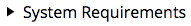
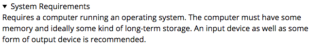
Here we see a standard disclosure widget with the label "System Requirements", in its default closed state. When the user clicks on the widget, or focuses it then presses the space bar, it "twists" open, revealing its contents:
From there, you can use CSS to style the disclosure widget, and you can programmatically open and close the widget by setting/removing its open attribute.
By default when closed, the widget is only tall enough to display the disclosure triangle and summary. When open, it expands to display the details contained within.
Note: Unfortunately, at this time there's no built-in way to animate the transition between open and closed.
Fully standards-compliant implementations automatically apply the CSS display: list-item to the element. You can use this to customize its appearance further. See Customizing the disclosure widget for further details.
Flow content, sectioning root, interactive content, palpable content.
Permitted content
One element followed by flow content.
Tag omission
不允许,开始标签和结束标签都不能省略。
Permitted parents
Any element that accepts flow content.
Permitted ARIA roles
None


 637
637


 被折叠的 条评论
为什么被折叠?
被折叠的 条评论
为什么被折叠?
 到【灌水乐园】发言


