


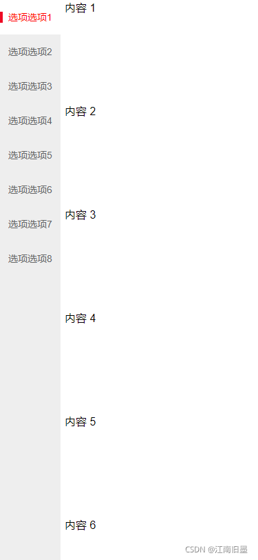
1.效果图
说明:点击左边导航栏,右边导航栏自动滑动至相应点击的内容;
滑动右边的导航栏,左边导航栏自动滑动至点击的内容;
2.代码展示
<!DOCTYPE html>
<html>
	<head>
		<meta charset="utf-8">
		<meta name="viewport" content="width=device-width, initial-scale=1.0, maximum-scale=1.0, user-scalable=0" />
		<title>基于Vant商品分类左右联动</title>
		<!-- 引入样式文件 -->
		<link rel="stylesheet" href="https://cdn.jsdelivr.net/npm/vant@2.12/lib/index.css" />
	</head>
	<body>
		<div id="app">
			<div>
				<van-tabs v-model="active" scrollspy>
					<van-tab v-for="index in 8" :title="'选项选项'+index">
						<div style="height: 150px;">
							内容 {{ index }}
						</div>
					</van-tab>
				</van-tabs>
			</div>
		</div>
	</body>
	<script src="https://cdn.jsdelivr.net/npm/vue/dist/vue.js"></script>
	<script src="https://cdn.jsdelivr.net/npm/vant@2.12/lib/vant.min.js"></script>
	<script>
		var app = new Vue({
			el: '#app',
			data: {
				active: 0,
			},
			created() {

			},
			methods: {

			}
		})
	</script>
	<style>
		.van-tabs {
			display: flex;
			justify-content: space-between;
		}

		/* 左侧导航栏 */
		.van-tabs__nav {
			position: relative;
			display: block;
			background-color: #EEEEEE;
			-webkit-user-select: none;
			user-select: none;
		}

		.van-tabs__wrap--scrollable .van-tabs__nav {
			overflow-x: hidden;
			overflow-y: auto;
			-webkit-overflow-scrolling: touch;
		}

		.van-tabs__nav--line.van-tabs__nav--complete {
			padding-right: 0px;
			padding-left: 0px;
			position: fixed;
			left: 0;
		}

		.van-tabs__nav--line.van-tabs__nav--complete {
			padding-right: 0px;
			padding-left: 0px;
		}

		.van-tabs__wrap {
			height: 100%;
			width: auto;
			overflow-y: auto;
		}

		.van-tabs__line {
			display: none;
		}

		.van-tab {
			position: relative;
			height: 50px;
			width: auto;
		}

		.van-tab--active {
			color: red;
			background-color: white;
		}

		.van-tab--active::before {
			position: absolute;
			top: 50%;
			left: 0;
			width: 4px;
			height: 16px;
			background-color: #ee0a24;
			-webkit-transform: translateY(-50%);
			transform: translateY(-50%);
			content: '';
		}

		/* 右侧导航栏 */
		.van-tabs__content {
			background-color: white;
			width: calc(100% - 94px);
			height: 100%;
			overflow-y: auto;
		}
	</style>
</html>


 5016
5016


 被折叠的 条评论
为什么被折叠?
被折叠的 条评论
为什么被折叠?
 到【灌水乐园】发言


