


五、Bootstrap插件设计
6、Bootstrap按钮(Button)插件
Bootstrap框架按钮,包括状态按钮、复选按钮和单选按钮等。
状态按钮
点击后按钮状态将会自动改变,通过JS代码可以实现按钮状态的重置。
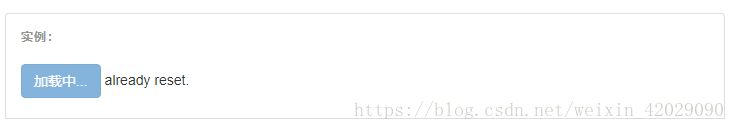
<div class="bs-example">
    <button type="button" id="loading-example-btn" data-loading-text="加载中..." class="btn btn-primary" autocomplete="off">
        测试状态按钮
    </button>
    <span id="id-span-info"></span>
</div><!-- /example -->
<script type="text/javascript">
    $('#loading-example-btn').on('click', function () {
        var $btn = $(this).button('loading');
        // business logic...
        $btn.button('reset');
        $('#id-span-info').html('already reset.');
    });
</script>
单选按钮
Bootstrap框架提供了自定义风格的单选按钮,主要通过将<input>标签定义为radio类来实现。
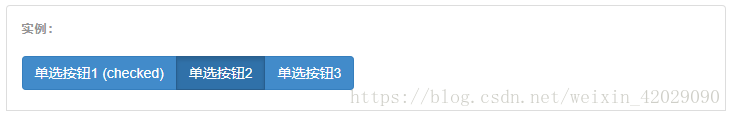
<div class="bs-example">
    <div class="btn-group" data-toggle="buttons">
        <label class="btn btn-primary active">
            <input type="radio" name="options" id="option1" autocomplete="off" checked>单选按钮1 (checked)
        </label>
        <label class="btn btn-primary">
            <input type="radio" name="options" id="option2" autocomplete="off">单选按钮2
        </label>
        <label class="btn btn-primary">
            <input type="radio" name="options" id="option3" autocomplete="off">单选按钮3
        </label>
    </div>
</div><!-- /example -->
复选按钮
Bootstrap框架提供了自定义风格的复选按钮,主要通过将<input>标签定义为checkbox类来实现。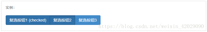
<div class="bs-example">
    <div class="btn-group" data-toggle="buttons">
        <label class="btn btn-primary active">
            <input type="checkbox" checked autocomplete="off">复选按钮1 (checked)
        </label>
        <label class="btn btn-primary">
            <input type="checkbox" autocomplete="off">复选按钮2
        </label>
        <label class="btn btn-primary">
            <input type="checkbox" autocomplete="off">复选按钮3
        </label>
    </div>
</div><!-- /example -->


 3606
3606


 被折叠的 条评论
为什么被折叠?
被折叠的 条评论
为什么被折叠?
 到【灌水乐园】发言


