


首先,我在SO中搜索了类似的问题,有很多但没有一个具有下面的确切要求.
我正在尝试使用纯CSS创建下面的按钮.
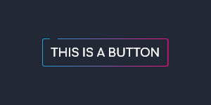
它具有以下要求.
>它的边界为1px,带有水平渐变.
>必须透明.
>必须有圆角
>它将具有透明的边框切口.
>宽度和高度必须可变
>它应可在所有现代浏览器(不是IE)中使用
我创建了一个Code Sandbox,除了border-radius以外,所有其他功能都正确无误.我使用了多边形剪切路径进行剪切,并使用了border-image进行了渐变,这就是为什么border-radius不起作用的原因.
body {
font-family: sans-serif;
background-color: #232837;
}
.button {
cursor: pointer;
display: inline-block;
height: 40px;
line-height: 40px;
padding: 0 10px;
color: white;
background-color: transparent;
border: solid 1px;
border-radius: 6px;
border-image: linear-gradient(to left, #743ad5 0%, #d53a9d 100%);
border-image-slice: 1;
clip-path: polygon(0 0, 12px 0, 12px 1px, 24px 1px, 24px 0, 100% 0, 100% 100%, 0 100%);
}
到目前为止,我设法避免使用svgs,因为我不太了解它们,无法正确实施解决方案,但是如果我必须走那条路,我会避免的.
任何建议将不胜感激.


 571
571


 被折叠的 条评论
为什么被折叠?
被折叠的 条评论
为什么被折叠?
 到【灌水乐园】发言


