


本篇文章给大家带来的内容是关于如何使用CSS实现鼠标经过图片上图片缩放(缓慢变化,有过渡效果,缩放的过程是有动画过渡的)效果,主要用到CSS transform属性,css3 transition属性,以下实现效果和具体的实现方法,希望对你有所帮助。
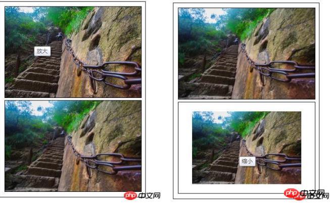
先来看下效果预览
代码解读
HTML部分的代码

定义容器大小,overflow: hidden;可以在子容器的大小超过父容器的时候,隐藏溢出的部分* {
margin: 0;
padding: 0;
font-family: "微软雅黑";
}
ul li{
list-style: none;
}
.content{
width: 310px;
height: 420px;
padding: 5px;
border: 1px solid #000;
margin: 10px auto;
}
/*定义容器的大小*/
.content ul li{
display: block;
width: 300px;
margin: 0 auto;
margin: 5px;
overflow: hidden;/*隐藏溢出*/
border: 1px solid #000;
}
定义图片的原始缩放比例transform: scale(1),。
图片缩放时的过度效果: transition: all 1s ease 0s;全部样式在1秒内缓动(逐渐变慢)的变化,除了ease(默认值)之外transition属性还有: linear(匀速),ease-in:(加速),ease-out:(减速),ease-in-out:(加速然后减速).content ul li img{
display: block;
border: 0;
width: 100%;
transform: scale(1);
transition: all 1s ease 0s;
-webkit-transform: scale(1);
-webkit-transform: all 1s ease 0s;
}
鼠标移动到图片时,图片的缩放效果:scale()里的值大于1,放大;scale()里的值小于1,缩小。/*图片放大*/
.content ul li:hover .amplify{
transform: scale(1.3);
transition: all 1s ease 0s;
-webkit-transform: scale(1.3);
-webkit-transform: all 1s ease 0s;
}
/*图片缩小*/
.content ul li:hover .narrow{
transform: scale(0.8);
transition: all 1s ease 0s;
-webkit-transform: scale(0.8);
-webkit-transform: all 1s ease 0s;
}


 1745
1745


 被折叠的 条评论
为什么被折叠?
被折叠的 条评论
为什么被折叠?
 到【灌水乐园】发言


