css3+html5——机器猫哆啦A梦+手、脚、头动起来!

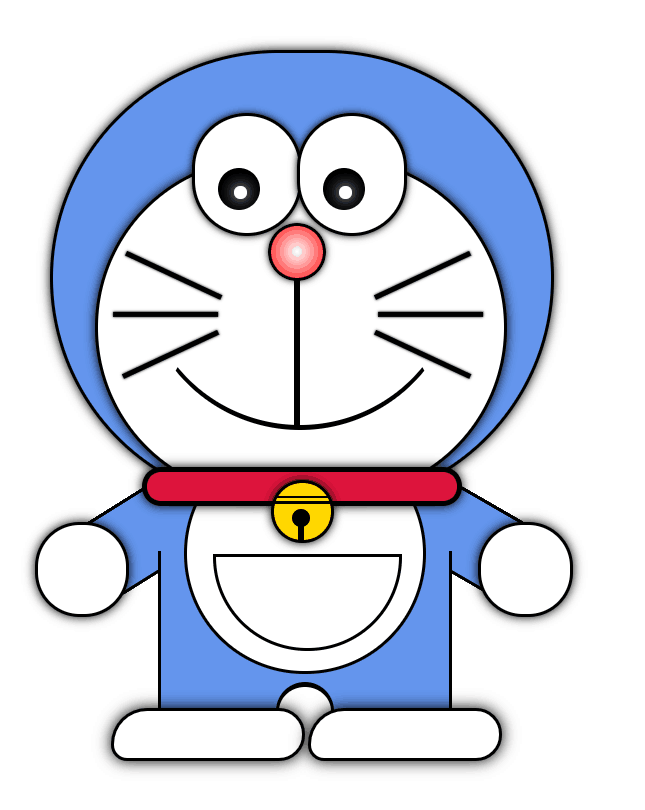
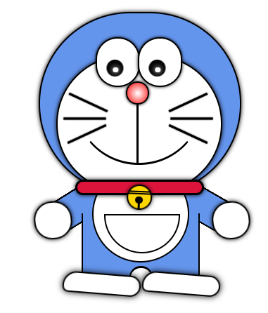
看起来难实则简单的哆啦A梦设计,调格式需要有耐心哦!

效果如下:


<!DOCTYPE html>
<html lang="en">
<head>
    <meta charset="UTF-8">
    <title>机器猫</title>
    <style type="text/css">
        *{
            margin: 0;
            padding:0;
        }
        .wrap{
            width: 600px;
            margin: 0 auto;
            padding-top: 20px;
            padding-left: 90px;
        }
        /*头部*/
        .headRadius{
            width: 190px;
            height:172px;
            background: cornflowerblue;
            border:1px solid black;
            border-radius: 120px;
            box-shadow: 0px 0px 6px 0px rgba(0,0,0,5);/*设置阴影*/

        }

        /*眼睛*/
        .eye{
            width: 40px;
            height:45px;
            position:absolute;
            margin-top: 23px;
            background: white;
            border:1px solid black;
            border-radius: 130px;
            box-shadow: 0px 0px 4px 0px rgba(0,0,0,5);/*设置阴影*/
            z-index: 20;
        }
        .eye1{
            margin-left: 53px;
        }
        .eye2{
            margin-left: 93px;
        }
        /*眼球*/
        .eyeball{
            width:16px;
            height:16px;
            position: absolute;
            margin-left: 9px;
            margin-top:20px;
            background: black;
            border-radius: 120px;
            animation: wave 0.5s infinite;/*动画调用*/
            transform-origin: center bottom;/*旋转中心点*/
        }
        /*动画效果定义*/
        @keyframes wave {
            0%{
                transform: rotate(-6deg);
            }
            50%{
                transform: rotate(6deg);
            }
            100%{
                transform: rotate(-6deg);
            }
        }
        .eyeball_in{
            width: 5px;
            height:5px;
            position: absolute;
            margin-top: 7px;
            margin-left: 6px;
            background: white;
            border-radius: 12px;
            box-shadow: 0px 0px 9px 0px rgba(255,255,255,5);/*设置阴影*/
        }
        /*脸*/
        .face{
            width: 155px;
            height:128px;
            position: absolute;
            margin-top: 40px;
            margin-left: 16px;
            background: white;
            border:1px solid black;
            border-radius: 120px;
            box-shadow: 0px 0px 6px 0px rgba(0,0,0,5);/*设置阴影*/
            z-index: 4;
        }
        /*鼻子*/
        .nose{
            width:20px;
            height: 20px;
            position: absolute;
            margin-top: 24px;
            margin-left: 65px;
            background: radial-gradient(white 1%,red);
            box-shadow: 0px 0px 4px 0px rgba(0,0,0,5);/*设置阴影*/
            border-radius: 20px;
            border:1px solid black;
        }
        /*鼻子下面的竖线*/
        .nose_vertical{
            width: 2px;
            height: 56px;
            background: black;
            margin-top:45px;
            margin-left:75px;
        }
        /*嘴巴*/
        .mouth{
            width:120px;
            height:120px;
            position: absolute;
            margin-top:21px;
            margin-left: 33px;
            background: transparent;
            /*background: pink;*/
            border-radius: 150px;
            border-top: 1px solid transparent;
            border-left: 1px solid transparent;
            border-right: 1px solid transparent;
            border-bottom: 2px solid black;
            z-index: 5;
        }
        /*胡须*/
        .whisker{
            width: 2px;
            height: 40px;
            position: absolute;
            background: black;
            box-shadow: 0px 0px 1px 0px rgba(0,0,0,5);/*设置阴影*/
            z-index: 5;
        }
        .w1{
            margin-top: 65px;
            margin-left: 45px;
            transform: rotate(115deg);/*倾斜角度*/
        }
        .w2{
            margin-top: 80px;
            margin-left: 42px;
            transform: rotate(90deg);
            /*-webkit-box-reflect: right 50px;!*靠右50px形成对称*!*/
        }
        .w3{
            margin-top: 95px;
            margin-left: 44px;
            transform: rotate(65deg);
        }
        .w4{
            margin-top: 65px;
            margin-left: 140px;
            transform: rotate(65deg);
        }
        .w5{
            margin-top: 80px;
            margin-left: 143px;
            transform: rotate(90deg);
        }
        .w6{
            margin-top: 95px;
            margin-left: 140px;
            transform: rotate(115deg);
        }
        /*领带*/
        .necktie{
            width: 118px;
            height: 11px;
            position: absolute;
            margin-top: 158px;
            margin-left: 34px;
            background: crimson;
            border-radius: 10px;
            border:2px solid black;
            box-shadow: 0px 0px 6px 0px rgba(0,0,0,5);/*设置阴影*/
            z-index: 5;
        }
        /*勋章*/
        .medal{
            width:22px;
            height:22px;
            position: absolute;
            margin-top: 163px;
            margin-left: 83px;
            background: gold;
            border-radius: 20px;
            border:1px solid black;
            box-shadow: 0px 0px 6px 0px rgba(0,0,0,5);/*设置阴影*/
            animation: wave 1s infinite;/*动画调用*/
            transform-origin: center top;/*旋转中心点*/
            z-index: 6;
        }
        /*勋章上的线*/
        .line{
            height:1px;
            position: absolute;
            background: black;
        }
        .L1{
            width: 20px;
            margin-top: 5px;
            margin-left: 1px;
        }
        .L2{
            width: 22px;
            margin-top: 7px;
        }
        /*勋章上的小黑圆点*/
        .blackCir{
            width:7px;
            height:7px;
            position: absolute;
            margin-top: 10px;
            margin-left: 7px;
            background: black;
            border-radius: 120px;
        }
        /*勋章上的第三条线*/
        .line3{
            width: 2px;
            height:6px;
            position: absolute;
            margin-top: 16px;
            margin-left: 9.5px;            /*强迫症很头疼*/
            background: black;
        }
        /*左边袖子*/
        .leftSleeve{
            width: 29px;
            height:58px;
            position: absolute;
            margin-top: 150px;
            margin-left: 25px;
            background: cornflowerblue;
            border-radius: 60px 0px 12px 12px;
            border:1px solid black;
            transform: rotate(58deg);/*倾斜角度*/
            z-index: 1;
        }
        /*右边袖子*/
        .rightSleeve{
            width: 29px;
            height:58px;
            position: absolute;
            margin-top: 150px;
            margin-left: 135px;
            background: cornflowerblue;
            border-radius: 12px 12px 0px 60px;
            border:1px solid black;
            transform: rotate(120deg);
            z-index: 1;
        }
        /*衣服中间矩形*/
        .clothes{
            width: 110px;
            height: 70px;
            position: absolute;
            margin-top: 190px;
            margin-left: 40px;
            background: cornflowerblue;
            border-left: 1px solid black;
            border-right: 1px solid black;
            z-index: 2;
        }
        /*衣服中间的大白圆*/
        .Circular{
            width: 90px;
            height:90px;
            position: absolute;
            margin-top: 145px;
            margin-left: 50px;
            background: white;
            border: 1px solid black;
            border-radius: 120px;
            z-index: 3;
        }
        /*肚子中间半圆*/
        .midCircular{
            width: 70px;
            height:35px;
            position: absolute;
            margin-top: 45px;
            margin-left: 10px;
            border-radius: 0px 0px 100px 100px;/*半圆*/
            background: white;
            border: 1px solid black;

        }
        /*手*/
        .hand{
            width:34px;
            height:34px;
            position: absolute;
            border-radius: 17px;
            background: white;
            border: 1px solid black;
            box-shadow: 0px 0px 6px 0px rgba(0,0,0,5);/*设置阴影*/
            animation: wave 2.5s infinite;/*动画调用*/
            transform-origin: center top;/*旋转中心点*/
            z-index: 2;
        }
        .leftHand{
            margin-top: 179px;
            margin-left: -7px;
        }
        .rightHand{
            margin-top: 179px;
            margin-left: 162px;
        }
        /*脚*/
        .foot{
            width: 72px;
            height:18px;
            position: absolute;
            background: white;
            border-radius: 18px 13px 13px 8px;
            border: 1px solid black;
            box-shadow: 0px 0px 9px 0px rgba(0,0,0,5);/*设置阴影*/
            animation: wave 2s infinite;/*动画调用*/
            transform-origin: center right;/*旋转中心点*/
            z-index: 4;
        }
        .leftFoot{
            margin-top: 250px;
            margin-left: 22px;
        }
        .rightFoot{
            margin-top: 250px;
            margin-left: 97px;
        }
        /*脚上的小圆*/
        .cirOnFoot{
            width: 20px;
            height:20px;
            position: absolute;
            margin-top: 240px;
            margin-left: 85px;
            background: white;
            border-radius: 12px;
            border-top: 2px solid black;
            border-left: 1px solid black;
            border-right: 1px solid black;
            border-bottom: 1px solid white;
            z-index: 3;
        }
    </style>
</head>
<body>
<div class="wrap">
    <!--头部-->
    <div class="headRadius">
        <!--第一个眼睛-->
        <div class=" eye eye1">
            <div class="eyeball">
                <div class="eyeball_in"></div>
            </div><!--眼球-->
        </div>
        <!--第二个眼睛-->
        <div class=" eye eye2">
            <div class="eyeball">
                <div class="eyeball_in"></div>
            </div><!--眼球-->
        </div>
        <!--脸-->
        <div class="face">
            <div class="nose"></div><!--鼻子-->
            <div class="nose_vertical"></div><!--鼻子下面的竖线-->
        </div>
        <div class="mouth"></div><!--嘴巴-->
        <!--胡须-->
        <div class="whisker w1"></div>
        <div class="whisker w2"></div>
        <div class="whisker w3"></div>
        <div class="whisker w4"></div>
        <div class="whisker w5"></div>
        <div class="whisker w6"></div>
        <!--领带-->
        <div class="necktie"></div>
        <!--勋章-->
        <div class="medal">
            <!--勋章上的线-->
            <div class="line L1"></div>
            <div class="line L2"></div>
            <!--勋章上的小黑圆点-->
            <div class="blackCir"></div>
            <div class="line3"></div>
        </div>

        <!--衣服-->
        <div class="leftSleeve"></div>
        <div class="rightSleeve"></div>
        <div class="clothes"></div>

        <!--手-->
        <div class="hand leftHand"></div>
        <div class="hand rightHand"></div>
        <!--衣服上中间的圆-->
        <div class="Circular">
            <!--衣服上中间的半圆-->
            <div class="midCircular"></div>
        </div>

        <!--脚-->
        <div class="foot leftFoot"></div>
        <div class="foot rightFoot"></div>
        <!--脚上的圆-->
        <div class="cirOnFoot"></div>
    </div>
</div>
</body>
</html>


  • 7
    点赞
  • 19
    收藏
    觉得还不错? 一键收藏
  • 1
    评论
好的,下面是一个用HTML+CSS画哆啦A梦的示例: 1. 首先,我们需要一个HTML文件,可以使用以下代码: ``` <!DOCTYPE html> <html> <head> <title>哆啦A梦</title> <style> #doraemon { position: relative; width: 200px; height: 200px; background-color: #4d4d4d; border-radius: 100px; overflow: hidden; } #doraemon:before { content: ""; position: absolute; top: 0; left: 0; width: 100%; height: 100%; background-color: #fff; border-radius: 100px; transform: translate(30px, 30px); } #doraemon .face { position: absolute; top: 30px; left: 30px; width: 140px; height: 140px; background-color: #fff; border-radius: 70px; overflow: hidden; } #doraemon .face:before { content: ""; position: absolute; top: 5px; left: 5px; width: 130px; height: 130px; background-color: #4d4d4d; border-radius: 65px; } #doraemon .face:after { content: ""; position: absolute; top: 50px; left: 50px; width: 40px; height: 40px; background-color: #fff; border-radius: 20px; } #doraemon .eyes { position: absolute; top: 50px; left: 70px; width: 60px; height: 45px; background-color: #000; border-radius: 30px; overflow: hidden; } #doraemon .eyes:before { content: ""; position: absolute; top: 5px; left: 5px; width: 50px; height: 35px; background-color: #fff; border-radius: 25px; } #doraemon .eyes:after { content: ""; position: absolute; top: 15px; left: 15px; width: 20px; height: 15px; background-color: #000; border-radius: 10px; } #doraemon .mouth { position: absolute; top: 110px; left: 40px; width: 120px; height: 50px; border-radius: 25px; border-top: 2px solid #000; background-color: #fff; transform: rotate(-20deg); } #doraemon .mouth:before { content: ""; position: absolute; top: 5px; left: 5px; width: 110px; height: 40px; background-color: #4d4d4d; border-radius: 20px; transform: rotate(20deg); } #doraemon .whiskers { position: absolute; top: 75px; left: 50px; width: 100px; height: 1px; background-color: #000; transform: rotate(10deg); } #doraemon .whiskers:before { content: ""; position: absolute; top: -5px; left: 0; width: 5px; height: 10px; background-color: #000; transform: rotate(-20deg); } #doraemon .whiskers:after { content: ""; position: absolute; top: 5px; left: 0; width: 5px; height: 10px; background-color: #000; transform: rotate(-20deg); } #doraemon .whiskers:nth-child(2) { transform: rotate(-10deg); } #doraemon .whiskers:nth-child(2):before { transform: rotate(20deg); } #doraemon .whiskers:nth-child(2):after { transform: rotate(20deg); } #doraemon .whiskers:nth-child(3) { transform: rotate(10deg); } #doraemon .whiskers:nth-child(3):before { transform: rotate(-20deg); } #doraemon .whiskers:nth-child(3):after { transform: rotate(-20deg); } </style> </head> <body> <div id="doraemon"> <div class="face"></div> <div class="eyes"></div> <div class="mouth"></div> <div class="whiskers"></div> <div class="whiskers"></div> <div class="whiskers"></div> </div> </body> </html> ``` 2. 接下来,我们来解释一下上面的代码: - 通过`position: relative`设置`#doraemon`为相对定位,以便于后面的绝对定位。 - 设置`width`和`height`为200px,使得`#doraemon`呈现为一个圆形。 - 设置`background-color`为#4d4d4d,使得`#doraemon`呈现为蓝色。 - 通过`border-radius: 100px`将`#doraemon`设置为圆形。 - 通过`overflow: hidden`将`#doraemon`内部的元素裁剪为圆形。 3. 接下来,我们需要用伪元素`::before`来实现哆啦A梦的脸部分: - 通过`content: ""`设置伪元素的内容为空。 - 通过`position: absolute`将伪元素绝对定位在`#doraemon`内部。 - 通过`top`和`left`属性将伪元素相对于`#doraemon`进行定位。 - 通过`width`和`height`设置伪元素的大小。 - 通过`background-color`设置伪元素的颜色。 - 通过`border-radius`将伪元素设置为圆形。 - 通过`transform: translate(30px, 30px)`将伪元素向右下方平移,实现哆啦A梦的脸颊。 4. 接下来,我们需要用`div`元素来实现哆啦A梦的眼睛: - 通过`position: absolute`将眼睛绝对定位在脸部内部。 - 通过`top`和`left`属性将眼睛相对于脸部进行定位。 - 通过`width`和`height`设置眼睛的大小。 - 通过`background-color`设置眼睛的颜色。 - 通过`border-radius`将眼睛设置为半圆形。 - 通过`overflow: hidden`将眼睛内部的元素裁剪为半圆形。 5. 接下来,我们需要用伪元素`::before`来实现哆啦A梦的眼珠: - 通过`content: ""`设置伪元素的内容为空。 - 通过`position: absolute`将伪元素绝对定位在眼睛内部。 - 通过`top`和`left`属性将伪元素相对于眼睛进行定位。 - 通过`width`和`height`设置伪元素的大小。 - 通过`background-color`设置伪元素的颜色。 - 通过`border-radius`将伪元素设置为圆形。 6. 接下来,我们需要用`div`元素来实现哆啦A梦的嘴巴: - 通过`position: absolute`将嘴巴绝对定位在脸部内部。 - 通过`top`和`left`属性将嘴巴相对于脸部进行定位。 - 通过`width`和`height`设置嘴巴的大小。 - 通过`border-radius`将嘴巴设置为半圆形。 - 通过`border-top`设置嘴巴的上边框。 - 通过`background-color`设置嘴巴的颜色。 - 通过`transform: rotate(-20deg)`将嘴巴旋转20度,使得它看起来更加生动。 7. 最后,我们需要用`div`元素和伪元素来实现哆啦A梦的小胡须: - 通过`position: absolute`将小胡须绝对定位在脸部内部。 - 通过`top`和`left`属性将小胡须相对于脸部进行定位。 - 通过`width`和`height`设置小胡须的大小。 - 通过`background-color`设置小胡须的颜色。 - 通过`transform: rotate(10deg)`将小胡须旋转10度,使得它看起来更加生动。 - 通过伪元素来实现小胡须的两端。 到这里,一个用HTML+CSS画的哆啦A梦就完成了。希望这个示例对你有所帮助!

“相关推荐”对你有帮助么?

  • 非常没帮助
  • 没帮助
  • 一般
  • 有帮助
  • 非常有帮助
提交
评论 1
添加红包

请填写红包祝福语或标题

红包个数最小为10个

红包金额最低5元

当前余额3.43前往充值 >
需支付:10.00
成就一亿技术人!
领取后你会自动成为博主和红包主的粉丝 规则
hope_wisdom
发出的红包
实付
使用余额支付
点击重新获取
扫码支付
钱包余额 0

抵扣说明:

1.余额是钱包充值的虚拟货币,按照1:1的比例进行支付金额的抵扣。
2.余额无法直接购买下载,可以购买VIP、付费专栏及课程。

余额充值