css实现圆环路径,实现CSS圆环的5种方法(小结)

这篇文章主要介绍了实现CSS圆环的5种方法(小结),有一定的参考价值,有需要的朋友可以参考一下,希望对你们有所帮助。

想到去年面试实习的时候被问到实习圆环的问题,特意写篇文章总结一下吧!总结了一下大概有5种方法。
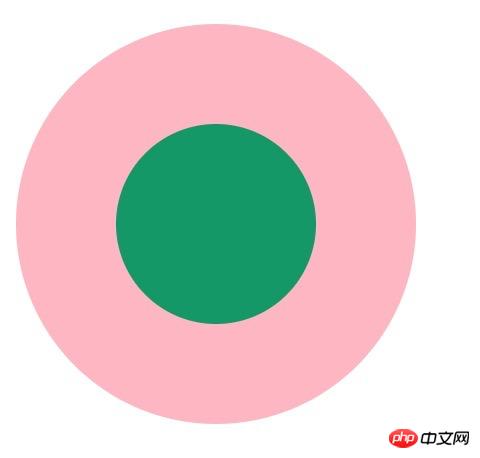
1f1693b1e1226034c92b00169a2bf8e4.png

1. 两个标签的嵌套:

width: 200px;

height: 200px;

background-color: lightpink;

border-radius: 50%;

}

.child1{

width: 100px;

height: 100px;

border-radius: 50%;

background-color: #009966;

position: relative;

top: 50px;

left: 50px;

}

2. 使用伪元素,before/after

width: 200px;

height: 200px;

background-color: lightpink;

border-radius: 50%;

}

.element2:after{

content: "";

display: block;

width: 100px;

height: 100px;

border-radius: 50%;

background-color: #009966;

position: relative;

top: 50px;

left: 50px;

}

3. 使用border:

width: 100px;

height: 100px;

background-color: #009966;

border-radius: 50%;

border: 50px solid lightpink ;

}

4. 使用border-shadow

width: 100px;

height: 100px;

background-color: #009966;

border-radius: 50%;

box-shadow: 0 0 0 50px lightpink ;

margin: auto;

}

.element5{

width: 200px;

height: 200px;

background-color: #009966;

border-radius: 50%;

box-shadow: 0 0 0 50px lightpink inset;

margin: auto;

}

5. 使用radial-gradient

width: 200px;

height: 200px;

border-radius: 50%;

background: -webkit-radial-gradient( circle closest-side,#009966 50%,lightpink 50%);

}

如果大家有其他的方法,请告诉我吧,谢谢!!!

总结:以上就是本篇文的全部内容,希望能对大家的学习有所帮助。更多相关教程请访问CSS视频教程!

相关推荐:

  • 0
    点赞
  • 1
    收藏
    觉得还不错? 一键收藏
  • 0
    评论
实现圆环进度条,你可以使用 CSS 的伪元素和 transform 属性来实现。以下是一个简单的示例: HTML: ```html <div class="progress-bar"> <div class="progress"></div> </div> ``` CSS: ```css .progress-bar { position: relative; width: 200px; height: 200px; border-radius: 50%; background-color: lightgray; } .progress { position: absolute; top: 0; left: 0; width: 100%; height: 100%; border-radius: 50%; background-color: #00bcd4; transform-origin: center center; } .progress::before { content: ""; position: absolute; top: -10px; left: calc(50% - 10px); width: 20px; height: 20px; border-radius: 50%; background-color: #00bcd4; } .progress::after { content: ""; position: absolute; top: calc(50% - 10px); right: -10px; width: 20px; height: 20px; border-radius: 50%; background-color: lightgray; } .progress-bar::after { content: ""; position: absolute; top: calc(50% - 30px); left: calc(50% - 30px); width: 60px; height: 60px; border-radius: 50%; background-color: lightgray; } .progress-bar::before { content: ""; position: absolute; top: calc(50% - 40px); left: calc(50% - 40px); width: 80px; height: 80px; border-radius: 50%; background-color: lightgray; } ``` 在上面的示例中,我们有一个包含两个 div 的容器。`.progress-bar` 是圆环的外部容器,`.progress` 是实际的进度条。我们使用伪元素 `::before` 和 `::after` 来创建圆环的开始和结束点。 通过改变 `.progress` 元素的 `transform` 属性,你可以调整进度条的进度。例如,你可以使用 `transform: rotate(45deg)` 来表示进度条完成了 45%。 你可以根据你的需求修改样式,并使用 JavaScript 来动态更新进度条的进度。

“相关推荐”对你有帮助么?

  • 非常没帮助
  • 没帮助
  • 一般
  • 有帮助
  • 非常有帮助
提交
评论
添加红包

请填写红包祝福语或标题

红包个数最小为10个

红包金额最低5元

当前余额3.43前往充值 >
需支付:10.00
成就一亿技术人!
领取后你会自动成为博主和红包主的粉丝 规则
hope_wisdom
发出的红包
实付
使用余额支付
点击重新获取
扫码支付
钱包余额 0

抵扣说明:

1.余额是钱包充值的虚拟货币,按照1:1的比例进行支付金额的抵扣。
2.余额无法直接购买下载,可以购买VIP、付费专栏及课程。

余额充值