import seaborn as sns
import matplotlib.pyplot as plt
import pandas as pd
import numpy as np
import warnings
warnings.filterwarnings('ignore')
sns.set_style("darkgrid")
df = pd.read_csv('layoffs_data.csv')
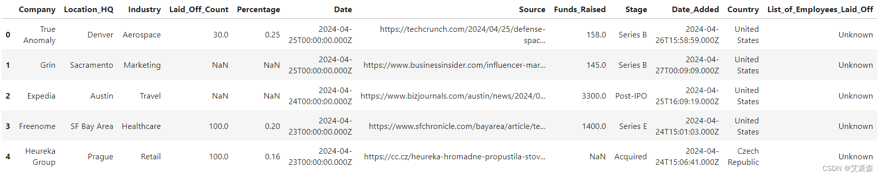
df.head()
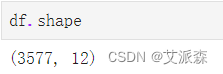
df.shape
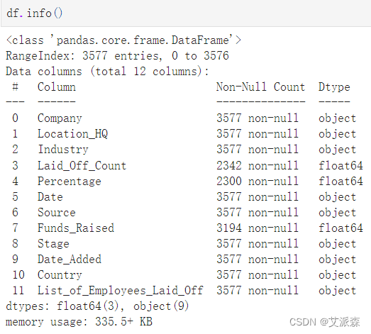
df.info()
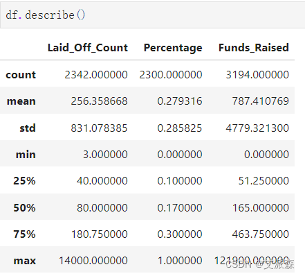
df.describe()
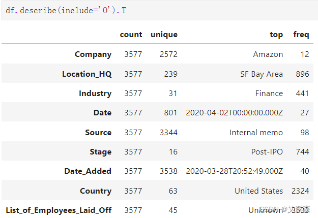
df.describe(include='O').T
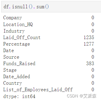
df.isnull().sum()
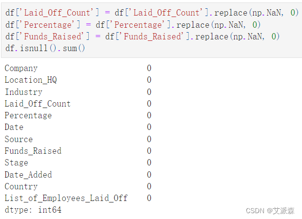
df['Laid_Off_Count'] = df['Laid_Off_Count'].replace(np.NaN, 0)
df['Percentage'] = df['Percentage'].replace(np.NaN, 0)
df['Funds_Raised'] = df['Funds_Raised'].replace(np.NaN, 0)
df.isnull().sum()
df.duplicated().sum()
# 将日期列转换为日期时间,并从中制作年和月列
import datetime as dt
df['Date'] = pd.to_datetime(df['Date'])
df['Year'] = df['Date'].dt.year
df['Month'] = df['Date'].dt.month_name()
df['Quarter'] = df['Date'].dt.to_period('Q')
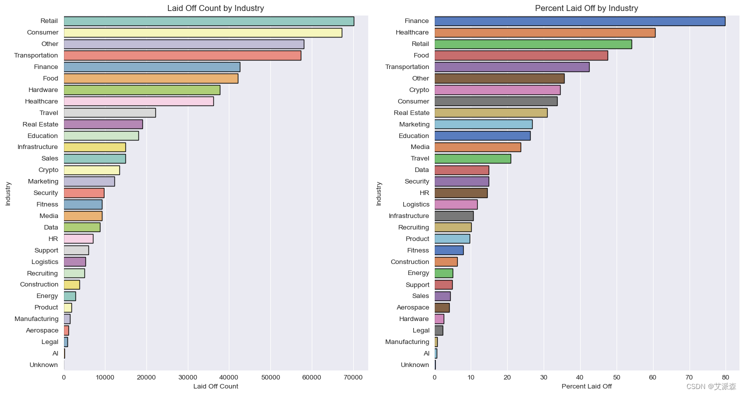
# 行业分析
fig, ax = plt.subplots(1, 2,figsize=(15,8))
ax[0] = sns.barplot(data=df.groupby('Industry')['Laid_Off_Count'].sum().sort_values(ascending=False).reset_index(),
y='Industry', x='Laid_Off_Count', edgecolor='black', palette='Set3', ax=ax[0])
ax[0].set(title='Laid Off Count by Industry', xlabel='Laid Off Count')
ax[1] = sns.barplot(data=df.groupby('Industry')['Percentage'].sum().sort_values(ascending=False).reset_index(),
y='Industry', x='Percentage', edgecolor='black', palette='muted', ax=ax[1])
ax[1].set(title='Percent Laid Off by Industry', xlabel='Percent Laid Off')
plt.tight_layout()
fig.show()
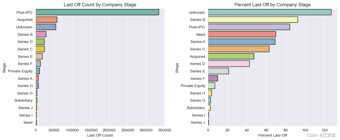
# 阶段分析
fig, ax = plt.subplots(1, 2,figsize=(12,5))
ax[0] = sns.barplot(data=df.groupby('Stage')['Laid_Off_Count'].sum().sort_values(ascending=False).reset_index(),
y='Stage', x='Laid_Off_Count', edgecolor='black', palette='Set2', ax=ax[0])
ax[0].set(title='Laid Off Count by Company Stage', xlabel='Laid Off Count')
ax[1] = sns.barplot(data=df.groupby('Stage')['Percentage'].sum().sort_values(ascending=False).reset_index(),
y='Stage', x='Percentage', edgecolor='black', palette='Set3', ax=ax[1])
ax[1].set(title='Percent Laid Off by Company Stage', xlabel='Percent Laid Off')
plt.tight_layout()
fig.show()
结论
裁员最多的是上市后的公司
裁员比例最高的是b轮融资公司
相比之下,很多人都在上市后的公司工作
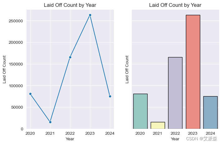
# 年度分析
fig, ax = plt.subplots(1,2, sharey=True, figsize=(8,5))
ax[0] = sns.lineplot(data=df.groupby('Year')['Laid_Off_Count'].sum().reset_index(), x='Year', y='Laid_Off_Count',
marker='o', ax=ax[0])
ax[0].set(title='Laid Off Count by Year', ylabel='Laid Off Count')
ax[1] = sns.barplot(data=df.groupby('Year')['Laid_Off_Count'].sum().reset_index(), x='Year', y='Laid_Off_Count',
ax=ax[1], palette='Set3', linewidth=1,edgecolor='black')
ax[1].set(title='Laid Off Count by Year', ylabel='Laid Off Count')
fig.show()
结论
对员工来说,2023年是最糟糕的一年
2021年的裁员减少了很多,我们必须检查一下
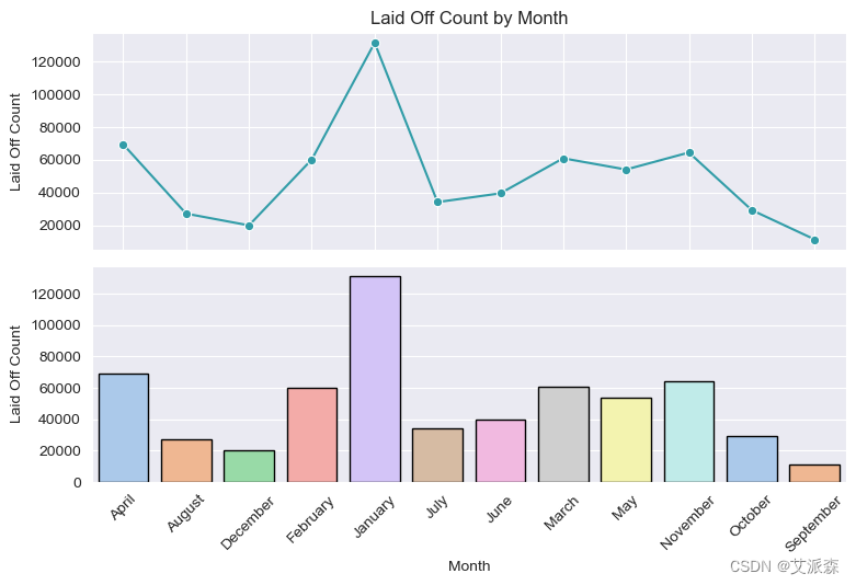
# 月分析
fig, ax = plt.subplots(2,1, sharex=True, figsize=(8,5))
ax[0] = sns.lineplot(data=df.groupby('Month')['Laid_Off_Count'].sum().reset_index(), x='Month', y='Laid_Off_Count',
marker='o', ax=ax[0], color='#329da8')
ax[0].set(title='Laid Off Count by Month', ylabel='Laid Off Count')
ax[1] = sns.barplot(data=df.groupby('Month')['Laid_Off_Count'].sum().reset_index(), x='Month', y='Laid_Off_Count',
ax=ax[1], palette='pastel', linewidth=1,edgecolor='black')
ax[1].set(ylabel='Laid Off Count')
plt.tight_layout()
plt.xticks(rotation=45)
fig.show()
结论
大多数裁员发生在1月份
在谷歌上快速搜索,这是我发现的:
裁员随时都可能发生。但就裁员最常发生的时间而言,1月和12月是众所周知的裁员高峰期。雇主们在每年的这个时候都在审查他们的预算。
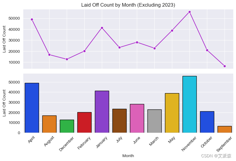
fig, ax = plt.subplots(2,1, sharex=True, figsize=(8,5))
ax[0] = sns.lineplot(data=df.query("Year != 2023").groupby('Month')['Laid_Off_Count'].sum().reset_index(), x='Month', y='Laid_Off_Count',
marker='o', ax=ax[0], color='#ab29cc')
ax[0].set(title='Laid Off Count by Month (Excluding 2023)', ylabel='Laid Off Count')
ax[1] = sns.barplot(data=df.query("Year != 2023").groupby('Month')['Laid_Off_Count'].sum().reset_index(), x='Month', y='Laid_Off_Count',
ax=ax[1], palette='bright' , linewidth=1,edgecolor='black')
ax[1].set(ylabel='Laid Off Count')
plt.tight_layout()
plt.xticks(rotation=45)
fig.show()
如果我们忽略2023年,由于大规模的经济衰退和公司在1月份解雇了大量员工,我们看到裁员通常发生在11月份。
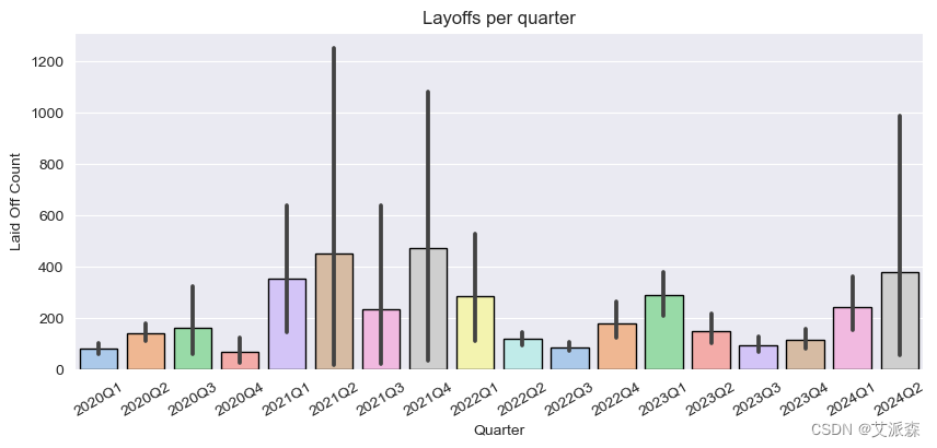
# 季度分析
fig, ax = plt.subplots(figsize=(10,4))
ax = sns.barplot(data=df.sort_values(by='Quarter'), x='Quarter', y='Laid_Off_Count'
,linewidth=1,edgecolor='black', palette='pastel')
ax.set(title='Layoffs per quarter', ylabel='Laid Off Count')
plt.xticks(rotation=30)
plt.show()
# 国家分析
fig, ax = plt.subplots(2,1,figsize=(10,5), sharex=True)
ax[0] = sns.barplot(data=df.groupby('Country')['Laid_Off_Count'].sum().sort_values(ascending=False).reset_index().head(10),
x='Country', y='Laid_Off_Count', linewidth=1,edgecolor='black', palette='deep', ax=ax[0])
ax[0].set(title='Layoffs by country (top 10)', ylabel='Lay Off Count')
ax[1] = sns.barplot(data=df.groupby('Country')['Laid_Off_Count'].sum().sort_values(ascending=False).reset_index().head(10),
x='Country', y='Laid_Off_Count', linewidth=1,edgecolor='black', palette='muted', ax=ax[1])
ax[1].set(title='Layoffs by country (top 10) - Log Scale', ylabel='Lay Off Count')
ax[1].set_yscale('log')
plt.tight_layout()
plt.xticks(rotation=30)
plt.show()
结论
美国的情况非常令人担忧,从柱状图中可以看出,美国的数据远远超过其他国家的数据,这对比较产生了明显的影响。
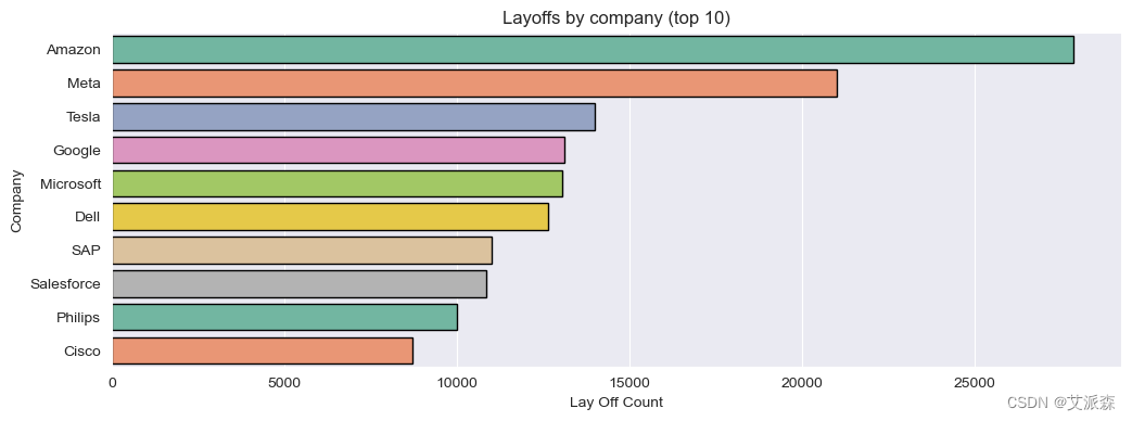
# 公司分析
fig, ax = plt.subplots(figsize=(12,4))
ax = sns.barplot(data= df.groupby('Company')['Laid_Off_Count'].sum().sort_values(ascending=False).reset_index().head(10),
x='Laid_Off_Count', y='Company'
,linewidth=1,edgecolor='black', palette='Set2', ax=ax)
ax.set(title='Layoffs by company (top 10)', xlabel='Lay Off Count')
plt.show()
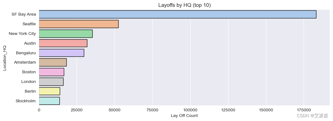
# 总部分析
fig, ax = plt.subplots(figsize=(12,4))
ax = sns.barplot(data= df.groupby('Location_HQ')['Laid_Off_Count'].sum().sort_values(ascending=False).reset_index().head(10),
x='Laid_Off_Count', y='Location_HQ'
,linewidth=1,edgecolor='black', palette='pastel', ax=ax)
ax.set(title='Layoffs by HQ (top 10)', xlabel='Lay Off Count')
plt.show()
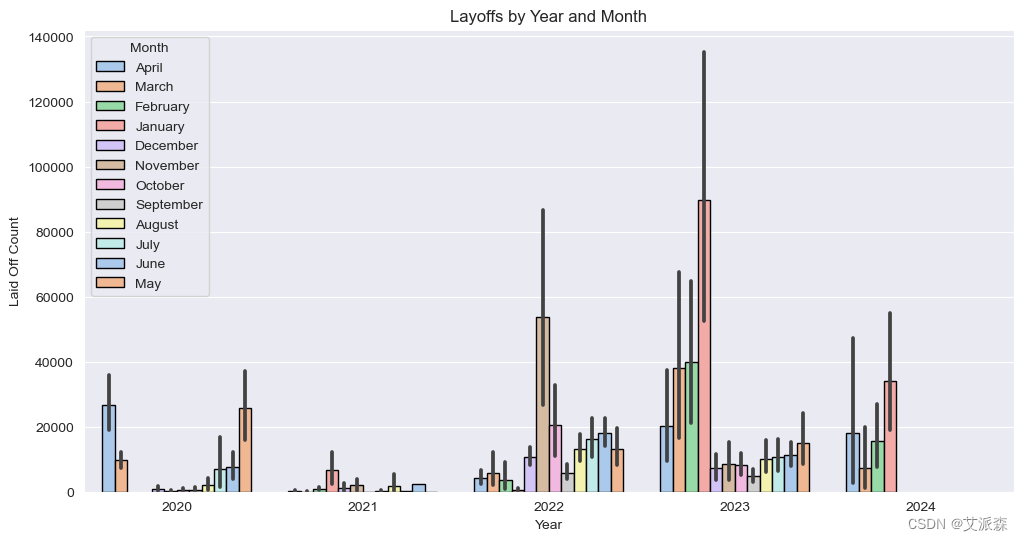
# 年、月分析
fig, ax = plt.subplots(figsize=(12,6))
ax = sns.barplot(data=df, x='Year', y='Laid_Off_Count', hue='Month',estimator=sum, edgecolor='black', ax = ax, palette='pastel')
ax.set(title='Layoffs by Year and Month', ylabel='Laid Off Count')
plt.show()
import plotly.express as px
world = df.groupby("Country")["Laid_Off_Count"].sum().reset_index()
figure = px.choropleth(world,locations="Country",
locationmode = "country names", color="Laid_Off_Count",
hover_name="Country",range_color=[1,10000],
color_continuous_scale="reds",
title="Countries having LayOffs")
figure.show()
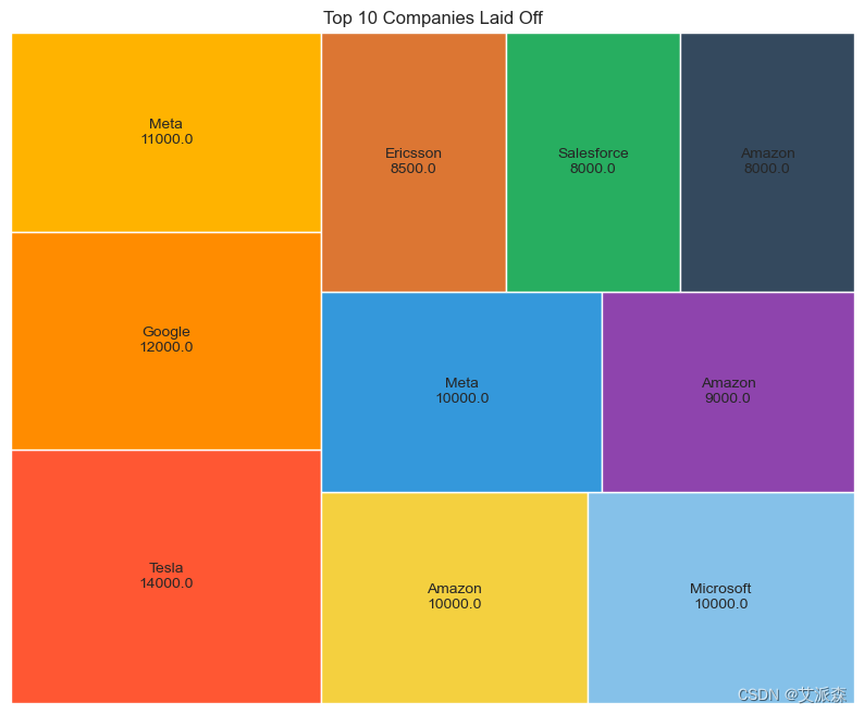
# 十大科技巨头裁员
import squarify
sorted_df = df.sort_values('Laid_Off_Count', ascending=False).head(10)
Companies = sorted_df["Company"].tolist()
Laid_off_count = sorted_df['Laid_Off_Count'].tolist()
colors = ['#FF5733', '#FF8C00', '#FFB300', '#F4D03F', '#85C1E9', '#3498DB', '#8E44AD', '#DC7633', '#27AE60', '#34495E']
sizes = [count / sum(Laid_off_count) for count in Laid_off_count]
labels = [f'{company}\n{laid_off_count}' for company, laid_off_count in zip(Companies, Laid_off_count)]
plt.figure(figsize=(10, 8))
squarify.plot(sizes=sizes,label = labels, color=colors)
plt.title('Top 10 Companies Laid Off')
plt.axis('off')
plt.show()
- 1.
- 2.
- 3.
- 4.
- 5.
- 6.
- 7.
- 8.
- 9.
- 10.
- 11.
- 12.
- 13.
- 14.
- 15.
- 16.
- 17.
- 18.
- 19.
- 20.
- 21.
- 22.
- 23.
- 24.
- 25.
- 26.
- 27.
- 28.
- 29.
- 30.
- 31.
- 32.
- 33.
- 34.
- 35.
- 36.
- 37.
- 38.
- 39.
- 40.
- 41.
- 42.
- 43.
- 44.
- 45.
- 46.
- 47.
- 48.
- 49.
- 50.
- 51.
- 52.
- 53.
- 54.
- 55.
- 56.
- 57.
- 58.
- 59.
- 60.
- 61.
- 62.
- 63.
- 64.
- 65.
- 66.
- 67.
- 68.
- 69.
- 70.
- 71.
- 72.
- 73.
- 74.
- 75.
- 76.
- 77.
- 78.
- 79.
- 80.
- 81.
- 82.
- 83.
- 84.
- 85.
- 86.
- 87.
- 88.
- 89.
- 90.
- 91.
- 92.
- 93.
- 94.
- 95.
- 96.
- 97.
- 98.
- 99.
- 100.
- 101.
- 102.
- 103.
- 104.
- 105.
- 106.
- 107.
- 108.
- 109.
- 110.
- 111.
- 112.
- 113.
- 114.
- 115.
- 116.
- 117.
- 118.
- 119.
- 120.
- 121.
- 122.
- 123.
- 124.
- 125.
- 126.
- 127.
- 128.
- 129.
- 130.
- 131.
- 132.
- 133.
- 134.
- 135.
- 136.
- 137.
- 138.
- 139.
- 140.
- 141.
- 142.
- 143.
- 144.
- 145.
- 146.
- 147.
- 148.
- 149.


 被折叠的 条评论
为什么被折叠?
被折叠的 条评论
为什么被折叠?
 到【灌水乐园】发言


