


很多小伙伴在前端学习的时候,发现盒子模型默认为正方形。如何把盒子变成想要的模型呢? 首先我们来看一下默认的情况----
.box{
width: 100px;
height: 100px;
background-color: rgb(116, 51, 51);
box-shadow:0 10px 10px red;
text-align: center;
position:absolute;
margin:0 auto;
left:0;
right:0;
bottom:0;
top:0;
}
Document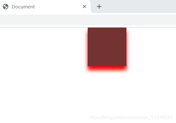
默认情况下为正方形,也许小伙伴觉得不太好看。 我们换成圆形的试试!
.box{
width: 100px;
height: 100px;
border-radius: 50%;
background-color: rgb(28, 99, 60);
border: 5px solid rgb(55, 0, 255);
position: absolute;
margin: 0 auto;
left: 0;
right: 0;
bottom: 0;
top: 0;
}
Round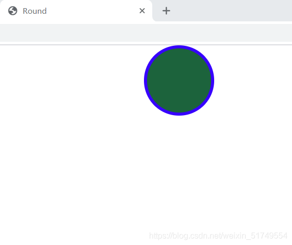
看一下我们变成了圆形! 来看看半圆形的吧!
.box{
width: 100px;
height: 50px;
background-color: rgb(175, 42, 216);
border: 3px solid rgb(26, 236, 26);
border-top-right-radius: 50px;
border-top-left-radius: 50px;
position:absolute;
margin: 0 auto;
left: 0;
right: 0;
bottom: 0;
top: 0;
}
semicircle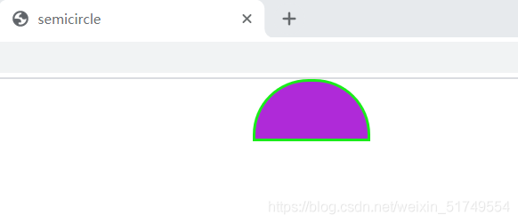
来试试其他形状!
.box{
width: 100px;
height: 100px;
background-color: rgb(82, 84, 223);
border-radius: 20px 15px 20px 10px;
position: absolute;
margin: 0 auto;
left: 0;
bottom: 0;
right: 0;
top: 0;
}
demo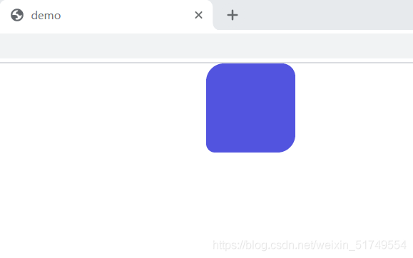
知识点分析:
border-radius:给元素设置圆角边框
可以实现圆,半圆,椭圆,四分之一圆等各种圆角图形。
可以设置四个值,分别为左上,右上,右下,左下
给个口诀,“从左上开始顺时针移动”。。。
希望这篇文章能让你学会border-radius属性!
到此这篇关于HTML+css盒子模型案例(圆,半圆等)“border-radius” 简单上手的文章就介绍到这了,更多相关html css盒子模型内容请搜索脚本之家以前的文章或继续浏览下面的相关文章,希望大家以后多多支持脚本之家!


 4259
4259


 被折叠的 条评论
为什么被折叠?
被折叠的 条评论
为什么被折叠?
 到【灌水乐园】发言


