


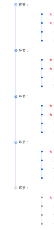
如图,左侧环节这边的竖线如何连起来,右侧的点数不固定,尺寸就不固定,右侧点和线效果我已经实现,整个内容都是动态生成的
回答:
css就可以实现
Documenthtml, body{
width: 100%;
height: 100%;
padding: 0;
margin: 0;
}
#box{
width: 300px;
height: 100%;
overflow: auto;
padding: 20px;
}
.pitem{
padding: 30px;
padding-left: 60px;
border-left: 3px solid #1D6DE5;
position: relative;
}
.pitem:last-child{
border-left-color: transparent;
}
.pitem .name{
position: absolute;
top: -2px;
left: 8px;
font-size: 12px;
}
.pitem .node{
position: absolute;
width: 8px;
height: 8px;
border: 2px solid #1D6DE5;
background: #fff;
border-radius: 50%;
top: 0;
left: -8px;
}
.pitem .node:after{
content: '';
position: absolute;
width: 2px;
height: 2px;
background: #1D6DE5;
top: calc(50% - 1px);
left: calc(50% - 1px);
border-radius: 50%;
}
.citem{
height: 30px;
border-left: 2px solid #1D6DE5;
position: relative;
}
.citem:after, .citem:before{
content: '';
position: absolute;
width: 8px;
height: 8px;
background: #1D6DE5;
border-radius: 50%;
left: -5px;
}
.citem:before{
top: -4px;
}
.citem:after{
bottom: -4px;
}
//生成元素
let arr = [4, 3, 5, 2]
document.getElementById('box').innerHTML = arr.map(item => {
let html = ''
for(let i = 0; i < item; i++){
html += '
}
return `
}).join('')
回答:
可以光明正大地贴一个自己做的方案了:易锦教育-职业体系课程-安卓逆向工程师。
我用的是伪元素,通过绝对定位偏移到左边,.part-index 的伪元素用来显示圆圈,.chapter-wrapper的伪元素用来显示时间轴。
一个知识点:只有元素本身有定位(比如position: relative),其伪元素才能相对该元素进行定位和设置宽高。
时间轴线高度:.chapter-wrapper 的高度是被课程列表撑开的,然后给 .chapter-wrapper 设置 position:relative,给伪元素设置 position:absolute,这样伪元素就可以设置高度值为百分比(我用的是给定top和bottom让它自己计算的方法),然后位置稍微调节一下就可以了。
回答:
采用盒子(内容部分)的左边框实现线条,使用伪元素实现小点 位置相对父父元素来进行定位


 1054
1054


 被折叠的 条评论
为什么被折叠?
被折叠的 条评论
为什么被折叠?
 到【灌水乐园】发言


