


在一个项目中,要得到一个透明边框。
好简单~开始干~!
HTML:
<div class="box">

</div>
CSS:
 .box{
            width: 300px;
            height: 150px;
            margin: 100px;
            background: #f00;                  /*红色背景*/
            border:30px rgba(0,0,0,0.5) solid; /*半透明黑色边框*/
        }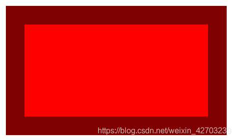
慢着,这不是我要的效果。我希望的是,半透明黑色边框在红色背景的外面,而不是覆盖红色背景的区域~!
解决方案:使用 background-clip 属性。
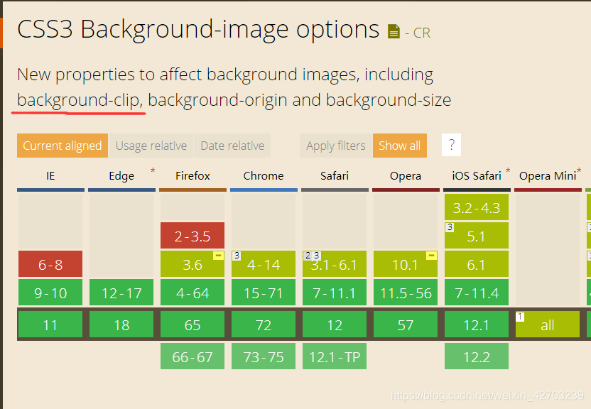
background-clip ,顾名思义就是“背景裁切”。按照 http://www.w3school.com.cn/ 的解释就是 "规定背景的绘制区域"。
它有三个值:
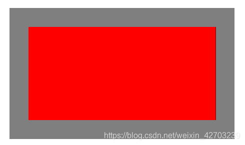
1、border-box ,默认值,意味着背景会被元素的 border box(边框的外沿框)裁切掉。也就是背景部分会进入到border边框区域。
2、padding-box , 背景被裁剪到内边距框。也就是说,背景会进入到padding区域,不会进入到border边框区域。
3、content-box , 背景被裁剪到内容框。也就是说,背景会进入到content内容区域,不会进入到padding区域和border边框区域。
第2,第3条属性值测试如下:
padding-box:
 .box{
            width: 300px;
            height: 150px;
            margin: 100px;
            background: #f00;
            background-clip: padding-box;  /* 新增 */
            border:30px rgba(0,0,0,0.5) solid;
}
content-box:
 .box{
            width: 300px;
            height: 150px;
            margin: 100px;
            background: #f00;
            background-clip: content-box;  /* 新增 */
            padding: 20px;                 /* 新增 */
            border:30px rgba(0,0,0,0.5) solid;
        }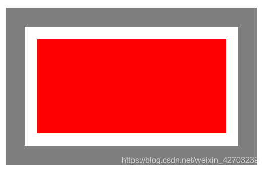
使用 content-box 可以看到,border和content内容部分之间有了空白区域,这个区域就是padding,背景不会进入这个区域。
这个属性不仅适用于背景颜色,背景图也同理。
根据caniuse.com 的统计,background-clip 支持ie9+的浏览器,所以放心大胆的使用吧。至于IE8,让它go die~


 2452
2452


 被折叠的 条评论
为什么被折叠?
被折叠的 条评论
为什么被折叠?
 到【灌水乐园】发言


