


 文章讲述了如何使用Echarts库创建一个柱状图,其中包含按月度和年份划分的y轴,以及如何处理最后一列的年份数据,同时解释了x轴偏移设置的必要性以保持数据对齐
echarts柱状折线图 前几项是按月计算,最后一列是年份这种情况如何实现呢?
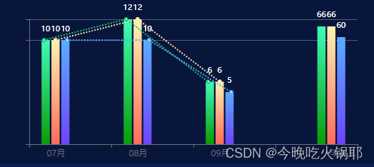
如下图
或者
代码如下:
图一代码:
<e-charts :option="option5" class="chart7"></e-charts>
const option5 =  {
        tooltip: {
            trigger: 'none'
        },
        lengend : {
            show: false
        },
        yAxis: [
            {
                type: 'value',
                show: true,
                id: '0',
                interval: 10,
                splitLine: {
                    lineStyle: {
                        color: 'rgba(255,255,255,.3)',
                    }
                },
                axisLabel: {
                    show: false
                },
            },//y轴一 对应月份y轴
            {
                type: 'value',
                show: false,
                id: '1'
            }, //y轴二 对应年份y轴
            {
                type: 'value',
                show: false,
                id: '2'
            } //y轴三 对应折线图y轴
        ],
        xAxis: [
        {
            type: 'category',
            data: monthData, // ['7月','8月','9月','今年']
            axisLabel: {
                padding: [0,0,0,40],
                formatter: (() => {
                    return (value, index) => {
                        const isLast = value === '今年'
                        const label = isLast? `{a|${value}}` : `{b|${value}}`
                        return label
                        }})(),
                rich: {
                    a: {
                        padding: [0,0,0,20],
                        align: 'right',
                    },
                    b: {
                        padding: [0,0,0,-80],
                    }
                }
            },
            axisTick: {
                alignWithLabel: false
            } //x轴这样设置是因为数据单个对应,设置位置偏移对应x轴的文字 不然会整体看着往左边偏了
        }
        ],
        grid: {
            top: 30,
            bottom: 30,
            right: 50,
            left: 50,
        },
        series: [
            {
                type: 'bar',
                name: '受理',
                data: SLData1, // data 格式为  ['7月数据','8月数据','9月数据','']  最后一项固定为空
                barMaxWidth: '10%',
                itemStyle: {
                    color: new echarts.graphic.LinearGradient(0, 0, 0, 1, [
                        { offset: 0, color: 'rgba(63, 252, 185, 1)' },
                        { offset: 1, color: 'rgba(9, 157, 5, 1)' }
                    ])
                },
                label: {
                    position: 'top',
                    distance: 10,
                    show: true,
                    fontSize: '11',
                    color: '#fff'
                }
            },
            {
                type: 'bar',
                name: '设置',
                data: SZData1,  // data 格式为  ['7月数据','8月数据','9月数据','']  最后一项固定为空
                barMaxWidth: '10%',
                itemStyle: {
                    color: new echarts.graphic.LinearGradient(0, 0, 0, 1, [
                        { offset: 0, color: 'rgba(255, 242, 178, 1)' },
                        { offset: 1, color: 'rgba(255, 107, 90, 1)' }
                    ])
                },
                label: {
                    position: 'top',
                    distance: 10,
                    show: true,
                    fontSize: '11',
                    color: '#fff'
                }
            },
            {
                type: 'bar',
                name: '139',
                data: OTData1,  // data 格式为  ['7月数据','8月数据','9月数据','']  最后一项固定为空
                barMaxWidth: '10%',
                itemStyle: {
                    color: new echarts.graphic.LinearGradient(0, 0, 0, 1, [
                        { offset: 0, color: 'rgba(90, 172, 255, 1)' },
                        { offset: 1, color: 'rgba(110, 68, 255, 1)' }
                    ])
                },
                label: {
                    position: 'top',
                    distance: 10,
                    show: true,
                    fontSize: '11',
                    color: '#fff'
                }
            },
             {
                type: 'bar',
                data: SLData, // data 格式为  ['','','','今年数据']  前三项固定为空
                name: '受理',
                barMaxWidth: '10%',
                yAxisIndex: '2',
                itemStyle: {
                    color: new echarts.graphic.LinearGradient(0, 0, 0, 1, [
                        { offset: 0, color: 'rgba(63, 252, 185, 1)' },
                        { offset: 1, color: 'rgba(9, 157, 5, 1)' }
                    ])
                },
                label: {
                    position: 'top',
                    distance: 10,
                    show: true,
                    fontSize: '11',
                    color: '#fff'
                }
            },
            {
                type: 'bar',
                data: SZData,   // data 格式为  ['','','','今年数据']  前三项固定为空
                name: '设置',
                barMaxWidth: '10%',
                yAxisIndex: '2',
                itemStyle: {
                    color: new echarts.graphic.LinearGradient(0, 0, 0, 1, [
                    { offset: 0, color: 'rgba(255, 242, 178, 1)' },
                        { offset: 1, color: 'rgba(255, 107, 90, 1)' }
                    ])
                },
                label: {
                    position: 'top',
                    distance: 10,
                    show: true,
                    fontSize: '11',
                    color: '#fff'
                }
            },
            {
                type: 'bar',
                data: OTData,  // data 格式为  ['','','','今年数据']  前三项固定为空
                name: '139',
                barMaxWidth: '10%',
                yAxisIndex: '2',
                itemStyle: {
                    color: new echarts.graphic.LinearGradient(0, 0, 0, 1, [
                        { offset: 0, color: 'rgba(90, 172, 255, 1)' },
                        { offset: 1, color: 'rgba(110, 68, 255, 1)' }
                    ])
                },
                 label: {
                    position: 'top',
                    distance: 10,
                    show: true,
                    fontSize: '11',
                    color: '#fff'
                }
            },
            {
                name: '受理',
                type: 'line',
                yAxisIndex: '1',
                xAxisIndex: '1',
                data: SLData1, // data 格式为  ['7月数据','8月数据','9月数据','']  最后一项固定为空
                lineStyle: {
                    type:'dotted'
                },
                color: 'rgba(28, 191, 124, 1)'
            },
            {
                name: '设置',
                type: 'line',
                yAxisIndex: '1',
                xAxisIndex: '1',
                data: SZData1, // data 格式为  ['7月数据','8月数据','9月数据','']  最后一项固定为空
                lineStyle: {
                    type:'dotted'
                },
                color: 'rgba(252, 228, 168, 1)',

            },
            {
                name: '139',
                type: 'line',
                yAxisIndex: '1',
                xAxisIndex: '1',
                data: OTData1, // data 格式为  ['7月数据','8月数据','9月数据','']  最后一项固定为空
                lineStyle: {
                    type:'dotted'
                },
                color: 'rgba(88, 168, 255, 1)'
            }
        ]
}
// 设置x轴偏移到柱状图正下方
option5.xAxis[1] = {
    type: 'value',
    max: option5.xAxis[0].data.length * 100,
    show: false
}
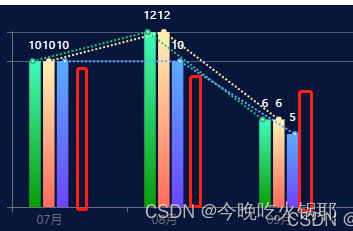
错误的显示如下 红色代表今年 ,就不是最后一列汇总今年的数据了
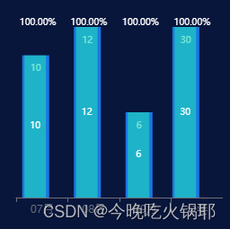
图二代码:
<div class="btm-zhu">
    <e-charts :option="option3" class="chart2"></e-charts>
</div>
const option3 = computed(()=>{
    return {
        tooltip: {
            trigger: 'none'
        },
        color: ['rgba(31, 219, 181, .6)','#1B77E3'],
        yAxis: [
            {
                type: 'value',
                show: false,
                // max: 100,
                id: '0'
            },  //y轴一 对应月份y轴
            {
                type: 'value',
                show: false,
                id: '1'
            }, //y轴二 及年份对应y轴
            {
                type: 'value',
                show: false,
                max: 100,
                id: '2'
            } // y轴三
        ],
        grid: {
            top: 40,
            right: 0,
            x: 10,
            x2: 10,
            y2: 30
        },
        xAxis: {
            type: 'category',
            data: monthData // 此处对应 7月 ,8月, 9月, 今年 (x轴底部单位)
        },
        splitLine: {
            show: true,    // 是否显示分隔线。默认数值轴显示,类目轴不显示
            interval: '0',    // 坐标轴刻度标签的显示间隔,在类目轴中有效.0显示所有
            color: ['#ccc'], //color分隔线颜色,可设置单个颜色,也可设置颜色数组,分隔线会按数组中颜色顺序依次循环设置颜色
            width: 3, // 分隔线线宽
            type: 'solid', // 坐标轴线线的类型(solid实线类型;dashed虚线类型;dotted点状类型)
        },
        label: {
            normal: {
                show: true,
                position: 'top',
                formatter: '本月',
                textStyle: {
                    color: '#fff'
                }
            }
        },
        series: [
            {
                type: 'bar',
                barMaxWidth: '24',
                barGap: '-110%',
                z: 2,
                label: {
                    show: true,
                    fontSize: 10,
                    color: '#fff'
                },
                yAxisIndex: '0',
                data: mdData3  // data中存7 8 9 月数据1
            },
            {
                type: 'bar',
                barMaxWidth: '30',
                z: 1,
                label: {
                    show: true,
                    position: 'top',
                    distance: '-20',
                    fontSize: 10,
                    color: '#fff'
                },
                yAxisIndex: '0',
                data: mdData4 // data中存7 8 9 月数据2
            },
            {
                type: 'bar',
                barMaxWidth: '24',
                barGap: '-110%',
                z: 2,
                label: {
                    show: true,
                    fontSize: 10,
                    color: '#fff'
                },
                tooltip: {
                    show: true
                },
                yAxisIndex: '1',
                data: mdData1 // data中存 今年数据1
            },
            {
                type: 'bar',
                barMaxWidth: '30',
                z: 1,
                label: {
                    show: true,
                    position: 'top',
                    distance: '-20',
                    fontSize: 10,
                    zIndex: 10,
                    color: '#fff'
                },
                yAxisIndex: '1',
                data: mdData2 // data中存今年数据2
            },
            {
                type: 'bar',
                barMaxWidth: '50',
                label: {
                    show: true,
                    position: 'top',
                    distance: '0',
                    fontSize: 10,
                    color: '#fff',
                    formatter: (params)=> {
                        switch (params.dataIndex) {
                            case 0:
                                return ((mdData3[0]/mdData4[0])*100).toFixed(2)+"%";
                            case 1:
                                return ((mdData3[1]/mdData4[1])*100).toFixed(2)+"%";
                            case 2:
                                return ((mdData3[2]/mdData4[2])*100).toFixed(2)+"%";
                            case 3:
                                return ((mdData1[3]/mdData2[3])*100).toFixed(2)+"%"
                        }

                    }

                },
                itemStyle: {
                    color: 'transparent'
                },
                yAxisIndex: '2',
                data: [100,100,100,100], //data存百分比数据  透明的 不然没法显示顶部白色文字占比
            }

        ]
    }
})
主要是靠设置多个y轴及x轴, y轴是为了年份数据不按月份数据为单位,会出现年份数据特别高,月份数据特别矮的情况
x轴则是按所需展示月份进行设置 当label数据特别多时 可以采用重复设置series内数据的方式, 一个label设置为inner
一个设置为outside这种形式 当label在柱状图顶部并且位置一样的时候可以采用设置柱状图为透明底,高度为100%的形式。
解释一下为什么要设置x轴偏移:
是因为 数据和x轴对应情况下,年份数据设置为空 [‘7月数据’,‘8月数据’,‘9月数据’,’ '] echarts 会保留年份数据的空白位置宽度,和x轴对应起来就是歪的
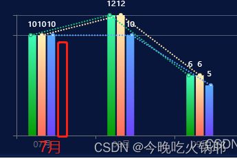
红色年份数据为空字符串 保留位置的情况下 7月会往右偏,所以和7 8 9 月数据对应看起来是往右偏了,所以要设置x轴偏移调回来


 1万+
1万+

 被折叠的 条评论
为什么被折叠?
被折叠的 条评论
为什么被折叠?
 到【灌水乐园】发言


