6款CSS特效边框样式
1.创建一个css文件写入下面代码
button {
    background: none;
    border: 0;
    box-sizing: border-box;
    box-shadow: inset 0 0 0 2px #f45e61;
    color: #f45e61;
    font-size: inherit;
    font-weight: 700;
    margin: 1em;
    padding: 1em 2em;
    text-align: center;
    text-transform: capitalize;
    position: relative;
    vertical-align: middle;
  }
  button::before, button::after {
    box-sizing: border-box;
    content: '';
    position: absolute;
    width: 100%;
    height: 100%;
  }

  .draw {
    -webkit-transition: color 0.25s;
            transition: color 0.25s;
  }
  .draw::before, .draw::after {
    border: 2px solid transparent;
    width: 0;
    height: 0;
  }
  .draw::before {
    top: 0;
    left: 0;
  }
  .draw::after {
    bottom: 0;
    right: 0;
  }
  .draw:hover {
    color: #2415f3;
  }
  .draw:hover::before, .draw:hover::after {
    width: 100%;
    height: 100%;
  }
  .draw:hover::before {
    border-top-color: #2415f3;
    border-right-color: #2415f3;
    -webkit-transition: width 0.25s ease-out, height 0.25s ease-out 0.25s;
            transition: width 0.25s ease-out, height 0.25s ease-out 0.25s;
  }
  .draw:hover::after {
    border-bottom-color: #2415f3;
    border-left-color: #2415f3;
    -webkit-transition: border-color 0s ease-out 0.5s, width 0.25s ease-out 0.5s, height 0.25s ease-out 0.75s;
            transition: border-color 0s ease-out 0.5s, width 0.25s ease-out 0.5s, height 0.25s ease-out 0.75s;
  }

  .meet:hover {
    color: #068b2e;
  }
  .meet::after {
    top: 0;
    left: 0;
  }
  .meet:hover::before {
    border-top-color: #068b2e;
    border-right-color: #068b2e;
  }
  .meet:hover::after {
    border-bottom-color: #068b2e;
    border-left-color: #068b2e;
    -webkit-transition: height 0.25s ease-out, width 0.25s ease-out 0.25s;
            transition: height 0.25s ease-out, width 0.25s ease-out 0.25s;
  }

  .center:hover {
    color: #c40eab;
  }
  .center::before, .center::after {
    top: 0;
    left: 0;
    height: 100%;
    width: 100%;
    -webkit-transform-origin: center;
        -ms-transform-origin: center;
            transform-origin: center;
  }
  .center::before {
    border-top: 2px solid #c40eab;
    border-bottom: 2px solid #c40eab;
    -webkit-transform: scale3d(0, 1, 1);
            transform: scale3d(0, 1, 1);
  }
  .center::after {
    border-left: 2px solid #c40eab;
    border-right: 2px solid #c40eab;
    -webkit-transform: scale3d(1, 0, 1);
            transform: scale3d(1, 0, 1);
  }
  .center:hover::before, .center:hover::after {
    -webkit-transform: scale3d(1, 1, 1);
            transform: scale3d(1, 1, 1);
    -webkit-transition: -webkit-transform 0.5s;
            transition: transform 0.5s;
  }

  .spin {
    width: 6em;
    height: 6em;
    padding: 0;
  }
  .spin:hover {
    color: #0eb7da;
  }
  .spin::before, .spin::after {
    top: 0;
    left: 0;
  }
  .spin::before {
    border: 2px solid transparent;
  }
  .spin:hover::before {
    border-top-color: #0eb7da;
    border-right-color: #0eb7da;
    border-bottom-color: #0eb7da;
    -webkit-transition: border-top-color 0.15s linear, border-right-color 0.15s linear 0.1s, border-bottom-color 0.15s linear 0.2s;
            transition: border-top-color 0.15s linear, border-right-color 0.15s linear 0.1s, border-bottom-color 0.15s linear 0.2s;
  }
  .spin::after {
    border: 0 solid transparent;
  }
  .spin:hover::after {
    border-top: 2px solid #0eb7da;
    border-left-width: 2px;
    border-right-width: 2px;
    -webkit-transform: rotate(270deg);
        -ms-transform: rotate(270deg);
            transform: rotate(270deg);
    -webkit-transition: -webkit-transform 0.4s linear 0s, border-left-width 0s linear 0.35s;
            transition: transform 0.4s linear 0s, border-left-width 0s linear 0.35s;
  }

  .circle {
    border-radius: 100%;
    box-shadow: none;
  }
  .circle::before, .circle::after {
    border-radius: 100%;
  }

  .thick {
    color: #f45e61;
  }
  .thick:hover {
    color: #fff;
    font-weight: 700;
  }
  .thick::before {
    border: 3em solid transparent;
    z-index: -1;
  }
  .thick::after {
    mix-blend-mode: color-dodge;
    z-index: -1;
  }
  .thick:hover::before {
    background: #f45e61;
    border-top-color: #f45e61;
    border-right-color: #f45e61;
    border-bottom-color: #f45e61;
    -webkit-transition: background 0s linear 0.4s, border-top-color 0.15s linear, border-right-color 0.15s linear 0.15s, border-bottom-color 0.15s linear 0.25s;
    transition: background 0s linear 0.4s, border-top-color 0.15s linear, border-right-color 0.15s linear 0.15s, border-bottom-color 0.15s linear 0.25s;
  }
  .thick:hover::after {
    border-top: 3em solid #f45e61;
    border-left-width: 3em;
    border-right-width: 3em;
  }
2.在Html页面引入并使用
<link rel="stylesheet" href="./css/你的css文件名称">
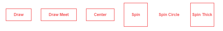
<div class="btn-class">
     <button class="draw">draw</button>
     <button class="draw meet">draw meet</button>
     <button class="center">center</button>
     <button class="spin">spin</button>
     <button class="spin circle">spin circle</button>
     <button class="spin thick">spin thick</button>
</div>
3.接下来在浏览器中打开你就可以看到酷炫的动画了


 1944
1944


 被折叠的 条评论
为什么被折叠?
被折叠的 条评论
为什么被折叠?
 到【灌水乐园】发言


