


css圆形加载中动画
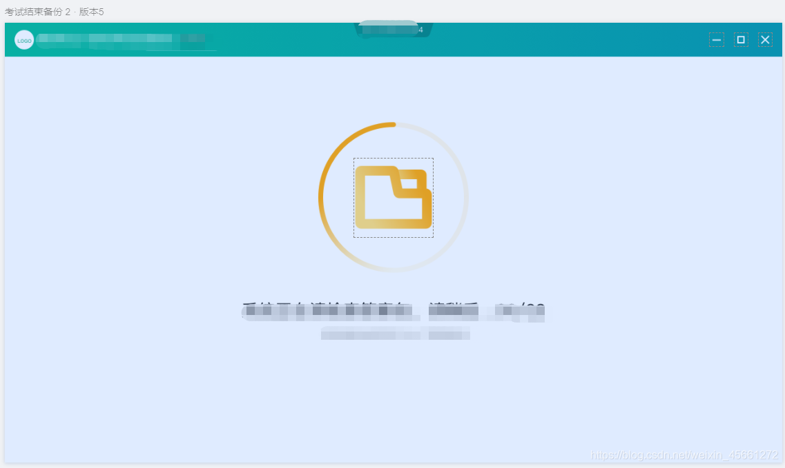
UI设计图效果
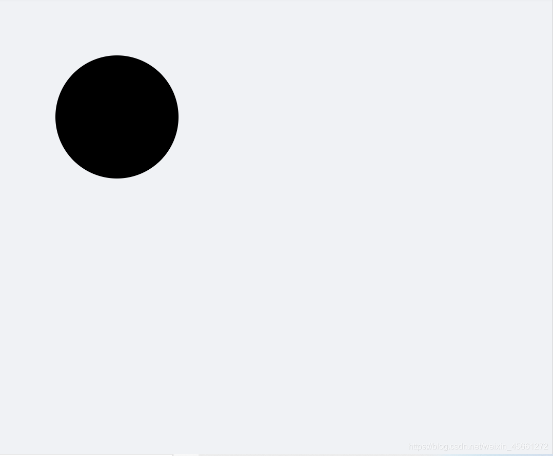
步骤1:画出一个圆
<div class="box"></div>
.box{
  width: 240px;
  height: 240px;
  border-radius: 50%;
  background: black;
  margin: 100px;
}
效果:
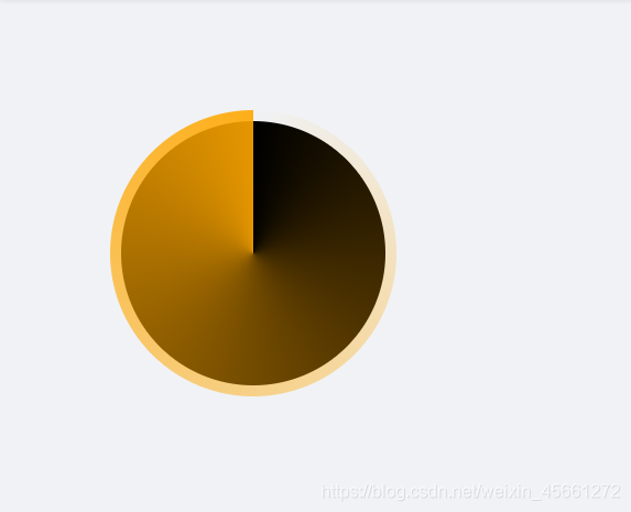
步骤2:画出外层的圆形
  <div class="box">
    <div class="circle"></div>
  </div>
.box{
  position: relative;
  width: 240px;
  height: 240px;
  border-radius: 50%;
  background: black;
  margin: 100px;
}
.circle {
  position: absolute;
  top: -10px;
  bottom: -10px;
  left: -10px;
  right: -10px;
  background: conic-gradient(transparent 0, #ffa700 100%, transparent);
  border-radius: 50%;
}
这里外层的圆 需要靠父级的进行定位 所以我们给父级加上 position: relative;
我们看下效果:
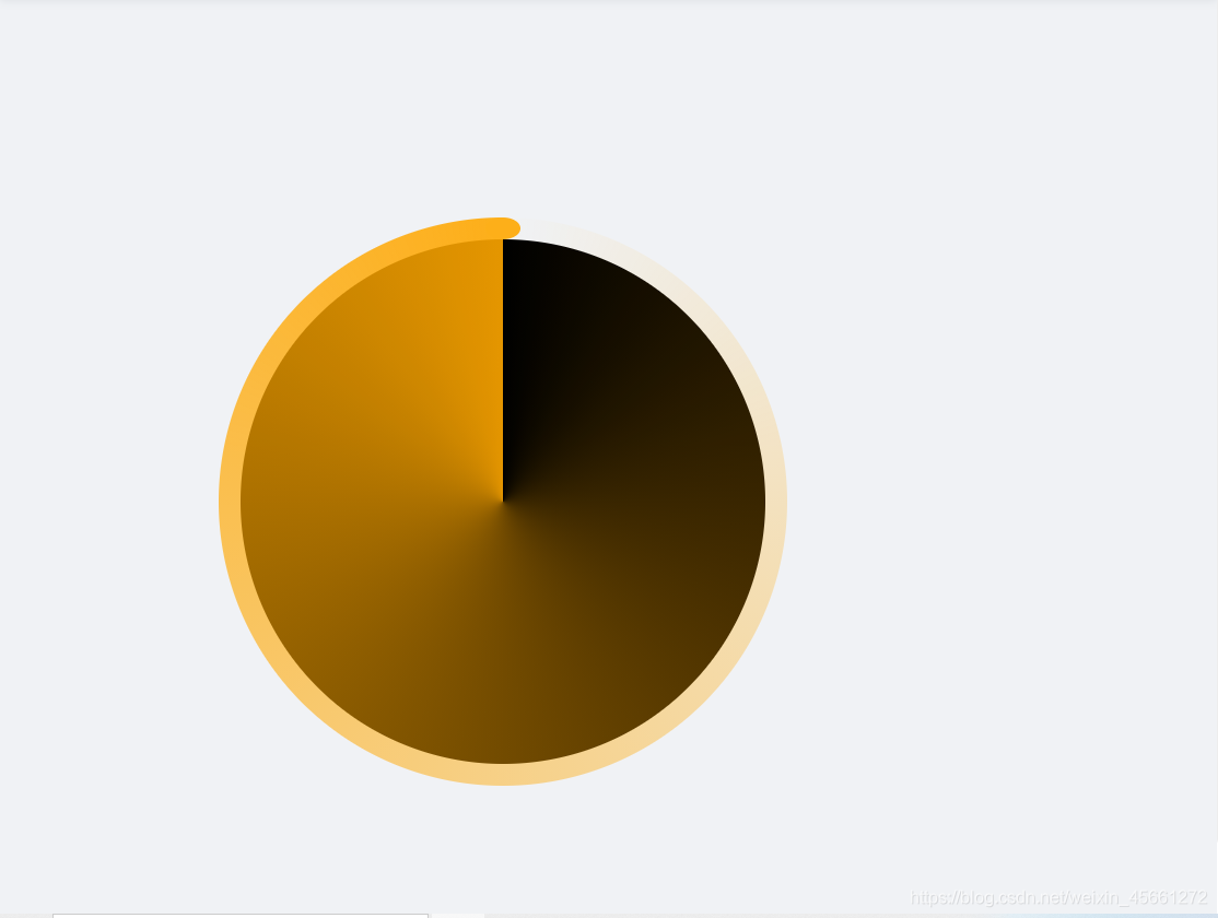
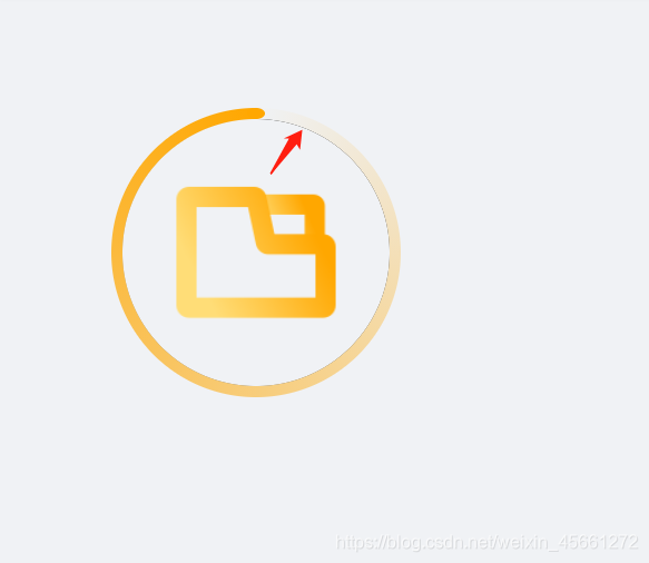
步骤3:头部加上圆角
我们仔细看UI图 发现外层的圆的头部 是带圆角的 所以这里我们加上。
.circle::after {
  content: "";
  width: 16px;
  height: 10px;
  position: absolute;
  top: 3px;
  left: 50%;
  background-color: #333;
  border-radius: 50%;
  background: #ffa700;
  transform: translate(-50%, -3px);
}
看下效果:
步骤4:中间加上icon
  <div class="box">
    <div class="circle"></div>
    <img class="icon" src="@/assets/images/inspect_pic_280.png" alt="" />
  </div>
设置图片宽高并让icon层级在上层
.icon {
  z-index: 10;
  width: 150px;
  height: 150px;
}
我们再给父div加上属性 让图片垂直居中
display: flex;
justify-content: center; // 水平居中
align-items: center; // 垂直居中
.box {
display: flex;
justify-content: center;
align-items: center;
position: relative;
width: 240px;
height: 240px;
border-radius: 50%;
background: black;
margin: 100px;
}
效果:

步骤5:去除中间背景色
.circle::before {
  content: "";
  position: absolute;
  top: 10px;
  bottom: 10px;
  left: 10px;
  right: 10px;
  background-color: #F0F2F5;
  border-radius: 50%;
}
这边我们发现有一条黑线,第一步时为了更加直观所以加上了背景颜色 现在这里我们去掉就好了。
步骤6:旋转动画
@keyframes rotate {
  100% {
    transform: rotate(360deg);
  }
}
再给 外层的圆加上动画
.circle{
  animation: rotate 1s linear infinite;
 }
看下效果基本已经实现了

步骤7:暂停动画
.animation-close {
  animation-play-state: paused;
}
完事,收工!下面是全部代码
<template>
  <div class="box">
    <div :class="['circle', animationShow ? '' : 'animation-close']"></div>
    <img class="icon" src="@/assets/images/inspect_pic_280.png" alt="" />
  </div>
</template>

<script lang="ts">
import { Component, Vue } from "vue-property-decorator";
@Component({
  name: "Loading"
})
export default class extends Vue {
  private animationShow: boolean = true;

  mounted() {
    setTimeout(() => {
      this.animationShow = false;
    }, 5000);
  }
}
</script>

<style lang="scss" scoped>
.box {
  display: flex;
  justify-content: center;
  align-items: center;
  position: relative;
  width: 240px;
  height: 240px;
  border-radius: 50%;
  margin: 100px;
}
.circle {
  position: absolute;
  top: -10px;
  bottom: -10px;
  left: -10px;
  right: -10px;
  background: conic-gradient(transparent 0, #ffa700 100%, transparent);
  border-radius: 50%;
  animation: rotate 1s linear infinite;
}

.icon {
  z-index: 10;
  width: 150px;
  height: 150px;
}

.circle::before {
  content: "";
  position: absolute;
  top: 10px;
  bottom: 10px;
  left: 10px;
  right: 10px;
  background-color: #f0f2f5;
  border-radius: 50%;
}

.circle::after {
  content: "";
  width: 16px;
  height: 10px;
  position: absolute;
  top: 3px;
  left: 50%;
  background-color: #333;
  border-radius: 50%;
  background: #ffa700;
  transform: translate(-50%, -3px);
}

@keyframes rotate {
  100% {
    transform: rotate(360deg);
  }
}

.animation-close {
  animation-play-state: paused;
}
</style>


 239
239


 被折叠的 条评论
为什么被折叠?
被折叠的 条评论
为什么被折叠?
 到【灌水乐园】发言


