


CSS动画:移动端充电效果
1.HTML结构
<body>
    <div class="box">
        <div class="number">21.1%</div>
        <div class="bubble-box">
            <div class="bubble"></div>
            <div class="bubble"></div>
            <div class="bubble"></div>
            <div class="bubble"></div>
            <div class="bubble"></div>
            <div class="circle"></div>
            <div class="bubble-bottom"></div>
            <div class="bubble-shadow"></div>
        </div>
    </div>
</body>
2.less文件(作用是自动生成css)
// 设置vw变量
@vw: 3.75vw;
// 清除浏览器默认的margin和padding
* {
    margin: 0;
    padding: 0;
}
// 充电区域样式
.box {
    width: 100vw;
    height: (500 / @vw);
    position: absolute;
    bottom: 0;
    // background-color: #000;

    // 数字部分
    .number {
        width: (140 / @vw);
        height: (140 / @vw);
        // background-color: green;
        position: absolute;
        left: 50%;
        transform: translate(-50%);
        line-height: (140 / @vw);
        text-align: center;
        font-size: (25 / @vw);
        color: #FFF;
        z-index: 2;
    }
    // 冒泡盒子部分
    .bubble-box {
        position: relative;
        width: 100vw;
        height: (500 / @vw);
        // 设置对比度,配合blur实现元素相融的效果
        filter: contrast(10);
        background-color: #000;
        animation: hueRotate 5s ease-in-out infinite;

        // 盒子颜色动画
        @keyframes hueRotate {
            from {
                // hue-rotate是旋转色相
                filter: contrast(10) hue-rotate(0);
            }
            to {
                filter: contrast(10) hue-rotate(360deg);
            }
        }

        // 圆圈部分
        .circle {
            position: relative;
            width: (140 / @vw);
            height: (140 / @vw);
            background-color: #000;
            margin: 0 auto;
            border-radius: 50%;
            animation: circleRun 5s linear infinite;

            &::before {
                content: '';
                width: (140 / @vw);
                height: (140 / @vw);
                background-color: cyan;
                position: absolute;
                left: 50%;
                top: 0;
                transform: translate(-50%);
                border-radius: 43% 32% 63% 46% / 45%;
                // 高斯模糊,配合contrast可以实现元素相融的效果
                filter: blur(5px);


            }
            &::after {
                content: '';
                position: absolute;
                top: (5 / @vw);
                left: 50%;
                transform: translate(-50%);
                width: (130 / @vw);
                height: (130 / @vw);
                background-color: #000;
                border-radius: 50%;
                // 高斯模糊,配合contrast可以实现元素相融的效果
                filter: blur(5px);
            }
        }
        // 圆圈转动动画
        @keyframes circleRun {
            from{
                transform: rotate(0);
            }
            to {
                transform: rotate(360deg);
            }
        }

        // 泡泡部分
        .bubble {
            background-color: cyan;
            position: absolute;
            border-radius: 50%;
            bottom: (5 / @vw);
            // 高斯模糊,配合contrast可以实现元素相融的效果
            filter: blur(5px);
            animation: bubbleUp 5s ease-in-out infinite;

            &:nth-child(1) {
                width: (18 / @vw);
                height: (18 / @vw);
                left: 50%;
                // bottom: 0;
                // 持续时间
                animation-duration: 5s;
                // 延迟时间
                animation-delay: 0s;

            }
            &:nth-child(2) {
                width: (20 / @vw);
                height: (20 / @vw);
                left: 42%;
                // bottom: 40px;
                // 持续时间
                animation-duration: 4s;
                // 延迟时间
                animation-delay: 1s;
            }
            &:nth-child(3) {
                width: (16 / @vw);
                height: (16 / @vw);
                left: 46%;
                // bottom: 80px;
                // 持续时间
                animation-duration: 3s;
                // 延迟时间
                animation-delay: 2s;
            }
            &:nth-child(4) {
                width: (24 / @vw);
                height: (24 / @vw);
                left: 52%;
                // bottom: 120px;
                // 持续时间
                animation-duration: 3s;
                // 延迟时间
                animation-delay: 3s;
            }
            &:nth-child(5) {
                width: (20 / @vw);
                height: (20 / @vw);
                left: 46%;
                // bottom: 160px;
                // 持续时间
                animation-duration: 3s;
                // 延迟时间
                animation-delay: 4s;
            }
        }
        // 泡泡动画
        @keyframes bubbleUp {
            from {
                bottom: (5 / @vw);

            }
            to {
                bottom: (400 / @vw);
            }
        }


        // 泡泡底座部分
        .bubble-bottom {
            width: (75 / @vw);
            height: (30 / @vw);
            background-color: cyan;
            position: absolute;
            bottom: (5 / @vw);
            left: 50%;
            transform: translate(-50%);
            border-radius: (60 / @vw) (60 / @vw) (30 / @vw) (30 / @vw);
            filter: blur(5px);
        }
        .bubble-shadow {
            width: (75 / @vw);
            height: (2 / @vw);
            background-image: linear-gradient(
                to right,
                transparent,
                #FFF,
                #FFF,
                #FFF,
                transparent
            );
            position: absolute;
            bottom: (2 / @vw);
            left: 50%;
            transform: translate(-50%);
        }
    }
}
3.css文件内容
* {
  margin: 0;
  padding: 0;
}
.box {
  width: 100vw;
  height: 133.33333333vw;
  position: absolute;
  bottom: 0;
}
.box .number {
  width: 37.33333333vw;
  height: 37.33333333vw;
  position: absolute;
  left: 50%;
  transform: translate(-50%);
  line-height: 37.33333333vw;
  text-align: center;
  font-size: 6.66666667vw;
  color: #FFF;
  z-index: 2;
}
.box .bubble-box {
  position: relative;
  width: 100vw;
  height: 133.33333333vw;
  filter: contrast(10);
  background-color: #000;
  animation: hueRotate 5s ease-in-out infinite;
}
@keyframes hueRotate {
  from {
    filter: contrast(10) hue-rotate(0);
  }
  to {
    filter: contrast(10) hue-rotate(360deg);
  }
}
.box .bubble-box .circle {
  position: relative;
  width: 37.33333333vw;
  height: 37.33333333vw;
  background-color: #000;
  margin: 0 auto;
  border-radius: 50%;
  animation: circleRun 5s linear infinite;
}
.box .bubble-box .circle::before {
  content: '';
  width: 37.33333333vw;
  height: 37.33333333vw;
  background-color: cyan;
  position: absolute;
  left: 50%;
  top: 0;
  transform: translate(-50%);
  border-radius: 43% 32% 63% 46% / 45%;
  filter: blur(5px);
}
.box .bubble-box .circle::after {
  content: '';
  position: absolute;
  top: 1.33333333vw;
  left: 50%;
  transform: translate(-50%);
  width: 34.66666667vw;
  height: 34.66666667vw;
  background-color: #000;
  border-radius: 50%;
  filter: blur(5px);
}
@keyframes circleRun {
  from {
    transform: rotate(0);
  }
  to {
    transform: rotate(360deg);
  }
}
.box .bubble-box .bubble {
  background-color: cyan;
  position: absolute;
  border-radius: 50%;
  bottom: 1.33333333vw;
  filter: blur(5px);
  animation: bubbleUp 5s ease-in-out infinite;
}
.box .bubble-box .bubble:nth-child(1) {
  width: 4.8vw;
  height: 4.8vw;
  left: 50%;
  animation-duration: 5s;
  animation-delay: 0s;
}
.box .bubble-box .bubble:nth-child(2) {
  width: 5.33333333vw;
  height: 5.33333333vw;
  left: 42%;
  animation-duration: 4s;
  animation-delay: 1s;
}
.box .bubble-box .bubble:nth-child(3) {
  width: 4.26666667vw;
  height: 4.26666667vw;
  left: 46%;
  animation-duration: 3s;
  animation-delay: 2s;
}
.box .bubble-box .bubble:nth-child(4) {
  width: 6.4vw;
  height: 6.4vw;
  left: 52%;
  animation-duration: 3s;
  animation-delay: 3s;
}
.box .bubble-box .bubble:nth-child(5) {
  width: 5.33333333vw;
  height: 5.33333333vw;
  left: 46%;
  animation-duration: 3s;
  animation-delay: 4s;
}
@keyframes bubbleUp {
  from {
    bottom: 1.33333333vw;
  }
  to {
    bottom: 106.66666667vw;
  }
}
.box .bubble-box .bubble-bottom {
  width: 20vw;
  height: 8vw;
  background-color: cyan;
  position: absolute;
  bottom: 1.33333333vw;
  left: 50%;
  transform: translate(-50%);
  border-radius: 16vw 16vw 8vw 8vw;
  filter: blur(5px);
}
.box .bubble-box .bubble-shadow {
  width: 20vw;
  height: 0.53333333vw;
  background-image: linear-gradient(to right, transparent, #FFF, #FFF, #FFF, transparent);
  position: absolute;
  bottom: 0.53333333vw;
  left: 50%;
  transform: translate(-50%);
}
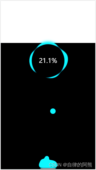
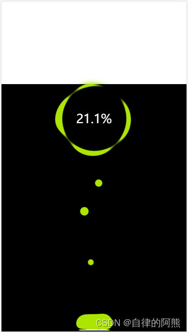
4.实现效果


 4980
4980


 被折叠的 条评论
为什么被折叠?
被折叠的 条评论
为什么被折叠?
 到【灌水乐园】发言


