


效果图

微信小程序动画
-
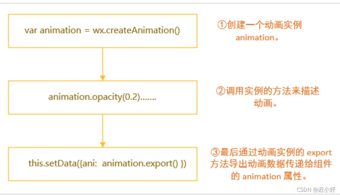
创建一个动画实例 animation
-
调用实例的方法来描述动画
-
最后通过动画实例的 export 方法导出动画数据传递给组件的 animation 属性
-
简单介绍一下例子中的几个参数和方法(其他的详见官方文档):
下面展示一些内联代码片。
    timingFunction: “运动”的方式,例子中的 'ease'代表动画以低速开始,然后加快,在结束前变慢
    delay: 多久后动画开始运行
    opacity(0.2) 慢慢变透明
    translate(100, -100) 向X轴移动100的同时向Y轴移动-100
    step(): 一组动画完成,例如想让上例中的HelloWorld向右上方移动并变透明后,再次向左移动50可以继续写 animation.translateX( -50).step() , 作用就是向右上方移动和变透明是同时进行, 这两种变化完成之后才会进行向左运行的一步。
搭建结构
<view class="">
    <view class="compound">
        <!-- 标题 -->
        <view class="title">开奖啦,瓜分100万</view>
        <!-- 动画盒子 -->
        <view class="box">
            <view class="circle" animation="{{animationData1}}"></view>
                 <view class="nums" animation="{{animationData2}}">
                <view class="num1">1</view>
                <view class="num2">2</view>
                <view class="num3">3</view>
                <view class="num4">4</view>
                <view class="num5">5</view>
            </view>
            <view class="center" bindtap="rotateFn">
                <image src="https://static.sprucesmart.com/hc.png"></image>
            </view>
        </view>
        <!-- 卡片 -->
        <view class="open" animation="{{animationData3}}" >
            <image src="https://i.loli.net/2021/09/15/rHTaZQhmlk36zFi.png"></image>
        </view>
    </view>
</view>
样式
    position: absolute;
    top: 0;
    left: 0;
    bottom: 0;
    right: 0;
    background: rgba(0, 0, 0, 0.9);

    .title {
        margin: 0 auto;
        text-align: center;
        height: 90rpx;
        font-size: 64rpx;
        font-family: PingFangSC-Semibold;
        font-weight: 600;
        color: rgba(255, 255, 255, 1);
        line-height: 90rpx;
        background: linear-gradient(180deg, rgba(255, 255, 255, 1) 0%, rgba(255, 238, 174, 1) 100%);
        -webkit-background-clip: text;
        -webkit-text-fill-color: transparent;
        padding-top: 110rpx;
        padding-bottom: 60rpx;
    }

    .box {
        width: 100%;
        height: 750rpx;
        position: relative;
        overflow: hidden;

        .circle {
            position: absolute;
            top: 50%;
            left: 50%;
            width: 540rpx;
            height: 540rpx;
            margin-left: -270rpx;
            margin-top: -270rpx;
            border-radius: 50%;
            box-sizing: border-box;
            border: 4px solid rgba(220, 220, 220, 1);
        }

        .nums {
            position: absolute;
            top: 0;
            left: 0;
            bottom: 0;
            right: 0;

            &>view {
                position: absolute;
                top: 50%;
                left: 50%;
                display: block;
                width: 172rpx;
                height: 172rpx;
                margin-left: -86rpx;
                margin-top: -86rpx;
                background: #FF6347;
                border-radius: 50%;
                line-height: 172rpx;
                text-align: center;
                color: #ffffff;
                font-size: 60rpx;
                font-weight: bold;
            }

            &>.num1 {
                transform: translate(0, -280rpx); // R=280
            }

            &>.num2 {
                transform: translate(266rpx, -87rpx); // R*cos(18), -R*sin(18)
            }

            &>.num3 {
                transform: translate(165rpx, 226rpx); // R*sin(36), R*cos(36)
            }

            &>.num4 {
                transform: translate(-165rpx, 226rpx); // 与3对称
            }

            &>.num5 {
                transform: translate(-266rpx, -87rpx); // 与5对称
            }
        }

        .center {
            position: absolute;
            top: 50%;
            left: 50%;
            width: 358rpx;
            height: 358rpx;
            margin-left: -179rpx;
            margin-top: -179rpx;

            &>image {
                display: block;
                width: 100%;
                height: 100%;
            }
        }
    }

    .open {
        position: absolute;
        top: 50%;
        left: 50%;
        width: 490rpx;
        height: 700rpx;
        margin-top: -350rpx;
        margin-left: -245rpx;
        overflow: hidden;

        &>image {
            display: block;
            width: 100%;
            height: 100%;
        }
    }
}
js
Page({

  /**
   * 页面的初始数据
   */
  data: {
    animationData1: {},    // 圆环
    animationData2: {},   //五张卡片
    animationData3: {},   //合成的卡片
    status:0
  },

  /**
   * 生命周期函数--监听页面加载
   */
  onLoad: function (options) {

  },

  /**
   * 生命周期函数--监听页面初次渲染完成
   */
  onReady: function () {

  },

  /**
   * 生命周期函数--监听页面显示
   */
  onShow: function () {
    this.animation1 = wx.createAnimation({ timingFunction: 'ease', duration: 50 })
    this.animation2 = wx.createAnimation({ timingFunction: 'ease', duration: 50 })
    this.animation3 = wx.createAnimation({ timingFunction: 'ease', duration: 50 })

    // 初始化
    this.animation1.opacity(0.2).step()
    this.animation3.scale(0).step()
    // 导出动画栈
    this.setData({
      animationData1: this.animation1.export(),
      animationData2: this.animation2.export(),
      animationData3: this.animation3.export()
    })


  },
  // 点击“立即合成”
  rotateFn() {
    this.animation1 = wx.createAnimation({
      duration: 600,
      timingFunction: 'linear',
    })
    this.animation2 = wx.createAnimation({
      duration: 600,
      timingFunction: 'linear',
    })
    this.animation3 = wx.createAnimation({
      duration: 600,
      timingFunction: 'linear',
    })
    this.animation1.opacity(1).step()  //圆环 变亮
    this.animation1.scale(0.1).step({ duration: 2000, delay: 2900 })  //2900后缩小

    this.animation2.rotate(360).step({ duration: 3000 })  //旋转
    this.animation2.scale(0.1).step({ duration: 2000 })   //缩小

    this.animation3.scale(1.2).step({ duration: 1000, delay: 4000 })  //4000后放大
    this.animation3.scale(1).step({ duration: 300 })  //变正常
      // 导出动画栈
      this.setData({
        animationData1: this.animation1.export(),
        animationData2: this.animation2.export(),
        animationData3: this.animation3.export(),

      })

  },

  /**
   * 生命周期函数--监听页面隐藏
   */
  onHide: function () {

  },

  /**
   * 生命周期函数--监听页面卸载
   */
  onUnload: function () {

  },

  /**
   * 页面相关事件处理函数--监听用户下拉动作
   */
  onPullDownRefresh: function () {

  },

  /**
   * 页面上拉触底事件的处理函数
   */
  onReachBottom: function () {

  },

  /**
   * 用户点击右上角分享
   */
  onShareAppMessage: function () {

  }
})


 1101
1101


 被折叠的 条评论
为什么被折叠?
被折叠的 条评论
为什么被折叠?
 到【灌水乐园】发言


