


  mounted() {
    this.$nextTick(() => {
      window.addEventListener("resize", () => { // 监听浏览器窗口大小改变
        // 浏览器变化执行动作
      });
    });
  },
// 方法
detectZoom() {
let ratio = 0
const screen = window.screen
const ua = navigator.userAgent.toLowerCase()
if (window.devicePixelRatio !== undefined) {
ratio = window.devicePixelRatio
} else if (~ua.indexOf('msie')) {
if (screen.deviceXDPI && screen.logicalXDPI) {
ratio = screen.deviceXDPI / screen.logicalXDPI
}
} else if (window.outerWidth !== undefined && window.innerWidth !== undefined) {
ratio = window.outerWidth / window.innerWidth
}
if (ratio) {
ratio = Math.round(ratio * 100)
}
return ratio
},效果:
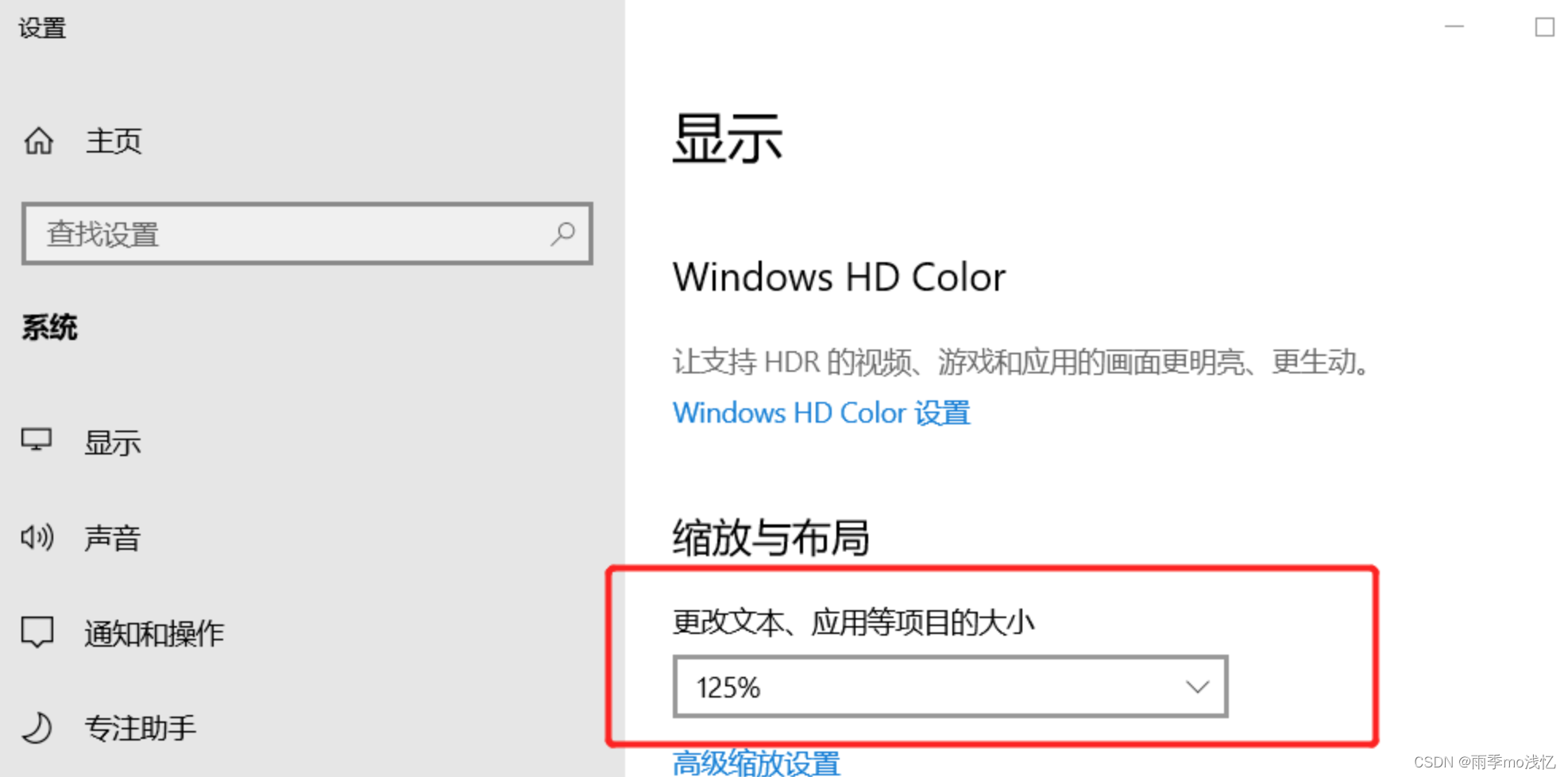
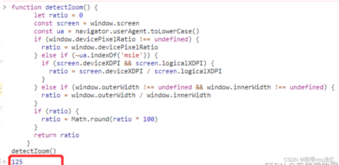
上面这个 125 就是电脑设置的缩放率 125
注意在这个方法也会包括浏览器的缩放率
Vue 自适应浏览器缩放百分比
1、首先新建一个 js 文件,这里就叫做:devicePixelRatio.js,把下面的代码复制到这个 js 文件里 :
class DevicePixelRatio {
    constructor() {
           // this.flag = false;
        }
        // 获取系统类型
    _getSystem() {
            let flag = false;
            var agent = navigator.userAgent.toLowerCase();
            //		var isMac = /macintosh|mac os x/i.test(navigator.userAgent);
            //		if(isMac) {
            //			return false;
            //		}
            // 现只针对 windows 处理,其它系统暂无该情况,如有,继续在此添加
            if (agent.indexOf("windows") >= 0) {
                return true;
            }
        }
        // 获取页面缩放比例
        //	_getDevicePixelRatio() {
        //		let t = this;
        //	}
        // 监听方法兼容写法
    _addHandler(element, type, handler) {
            if (element.addEventListener) {
                element.addEventListener(type, handler, false);
            } else if (element.attachEvent) {
                element.attachEvent("on" + type, handler);
            } else {
                element["on" + type] = handler;
            }
        }
        // 校正浏览器缩放比例
    _correct() {
            let t = this;
            // 页面 devicePixelRatio(设备像素比例)变化后,计算页面 body 标签 zoom 修改其大小,来抵消 devicePixelRatio 带来的变化。
            document.getElementsByTagName('body')[0].style.zoom = 1 / window.devicePixelRatio;
        }
        // 监听页面缩放
    _watch() {
            let t = this;
            t._addHandler(window, 'resize', function() { // 注意这个方法是解决全局有两个window.resize
                // 重新校正
                t._correct()
            })
        }
        // 初始化页面比例
    init() {
        let t = this;
        if (t._getSystem()) { // 判断设备,目前只在 windows 系统下校正浏览器缩放比例
            // 初始化页面校正浏览器缩放比例
            t._correct();
            // 开启监听页面缩放
            t._watch();
        }
    }
}
export default DevicePixelRatio;
2、接下来就是引用了,可以在 App.vue 里全局引用,也可以在页面单独引用
<script>
import DevicePixelRatio from './devicePixelRatio';
export default {
  name: "App",
  created() {
    new DevicePixelRatio().init();
	}
};
</script>
这样就可以达到自适应的效果,但是有一个问题,比如缩放到 125% 或者 150% 是把下面的一部分剪掉了,如果不想被剪掉就要获取缩放的百分比,然后设置给最外层的高度,比如缩放 125% 就设置 height: 125vh 。
3、获取页面缩放百分比
mounted () {
    window.onresize = () => {
      return (() => {
        this.detectZoom()
      })()
    };
  },
methods:{ detectZoom (){ var ratio = 0, screen = window.screen, ua = navigator.userAgent.toLowerCase(); if (window.devicePixelRatio !== undefined) { ratio = window.devicePixelRatio; } else if (~ua.indexOf('msie')) { if (screen.deviceXDPI && screen.logicalXDPI) { ratio = screen.deviceXDPI / screen.logicalXDPI; } } else if (window.outerWidth !== undefined && window.innerWidth !== undefined) { ratio = window.outerWidth / window.innerWidth; } if (ratio){ ratio = Math.round(ratio * 100); } // ratio 就是获取到的百分比 console.log(ratio) this.onresize_height = ratio // return ratio; }, }
项目真实使用案例 :
edit 编辑页面的头部图片会因浏览器放大而产生右侧有留白的情况 :
可能的原因是下面内容的宽度超出了正常的 100%
解决 :
src / views / edit / index.vue 文件
代码 :
<template>
  <div>
    <public-header :ratio="ratio">
      <!-- content . . . -->
    </public-header>
  </div>
</template>

<script>
import publicHeader from "@/components/common/publicHeader.vue"; // 公共头部组件
export default {
  name: "designer",

  data() {
    return {
      ratio: 100, // 浏览器默认缩放比例
    };
  },

  components: {
    publicHeader, // 公共头部组件
  },

  mounted() {
    // 监听浏览器缩放并控制公共头部组件的宽度
    this.$nextTick(() => {
      window.addEventListener("resize", () => { // 监听浏览器窗口大小改变
        // 浏览器变化执行动作
        this.detectZoom();
      });
    });
  },

  methods: {
    // Vue 监听获取缩放比例的方法
    detectZoom() {
      // let ratio = 0
      const screen = window.screen;
      const ua = navigator.userAgent.toLowerCase();
      if (window.devicePixelRatio !== undefined) {
        this.ratio = window.devicePixelRatio;
      } else if (~ua.indexOf("msie")) {
        if (screen.deviceXDPI && screen.logicalXDPI) {
          this.ratio = screen.deviceXDPI / screen.logicalXDPI;
        }
      } else if (
        window.outerWidth !== undefined &&
        window.innerWidth !== undefined
      ) {
        this.ratio = window.outerWidth / window.innerWidth;
      }

      if (this.ratio) {
        this.ratio = Math.round(this.ratio * 100);
      }
      return this.ratio;
    },
  },
};
</script>

<style lang="scss" scoped>
</style>
src / components / common / publicHeader.vue 文件
<template>
  <div>
    <div class="header" :style="{width: ratio >100 ? ratio + '%' : '100%'}">
      <img src="" alt="">
    </div>
    <!-- 放置插槽 -->
    <slot name="content"></slot>
  </div>
</template>

<script>
  export default {
    props: {
      ratio: {
        type: Number,
        default: 100,
      }
    }
  }
</script>

<style lang="scss" scoped>

</style>


 1253
1253


 被折叠的 条评论
为什么被折叠?
被折叠的 条评论
为什么被折叠?
 到【灌水乐园】发言


