


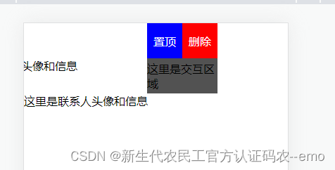
 该代码示例展示了如何使用HTML、CSS和JavaScript实现一个滑动展开的侧边栏交互效果。当用户在联系人列表项上滑动时,右侧的控制按钮(如“置顶”和“删除”)会滑入视图,滑动超过一定距离则会完全展开,反之则收起。
<!DOCTYPE html>
<html lang="en">
<head>
<meta charset="UTF-8">
<meta http-equiv="X-UA-Compatible" content="IE=edge">
<meta name="viewport" content="width=device-width, initial-scale=1.0">
<title>Document</title>
<style>
* {
margin: 0;
padding: 0;
list-style: none;
box-sizing: border-box;
}
.contact-list {
padding: 0;
margin: 0;
list-style: none;
}
.contact-item {
position: relative;
height: 50px;
overflow: hidden;
}
.wrapper {
position: relative;
height: 100%;
/* padding: 10px; */
background-color: #fff;
box-shadow: 0 1px 2px rgba(0, 0, 0, 0.1);
transition: all 0.3s ease;
transform: translateX(0);
}
.left {
float: left;
width: calc(100% - 100px);
overflow: hidden;
}
.left img {
display: block;
width: 50px;
height: 50px;
margin-right: 10px;
border-radius: 50%;
float: left;
}
.left .name {
margin-top: 10px;
font-size: 18px;
font-weight: bold;
white-space: nowrap;
overflow: hidden;
text-overflow: ellipsis;
}
.left .recent-msg {
margin-top: 5px;
font-size: 14px;
white-space: nowrap;
overflow: hidden;
text-overflow: ellipsis;
}
.right {
position: absolute;
top: 0;
right: 0;
width: 100px;
height: 100%;
background-color: #525252;
transition: all 0.3s ease;
transform: translateX(100%);
display: flex;
align-items: center;
justify-content: center;
}
.right button {
display: block;
width: 100%;
height: 100%;
background-color: transparent;
border: none;
color: #fff;
font-size: 16px;
transition: all 0.3s ease;
}
.right button:first-child {
/* border-bottom: 1px solid #3e3e3e; */
color: white;
background: blue;
}
.right button:last-child {
/* border-bottom: 1px solid #3e3e3e; */
color: white;
background: red;
}
.right button:hover {
background-color: rgba(255, 255, 255, 0.1);
}
.right.open {
transform: translateX(0);
}
.wrapper.open {
transform: translateX(-100px);
}
</style>
</head>
<body>
<ul class="contact-list">
<li class="contact-item">
<div class="wrapper">
<div class="left">
<img src="./images/爱好推荐-活动.png" alt="">
<div class="name">
你好
</div>
</div>
<div class="right">
<button>置顶</button>
<button>删除</button>
</div>
</div>
</li>
<li class="contact-item">
<div class="wrapper">
<div class="left">这里是联系人头像和信息</div>
<div class="right">这里是交互区域</div>
</div>
</li>
<li class="contact-item">
<div class="wrapper">
<div class="left">这里是联系人头像和信息</div>
<div class="right">这里是交互区域</div>
</div>
</li>
</ul>
<script>
var items = document.querySelectorAll('.contact-item');
for (var i = 0; i < items.length; i++) {
items[i].addEventListener('touchstart', touchStart);
items[i].addEventListener('touchmove', touchMove);
items[i].addEventListener('touchend', touchEnd);
}
var startX, startY, currentX, currentY;
function touchStart(event) {
startX = event.touches[0].clientX;
startY = event.touches[0].clientY;
currentX = startX;
currentY = startY;
}
function touchMove(event) {
currentX = event.touches[0].clientX;
currentY = event.touches[0].clientY;
if (Math.abs(currentX - startX) > Math.abs(currentY - startY)) {
event.preventDefault();
var touchDiff = currentX - startX;
var wrapper = this.querySelector('.wrapper');
var right = this.querySelector('.right');
if (touchDiff < 0 && Math.abs(touchDiff) < right.offsetWidth) {
wrapper.style.transform = 'translateX(' + touchDiff + 'px)';
right.classList.add('open');
} else if (touchDiff > 0) {
wrapper.style.transform = 'translateX(0)';
right.classList.remove('open');
}
}
}
function touchEnd(event) {
var touchDiff = currentX - startX;
var wrapper = this.querySelector('.wrapper');
var right = this.querySelector('.right');
if (touchDiff < 0 && Math.abs(touchDiff) < right.offsetWidth / 2) {
wrapper.style.transform = 'translateX(0)';
right.classList.remove('open');
} else if (touchDiff < 0 && Math.abs(touchDiff) >= right.offsetWidth / 2) {
wrapper.style.transform = 'translateX(-' + right.offsetWidth + 'px)';
right.classList.add('open');
} else {
wrapper.style.transform = 'translateX(0)';
right.classList.remove('open');
}
}
</script>
</body>
</html>


 扫一扫
扫一扫


 被折叠的 条评论
为什么被折叠?
被折叠的 条评论
为什么被折叠?
 到【灌水乐园】发言


