


引言
昨天晚上索契冬奥会开幕,开幕式上还出现了五环变四环的乌龙,哈哈。我们用SVG弄个五环动画加以弥补。
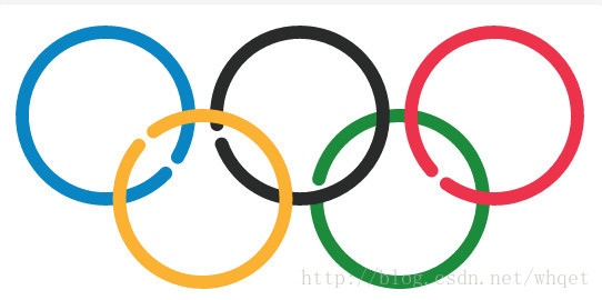
先来看看效果,效果如下图所示。根据大家留言的意见进行了修正,见效果。
效果解析
好的,Let‘s do it.
<svg width="550px" height="300px" class="circle" viewbox="0 0 550 300">
  <path class="blue" d="M 100, 100 m -75, 0 a 75,75 0 1,0 150,0 a 75,75 0 1,0 -150,0 "/>
  <path class="green" d="M 365, 175 m -75, 0 a 75,75 0 1,0 150,0 a 75,75 0 1,0 -150,0 "/>
  <path class="black" d="M 275, 100 m -75, 0 a 75,75 0 1,0 150,0 a 75,75 0 1,0 -150,0 "/>
  <path class="red" d="M 450, 100 m -75, 0 a 75,75 0 1,0 150,0 a 75,75 0 1,0 -150,0 "/>
  <path class="yellow" d="M 187.5, 175 m -75, 0 a 75,75 0 1,0 150,0 a 75,75 0 1,0 -150,0 "/>
</svg>//颜色变量
@blue : #0885C2;
@red : #ED334C;
@yellow : #FBB132;
@green : #1C8b3C;
@black : #292B2A;
//动画持续时间动画
@duration : 3s;
//设置svg居中显示
html, body { height: 100%; }
body {
display: flex;
justify-content: center;
align-items: center;
background: whitesmoke;
margin: 0 1rem;
}
svg {
maxwidth: 100%;
height: auto;
background: white;
box-shadow: 0 1px 4px gainsboro;
border-radius: .5rem;
}
//定义svg五环的绘制属性和动画效果
path {
fill: transparent;
stroke: rgba(0,0,0,.4);
stroke-width: 12;
stroke-dasharray: 465;
stroke-linecap: round;
stroke-linejoin: round;
-webkit-animation: load @duration linear infinite;
animation: load @duration linear infinite;
transform-origin: center center;
}
//动画关键帧
@keyframes load {
from{stroke-dashoffset:480; }
to { stroke-dashoffset: 0; }
}
//五环的颜色
//旋转环以模拟实现异步效果
.blue {
stroke: @blue;
transform: rotate(210deg)
}
.black {
stroke: @black;
transform: rotate(-20deg)
}
.red {
stroke: @red;
transform: rotate(-55deg)
}
.yellow {
stroke: @yellow;
transform: rotate(40deg)
}
.green {
stroke: @green;
}好了,整个效果就是这样。大家可以到我的codepen在线修改、体验,或是下载收藏本效果。
------------------------------------------------------------------------------------------------------------------------
华丽的分分分分分分割线
------------------------------------------------------------------------------------------------------------------------
效果优化
根据大家的意见进行了修正,参照Brian Suda的svg path animation优化了动画操作,做法解析如下。
html部分增加了重播的按钮和每条path的id控制
<button οnclick="rerun();">Again!</button>
<svg id="mySvg"  version="1.1" viewBox="0 0 550 300">
<path id="i0" class="blue"  d="M 100, 100 m -75, 0 a 75,75 0 1,0 150,0 a 75,75 0 1,0 -150,0 "/>
<path id="i1" class="green" d="M 365, 175 m -75, 0 a 75,75 0 1,0 150,0 a 75,75 0 1,0 -150,0"/>
<path id="i2" class="black" d="M 275, 100 m -75, 0 a 75,75 0 1,0 150,0 a 75,75 0 1,0 -150,0 "/>
<path id="i3" class="red" d="M 450, 100 m -75, 0 a 75,75 0 1,0 150,0 a 75,75 0 1,0 -150,0"/>
<path id="i4" class="yellow" d="M 187.5, 175 m -75, 0 a 75,75 0 1,0 150,0 a 75,75 0 1,0 -150,0"/>
</svg>button {
position: absolute;
top: 10px;
right: 5px;
}
path {
fill: transparent;
stroke-width: 12;
stroke-linecap: round;
stroke-linejoin: round;
}
.blue {
stroke: #0885C2;
}
.black {
stroke: #292B2A;
}
.red {
stroke: #ED334C;
}
.yellow {
stroke: #FBB132;
}
.green {
stroke: #1C8b3C
}var current_frame, total_frames, path, length, handle, myobj;
var mysvg=document.getElementById('mySvg');
var init = function() {
current_frame = 0;
total_frames = 60;
path = new Array();
length = new Array();
for(var i=0; i<5;i++){
path[i] = document.getElementById('i'+i);
l = path[i].getTotalLength();
length[i] = l;
path[i].style.strokeDasharray = l + ' ' + l;
path[i].style.strokeDashoffset = l;
}
handle = 0;
}
var draw = function() {
var progress = current_frame/total_frames;
if (progress > 1) {
window.cancelAnimationFrame(handle);
} else {
current_frame++;
for(var j=0; j<path.length;j++){
path[j].style.strokeDashoffset = Math.floor(length[j] * (1 - progress));
}
handle = window.requestAnimationFrame(draw);
}
};
init();
draw();
var rerun = function() {
var old = document.getElementById('mySvg');
old.parentNode.removeChild(old);
document.getElementsByTagName('body')[0].appendChild(mysvg);
init();
draw();
};That's it. 大家可以到我的codepen在线修改、体验改进后的效果,或是下载收藏本效果。
总结
1.本效果主要利用strokeDashOffset属性的改变实现线绘动画,大家可以参考老外的animated-line-drawing-svg。
2.利用js优化动画,大家可以参考Brian Suda的Animating Vectors with SVG。
3.关于网页里使用svg的情况,大家可以参考Chris Coyier在css-ticiks的Using SVG。
4.SVG动画教程,参阅10 BEST SVG ANIMATION TUTORIAL。
---------------------------------------------------------------
前端开发whqet,关注web前端开发技术,分享网页相关资源。
---------------------------------------------------------------


 2516
2516


 被折叠的 条评论
为什么被折叠?
被折叠的 条评论
为什么被折叠?
 到【灌水乐园】发言


