


关于负margin的原理http://www.cnblogs.com/2050/archive/2012/08/13/2636467.html#2457812(尊重原创)
总结来说就是:1.margin负边距会对文档流产生影响,并且方向为向左或向上;2.左右负边距会改变对象的宽度;3.负边距对脱离文档流的定位有影响。
以下几个应用示例
一、左右列固定,中间列自适应(类似QQ空间的三列布局)
觉得这篇文章写的最为细致:
http://www.cnblogs.com/2050/archive/2012/07/30/2614852.html
<!DOCTYPE html>
<html>
<head>
<meta charset="utf-8" />
<title>宽度自适应布局</title>
<style>
body,div{ margin:0; padding:0;}
div{ height:200px; color:#F00;}
.left{ float:left; width:100px; background:#00f; _margin-right:-3px;}
.right{ float:right; width:100px; background:#0f0; _margin-left:-3px;}<!-- _margin-left:-3px和_margin-right:-3px解决ie6 3px bug -->
.center{ background:#333; margin:0 100px; _margin:0 97px;}<!-- margin:0 100px; 这个是必须的为了保证中间列的子元素的起点为左上角,同时大小应设置为左右两列的宽度 -->
</style>
</head>
<body>
<div class="left">我是left</div>
<div class="right">我是right</div>
<div class="center">我是center</div>
</body>
</html>
二、水平垂直居中(类似登录窗口的弹出,位于浏览器窗口的正中间)
.content{
	width:550px;
	height:400px;
	position:absolute;
	top:50%;
	left:50%;
	margin-left:-275px;
	margin-top:-210px;//.content的 宽和高的一半
	border:1px dashed #333;
	background:#eee;
	-moz-border-radius:5px;
	-webkit-border-radius:5px;
	border-radius:5px;//针对不同浏览器内核的样式
	padding:10px;
}如果只想实现一个方向的居中,则可以只使用left , margin-left 来实现水平居中,使用top , margin-top来实现垂直居中。
三、去除列表右边框
项目中经常会使用浮动列表展示信息,为了美观通常为每个列表之间设置一定的间距(margin-right),当父元素的宽度固定时,每一行的最右端的li元素的右边距就多余了,去除的方法通常是为最右端的li添加class,设置margin-right:0; 这种方法需要动态判断为哪些li元素添加class,麻烦!!!利用负margin就可以实现下面这种效果:
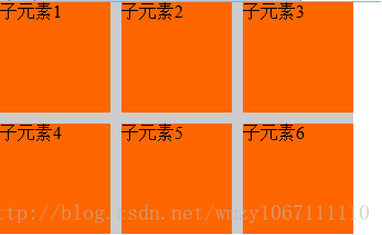
代码如下:
 <div id="test">
        <ul>
            <li>子元素1</li>
            <li>子元素2</li>
            <li>子元素3</li>
            <li>子元素4</li>
            <li>子元素5</li>
            <li>子元素6</li>
        </ul>
    </div>
body,ul,li{ padding:0; margin:0;}
ul,li{ list-style:none;}
#test{
width:320px;
height:210px;
background:#CCC;
}
#test ul{
margin-right:-10px;//将列表右边收回多出来的宽度即可,不能给ul设置宽度
zoom:1;
}
#test ul li{
width:100px;
height:100px;
background:#F60;
margin-right:10px;
margin-bottom:10px;
float:left;
}四、去除列表最后一个li的margin-bottom:1px;的样式
列表中我们经常会添加border-bottom值,最后一个li的border-bottom往往会与外边框重合,视觉上不雅观,往往要移除。
这个原理和(三、去除列表右边框)的原理是一样的
#test li{
        height:25px;
        line-height:25px;
        padding:5px;
        border-bottom:1px dotted #D5D5D5;
        margin-bottom:-1px;
    }
--追加 2013年12月21日
今天在写页面的时候遇到了这个问题,想着用这个办法试验一下,结果发现这个和我想象的不一样,我以为margin-bottom 可以消除最后一个li的border,原来是将他们因为border多出来的1px用-1px给剪掉了,这样的话,对于外面的大边框和里面的li的底边框颜色样式不一致的话,并不会起到预想的效果,因为最后一个li的border-bottom 会和它的父级底边框重叠,so~还是一个人情况而定吧。
五、多列等高(这个我很少用,一般会联想到用ul或者dl,所以没有多想过)
借用:http://www.cnblogs.com/jscode/archive/2012/08/28/2660078.html
此例关键是给每个框设置大的底部内边距,然后用数值相似的负外边距消除这个高度。这会导致每一列溢出容器元素,如果把外包容器的overflow属性设为hidden,列就在最高点被裁切。
<div class="wrapper">
  <div class="box">
    <h1>Andy Budd</h1>
    <p>your content goes here.</p>
    <div class="bottom"></div>
  </div>
  <div class="box">
    <h1>Richard Rutter</h1>
    <p>your content goes here.</p>
    <div class="bottom"></div>
  </div>
  <div class="box">
    <h1>Jeremy Keith</h1>
    <p>your content goes here.</p>
    <div class="bottom"></div>
  </div>
</div>
.wrapper {
overflow:hidden;
width:100%;
position: relative;
}
.box {
width:250px;
margin-left:20px;
float:left;
display:inline;
padding:20px;
padding-bottom:220px;
margin-bottom:-200px;
background:#89ac10 url(img/top.gif) no-repeat left top;
}
.bottom {
position:absolute;
bottom:0;
height:20px;
width:290px;
background:#89ac10 url(img/bottom.gif) no-repeat left bottom;
margin-left:-20px;
}


 349
349


 被折叠的 条评论
为什么被折叠?
被折叠的 条评论
为什么被折叠?
 到【灌水乐园】发言


