


uniapp 制作一个可复用的segmented-control(tab选项卡)
开局一张图,内容全靠编
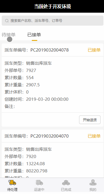
1.开局一张图(先上效果图)
2.内容全靠编
开始编写复用组件:
segmented-control.vue

<template>
  <view id="segmented" class="segmented" :style="{top:stickyTopData+'px'}">
    <view class="line" :style="{transform:'translateX('+offsetLeft+'px)',width:lineWidth+'px'}"></view>
    <view class="segmented-control">
        <view :id="'sc-'+index" :data-index="index" v-for="(item, index) in values" class="segmented-control-item" :key="index" :class="index === current ? 'active' : ''"
            @click="onClick">
            {{item}}
        </view>
    </view>
  </view>

</template>

<script>
export default {
  name: 'segmented-control',
  props: {
    values: { // 要显示的数组
      type: Array,
      default() {
        return [];
      }
    },
    stickyTop:{ // 距离头部多少px将其固定
      type: Number,
      default(){
        return 0;
      }
    },
    current: { // 当前选中第几个
      type: Number,
      default(){
        return 1;
      }
    }
  },
  data() {
    return {
      lineWidth: 0, // 线的宽度
      offsetLeft: 0 // 相对左边的距离
    };
  },
  methods: {
    /**
     * 点击事件
     */
    onClick(e) {
      let index = parseInt(e.mp.target.dataset.index);
      let that = this;
      let id = e.mp.target.id;
      if (that.current !== index) {
        that.$emit('clickItem', index); // 父级组件回调方法
      }
    }
  },
  mounted() {
    let that = this;
    if (that.values) {
      if (that.values && that.values[that.current]) {
        that.lineWidth = 0;
        setTimeout(() => { // 延时获取线的宽度和左边距离
          const query = uni.createSelectorQuery();
          query.select('#sc-' + that.current).boundingClientRect();
          query.exec(res => {
            that.offsetLeft = res[0].left + 16;
            that.lineWidth = res[0].width - 70;
          });
        }, 500);
      }
    }
  },
  computed:{
    stickyTopData:function(){
      return uni.upx2px(this.stickyTop); // 顶部固定显示距离
    }
  },
  watch: {
      current(newValue, oldValue) {
      let that = this;
          setTimeout(() => { // 监听当前选择的item变化,重新计算线的宽和左边的距离
            const query = uni.createSelectorQuery();
            query.select('#sc-' + newValue).boundingClientRect();
            query.exec(res => {
              that.offsetLeft = res[0].left + 16;
              that.lineWidth = res[0].width - 70;
            });
          }, 200);
      }
  },
};
</script>

<style lang="less">
.segmented {
  position: sticky;
}
.segmented-control {
  display: flex;
  background: #ffffff;
  align-items: center;
  padding: 20upx;
  border-bottom: 1px solid #f6f6f6;
  .segmented-control-item {
    width: 178upx;
    font-size: 32upx;
    color: #999;
  }
  .active {
    color: #333;
  }
}
.line {
  height: 6upx;
  border-radius: 3upx;
  background-color: #E5A600;
  position: absolute;
  top: 80upx;
  left: 0;
  transition: all 0.3s;
}
</style>
开始编写父级组件来调用复用组件
list.vue
<template>
  <view>
    <segmented-control
      id="tabbar"
      :values="items"
      :stickyTop="108"
      :current="current"
      @clickItem="onClickItem"
    ></segmented-control>
    <view class="list" id="list">{{ current }}</view>
  </view>
</template>

<script>
import segmentedControl from '@/components/segmented-control';

export default {
  components: {
    segmentedControl
  },
  data() {
    return {
      items: ['已完成', '已拒绝', '已取消'],
      current: 0
    };
  },
  methods: {
    /**
     * 点击segmentedControl 事件回调
     */
    onClickItem(index) {
      if (this.current !== index) {
        this.current = index;
      }
    }
  }
};
</script>

<style lang="less">
@import '../../css/list.less';
</style>
完事了,上图
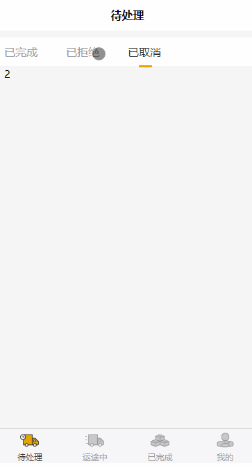
线的宽度、过渡的时间、样式什么的自己调一调,改一改就行了


 2908
2908


 被折叠的 条评论
为什么被折叠?
被折叠的 条评论
为什么被折叠?
 到【灌水乐园】发言


