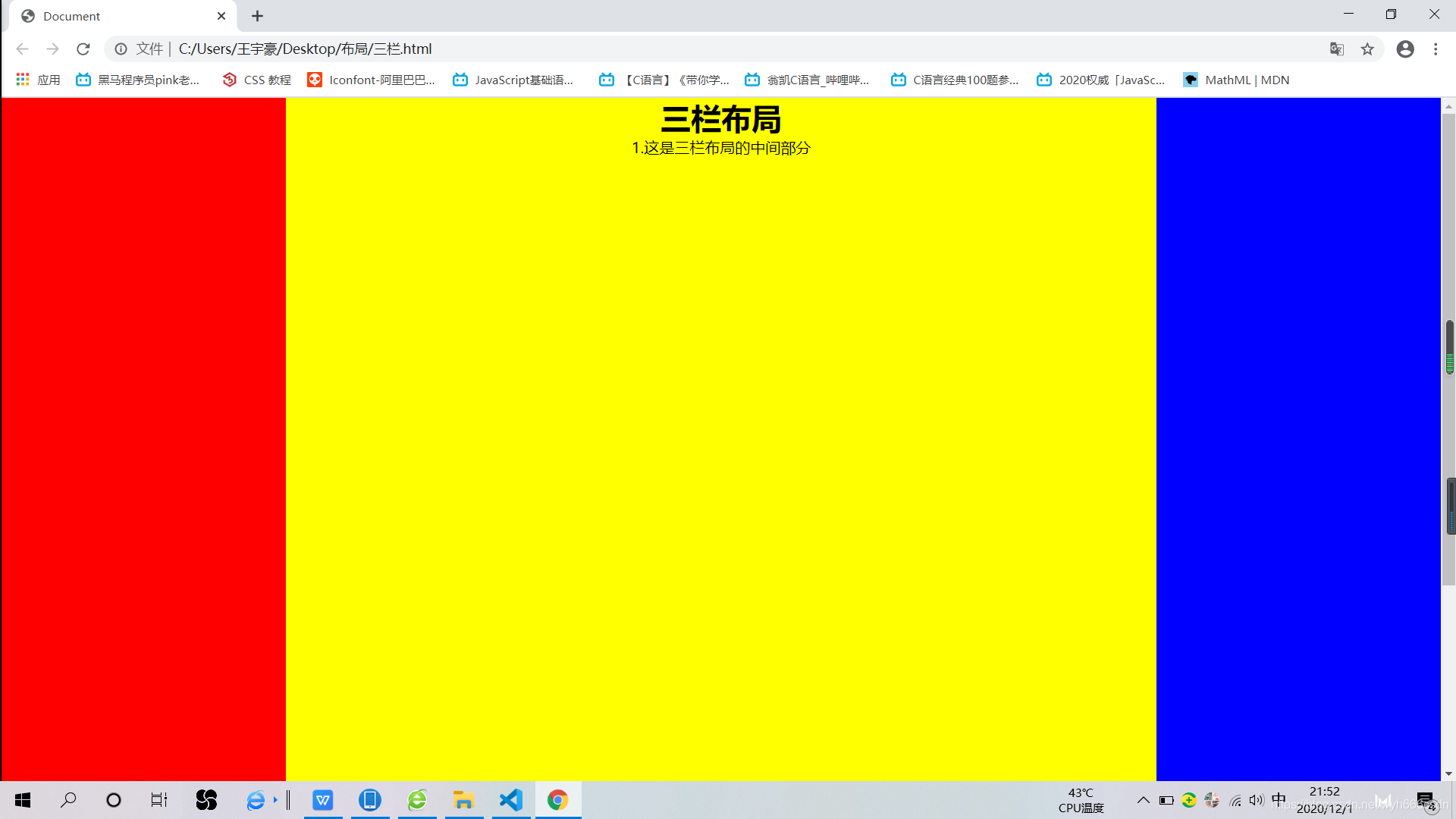
三栏布局flex
<!DOCTYPE html>
<html lang="en">
<head>
<meta charset="UTF-8">
<meta name="viewport" content="width=device-width, initial-scale=1.0">
<title>Document</title>
<style>
* {
margin: 0;
padding: 0;
}
.layout.flexbox .left-center-right {
display: flex;
}
.layout.flexbox .left {
width: 300px;
background: red;
height: 1000px;
}
.layout.flexbox .center {
flex-grow: 1;
background: yellow;
text-align: center;
}
.layout.flexbox .right {
width: 300px;
background: blue;
height: 1000px;
}
</style>
</head>
<body>
<div class="layout flexbox">
<div>
<div class="left"></div>
<div class="center">
<h1>三栏布局</h1>
</div>
<div class="right"></div>
</div>
</div>
</body>
</html>
三栏布局 postion+margin
<!DOCTYPE html>
<html lang="en">

<head>
    <meta charset="UTF-8">
    <meta name="viewport" content="width=device-width, initial-scale=1.0">
    <meta http-equiv="X-UA-Compatible" content="ie=edge">

    <title>Document</title>
    <style>
        * {
            margin: 0;
            padding: 0;
        }

        .main {
            position: relative;
        }

        .left {
            position: absolute;
            top: 0;
            left: 0;
            width: 300px;
            height: 500px;
            background-color: red;
        }

        .right {
            position: absolute;
            top: 0;
            right: 0;
            width: 200px;
            height: 500px;
            background: greenyellow;
        }

        .middle {
            height: 500px;
            background: yellow;
            margin-left: 300px;
            margin-right: 200px;
        }
    </style>
</head>

<body>
    <div class="main">
        <div class="left">我是左边</div>
        <div class="middle">我是中间
            <div style="background: blueviolet; width: 200px;height: 200px;">

            </div>
        </div>
        <div class="right">我是右边</div>
    </div>
</body>

</html>

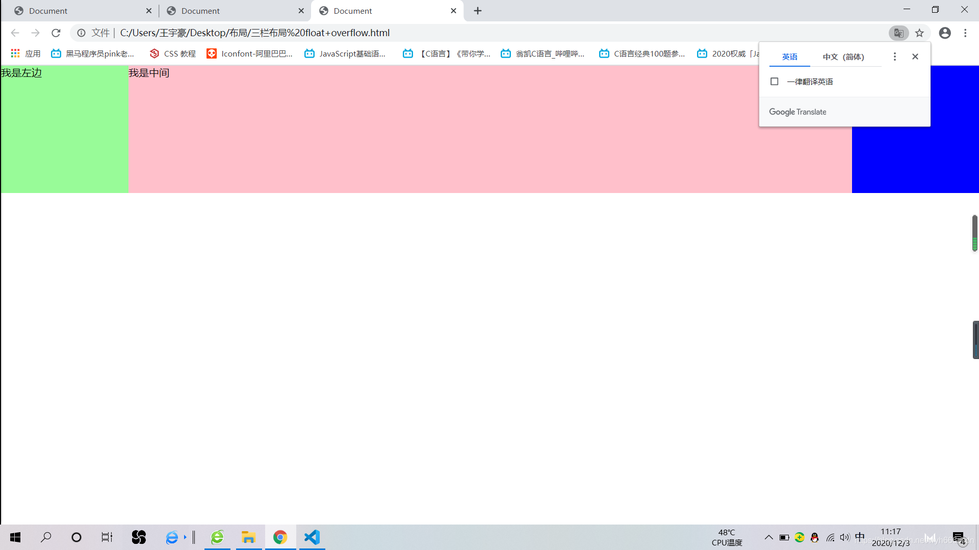
三栏布局 float+overflow(center盒子在最下面,因为浮动不会影响上面的布局)
<!DOCTYPE html>
<html lang="en">

<head>
    <meta charset="UTF-8">
    <meta name="viewport" content="width=device-width, initial-scale=1.0">
    <title>Document</title>
    <style>
        * {
            margin: 0;
            padding: 0;
        }

        .left {
            width: 200px;
            height: 200px;
            background-color: palegreen;
            float: left;
        }

        .right {
            width: 200px;
            height: 200px;
            background-color: blue;
            float: right;

        }

        .middle {
            background-color: pink;
            height: 200px;
            overflow: hidden;
        }
    </style>

</head>

<body>
    <div class="main">
        <div class="left">我是左边</div>
        <div class="right">我是右边</div>
        <div class="middle">我是中间</div>
    </div>

</body>

</html>


 333
333


 被折叠的 条评论
为什么被折叠?
被折叠的 条评论
为什么被折叠?
 到【灌水乐园】发言


