


Pgfplots package
原 文:Pgfplots package
译 者:Xovee
翻译时间:2023年10月30日
文章目录
介绍
pgfplots包基于TikZ,是一个强大的可视化工具,它可以用来创建专业的科学论文配图。你只需要给pgfplots提供数据/公式,它会帮你解决剩下所有的绘制问题。
文档preamble
首先在文档的preamble部分引入pgfplots包:
\usepackage{pgfplots}
在这里,你也可以定制话包的一些配置。例如,改变每个绘图的大小以及设置向后兼容的版本(推荐设置这一点!):
\pgfplotsset{width=10cm,compat=1.9}
上面的命令将绘图的大小设置为10厘米(很大了!)你也可以使用其他的单位,例如pt, mm, in等。compat参数的意思是你提供的代码仅兼容于1.9或者之后的软件版本。
编译时间(简短的背景知识)
在TeX被发明的时候,它并不是用于直接绘制图像。用户使用其他的软件来绘制图像(例如MetaPost),然后将其导入至编译好的TeX文档。pdfTeX的发明使得用户可以直接使用其内置的TeX语言命令(primitives)来创建PDF图像。pdfTeX的出现激发了大量复杂的LaTeX图像绘制包,例如TikZ和pgfplots等。
但是,当我们深入了解pdfTeX引擎的时候(或者其他类似引擎),那些高阶的LaTeX绘图命令需要被处理为低阶的pdfTeX引擎命令,后者再进一步生成PDF代码来绘制图像。这一揽子操作可能会使代码执行时间变的很长。就算只是使用一个高阶LaTeX图形命令和相应的数据,系统也可能会执行一系列重复的低阶TeX引擎命令。从一个用户的角度来看,包含较多pgfplots图像的文档,可能会花费较多的时间去渲染(显示、编译)。
减少编译时间
为了减少文档编译的时间,你可以将pgfplots设置为将图像导出为多个单独的PDF文件,然后将这些文件引入到文档之中(外部化)。也就是说,只需要一次性的绘制编译,就可以重复地使用这些绘图。
代码:
\usepgfplotslibrary{external}
\tikzexternalize
你可以参考这篇文档来获得更多设置tikz-externalization的信息。
基础示例(以及如何对图像进行外部化操作)
\documentclass{article}
\usepackage[margin=0.25in]{geometry}
\usepackage{pgfplots}
\pgfplotsset{width=10cm,compat=1.9}
% We will externalize the figures
\usepgfplotslibrary{external}
\tikzexternalize
\begin{document}
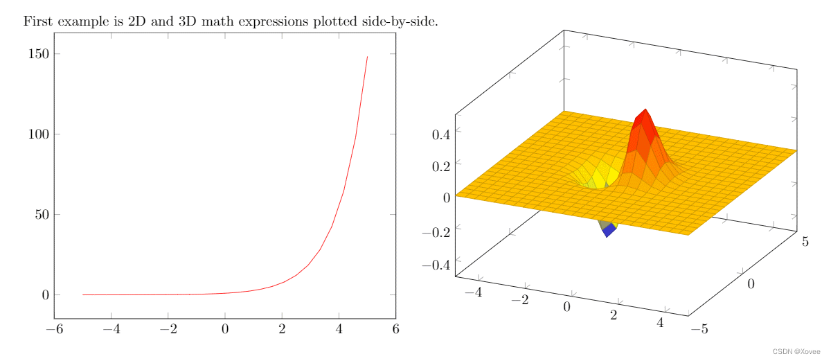
First example is 2D and 3D math expressions plotted side-by-side.
%Here begins the 2D plot
\begin{tikzpicture}
\begin{axis}
\addplot[color=red]{exp(x)};
\end{axis}
\end{tikzpicture}
%Here ends the 2D plot
\hskip 5pt
%Here begins the 3D plot
\begin{tikzpicture}
\begin{axis}
\addplot3[
surf,
]
{exp(-x^2-y^2)*x};
\end{axis}
\end{tikzpicture}
%Here ends the 3D plot
\end{document}
代码解释
因为pgfplots基于tiki,所以代码必须位于tikzpicture环境之中。然后环境\begin{axis}和\end{axis}将会设定图像的缩放比例。文末列出了其他可用的axis环境。
为了绘制一个真实的图像,我们使用了命令\addplot[color=red]{log(x)};。在方括号中我们添加了一些参数,包括将颜色设置为红色(red)。方括号中的参数是强制的,如果我们不打算设置任何参数,那么我们需要在方括号之间输入一个空格。在大括号中,我们输入一个函数来绘制其图像。需要注意的是,这个命令必须由一个分号结束(;)。
如果你要在该图像旁边绘制第二个图像(在同一行),声明一个新的tikzpicture环境。不要插入一个新行,插入一个小的空白间隔,例如\hskip 10pt会在两个图像之间插入10pt大小的空白。
剩下的语法是类似的,除了\addplot3 [surf,]{exp(-x^2-y^2)*x};。这个命令会绘制一个3D图形,参数surf定义了该图形为一个曲面图形(Surface)。绘制图形的函数必须放置在大括号之中。不要忘了添加分号!;
注意:一个好的代码习惯是在\addplot命令的参数之后添加一个逗号(,),这样会让代码更有可读性。
2D绘图
pgfplots的2D绘图命令非常的多——你可以轻松的定制化你的图形。一般来说,在默认的选项下所绘制的图形已经足够美观。
绘制数学公式
下面是一个例子:
\begin{tikzpicture}
\begin{axis}[
    axis lines = left,
    xlabel = \(x\),
    ylabel = {\(f(x)\)},
]
%Below the red parabola is defined
\addplot [
    domain=-10:10,
    samples=100,
    color=red,
]
{x^2 - 2*x - 1};
\addlegendentry{\(x^2 - 2x - 1\)}
%Here the blue parabola is defined
\addplot [
    domain=-10:10,
    samples=100,
    color=blue,
    ]
    {x^2 + 2*x + 1};
\addlegendentry{\(x^2 + 2x + 1\)}

\end{axis}
\end{tikzpicture}
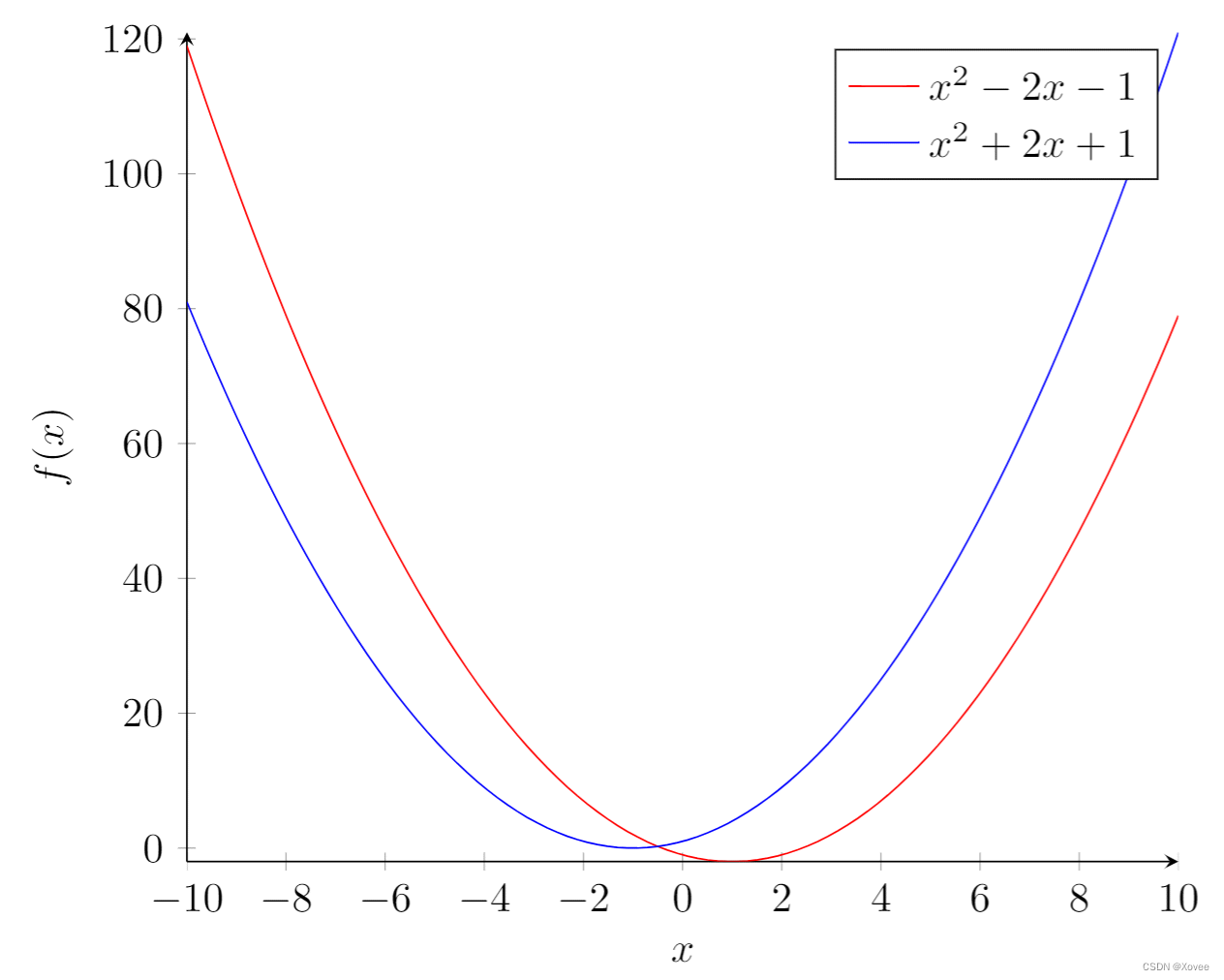
代码解释
axis lines = left
设定图形的轴在左侧和下测,而不是默认的四边都有。其他的可选项请见文末的参考指南。
xlabel = (x) and ylabel = {(f(x))}.
横轴和纵轴的标签。大括号的使用可以告诉pgfplots如何去组织文本。
\addplot
在坐标轴上绘制图形。
domain=-10:10
x
x
x的范围
samples=100
domain指定的范围内所绘制的节点数量。数量越多则绘制的图形越精确,但是渲染时间也更长。
\addlegendentry{(x^2 - 2x - 1)}
为函数
x
2
−
2
x
−
1
x^2-2x-1
x2−2x−1添加一个图例。
如果你想在该图中绘制另一个图形,直接再次使用\addplot即可。
从数据中绘制
很多时候我们需要从数据中来绘制图形。下面的例子展示了如何做到这一点:
Plotting from data:

\begin{tikzpicture}
\begin{axis}[
    title={Temperature dependence of CuSO\(_4\cdot\)5H\(_2\)O solubility},
    xlabel={Temperature [\textcelsius]},
    ylabel={Solubility [g per 100 g water]},
    xmin=0, xmax=100,
    ymin=0, ymax=120,
    xtick={0,20,40,60,80,100},
    ytick={0,20,40,60,80,100,120},
    legend pos=north west,
    ymajorgrids=true,
    grid style=dashed,
]

\addplot[
    color=blue,
    mark=square,
    ]
    coordinates {
    (0,23.1)(10,27.5)(20,32)(30,37.8)(40,44.6)(60,61.8)(80,83.8)(100,114)
    };
    \legend{CuSO\(_4\cdot\)5H\(_2\)O}

\end{axis}
\end{tikzpicture}
代码解释
title={Temperature dependence of CuSO(_4\cdot)5H(_2)O solubility}
添加一个图形标题(在图形上方)
xmin=0, xmax=100, ymin=0, ymax=120
坐标轴的范围
xtick={0,20,40,60,80,100}, ytick={0,20,40,60,80,100,120}
坐标轴标记显示的地方。如果为空则pgfplots会自动设置。
legend pos=north west
图例的位置。文末列出了更多的位置选项。
ymajorgrids=true
显示y轴的网格(对应的x轴网格命令为xmajorgrids)
grid style=dashed
网格线的风格设置为虚线。
mark=square
coordinates数据所绘制的线上标志的样式。
coordinates {(0,23.1)(10,27.5)(20,32)…}
节点的位置。
如果你的数据存储在文件之中(这可能是最常遇到的情况),请使用\addplot table {file_with_the_data.dat}命令,而不是\addplot和coordinates命令。其余命令的语法不变。
散点图
散点图是一种常见的计算概率回归的工具。在这个例子中,我们会使用scattered_example.dat文件中存储的数据来创建一个对应的散点图。数据格式为:
GPA ma ve co un
3.45 643 589 3.76 3.52
2.78 558 512 2.87 2.91
2.52 583 503 2.54 2.4
3.67 685 602 3.83 3.47
3.24 592 538 3.29 3.47
2.1 562 486 2.64 2.37
…
我们使用数据的前两列来绘制散点图:
\begin{tikzpicture}
\begin{axis}[
    enlargelimits=false,
]
\addplot+[
    only marks,
    scatter,
    mark=halfcircle*,
    mark size=2.9pt]
table[meta=ma]
{scattered_example.dat};
\end{axis}
\end{tikzpicture}
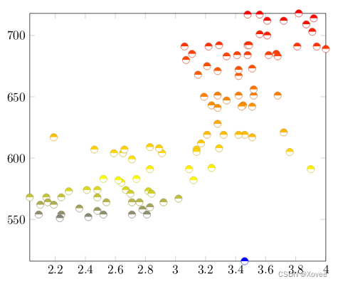
代码解释
除了scatter,我们之前用过的用于axis和addplot环境的命令还可以接着使用。
enlarge limits=false
允许节点出现在坐标轴上。
only marks
在每个节点上放置一个标志(mark)。
scatter
当我们使用scatter的时候,节点的颜色将取决于它的值的大小。具体的颜色由meta参数设定。
mark=halfcircle
将标志的样式设置为半圆。文末介绍了更多的标志样式。
mark size=2.9pt
标志的大小。
table[meta=ma]{scattered_example.dat};
告知绘图引擎数据存储于一个文件之中。参数meta=ma指定了决定标志颜色的数据列名。大括号中的参数指定了数据文件的路径。
柱状图
柱状图经常用来表示分组的统计数据。在pgfplots中,我们可以细致地自定义柱状图的样式。下面展示一个例子:
\begin{tikzpicture}
\begin{axis}[
	x tick label style={
		/pgf/number format/1000 sep=},
	ylabel=Year,
	enlargelimits=0.05,
	legend style={at={(0.5,-0.1)},
	anchor=north,legend columns=-1},
	ybar interval=0.7,
]
\addplot
	coordinates {(2012,408184) (2011,408348)
		 (2010,414870) (2009,412156)};
\addplot
	coordinates {(2012,388950) (2011,393007)
		(2010,398449) (2009,395972)};
\legend{Men,Women}
\end{axis}
\end{tikzpicture}
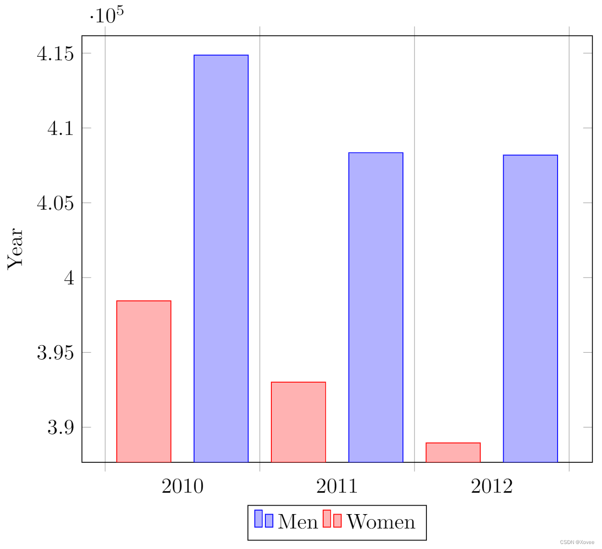
代码解释
首先我们定义了tikzpicture和axis环境。axis还声明了一些新的参数:
x tick label style={/pgf/number format/1000 sep=}
这行代码定义了一个完整的图形样式。你可以在axis环境中添加多个\addplot命令,绘图的风格会自动统一。(为了让这行代码有效,下面介绍的ybar是强制的。
enlargelimits=0.05.
扩大图形的边界。在柱状图中,我们经常需要一些额外的空白空间来让图形更美观或者在柱之上添加一些标签。在这里,0.05表示添加的空间长度是图形高的5%。
legend style={at={(0.5,-0.2)}, anchor=north,legend columns=-1}
这个代码一般来说可以满足大多数情况。你也可以改变-0.2为其他值来让图例离坐标轴更远或者更近。
ybar interval=0.7,
柱的宽度。值为1代表每个柱之间没有间隔,值为0代表柱没有宽度,图形中只会显示一条线来代表柱。
coordinates定义了柱的坐标和高度。
y轴的标签最多显示四位数字。如果值超过9999,那么pgfplots将会使用统一的表示法(如图中所示)。
3D绘图
pgfplots还有3D绘图的功能。
绘制数学公式
我们来展示一个稍微复杂的例子:
\begin{tikzpicture}
\begin{axis}[
    title=Example using the mesh parameter,
    hide axis,
    colormap/cool,
]
\addplot3[
    mesh,
    samples=50,
    domain=-8:8,
]
{sin(deg(sqrt(x^2+y^2)))/sqrt(x^2+y^2)};
\addlegendentry{\(\frac{sin(r)}{r}\)}
\end{axis}
\end{tikzpicture}
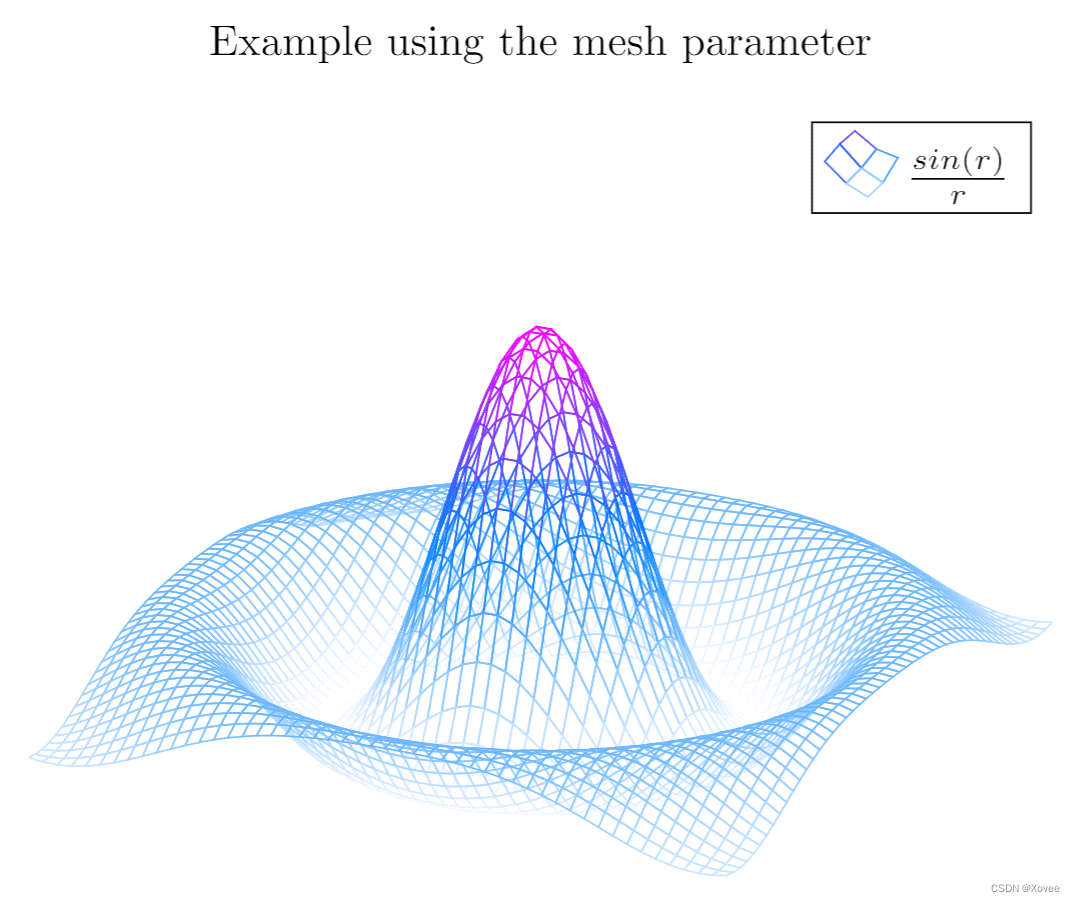
代码解释
大多数的命令我们已经解释过了,除了以下三个:
hide axis
隐藏坐标轴。
colormap/cool
绘图所用的颜色映射。文末介绍了更多可选的颜色方案。
mesh
绘制为网格样式。
注意:当你打算绘制三角函数的时候,pgfplots会默认使用度(degree)作为度量单位。如果角度为弧度(如本例所示),那么你需要使用deg函数来转换其为度。
等高线图
你还可以使用pgfplots来绘制等高线图。你首先得使用其他软件将数据进行预处理。让我们来看一个例子。
\begin{tikzpicture}
\begin{axis}
[
    title={Contour plot, view from top},
    view={0}{90}
]
\addplot3[
    contour gnuplot={levels={0.8, 0.4, 0.2, -0.2}}
]
{sin(deg(sqrt(x^2+y^2)))/sqrt(x^2+y^2)};
\end{axis}
\end{tikzpicture}
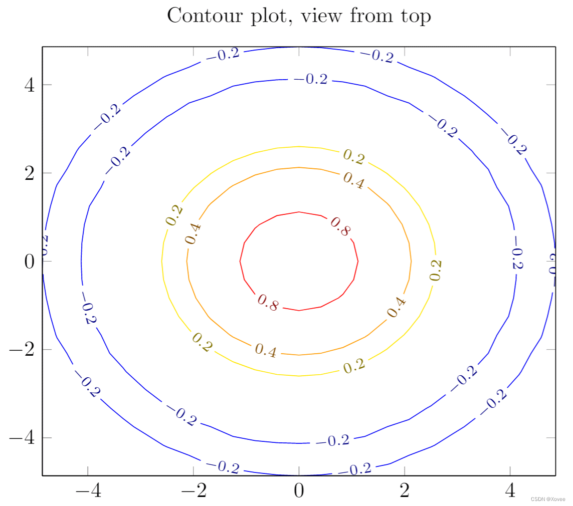
代码解释
在title参数这里,我们使用了大括号,因为标题中含有逗号。
view={0}{90}
改变图形的视角。该参数传递给axis环境,这意味着你可以在任何3D绘图中使用这个参数。第一个值表示z轴的旋转角度(rotation)。第二个值表示x轴的旋转角度。0和90的组合表示我们从正上方来观看图形。
contour gnuplot={levels={0.8, 0.4, 0.2, -0.2}}
这行代码首先告诉LaTeX去使用外部软件gnuplot来计算等高线。你可以直接在Overleaf中使用这个代码。但如何你在本地编译的话,你需要安装gnuplot(你也可以使用matlab,将参数gnuplot替换为matlab)。参数level中定义了要显示的等高线的海拔高度
从数据中绘制一个曲面
为了将一系列数据绘制为3D曲面,我们需要每一个点的坐标。这些坐标可以是未排序的集合,或者是一个矩阵(如本例所示)。
\begin{tikzpicture}
\begin{axis}
\addplot3[
    surf,
]
coordinates {
(0,0,0) (0,1,0) (0,2,0)

(1,0,0) (1,1,0.6) (1,2,0.7)

(2,0,0) (2,1,0.7) (2,2,1.8)
};
\end{axis}
\end{tikzpicture}
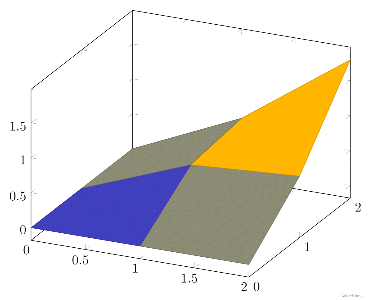
数据解释
传递给coordinates参数的数据被处理成一个
3
×
3
3\times 3
3×3的矩阵,矩阵中不同的行之间空白行作为分割。
Parametric plot
我们来看一个例子:
\begin{tikzpicture}
\begin{axis}
    [
    view={60}{30},
    ]
\addplot3[
    domain=0:5*pi,
    samples = 60,
    samples y=0,
]
({sin(deg(x))},
{cos(deg(x))},
{x});
\end{axis}
\end{tikzpicture}
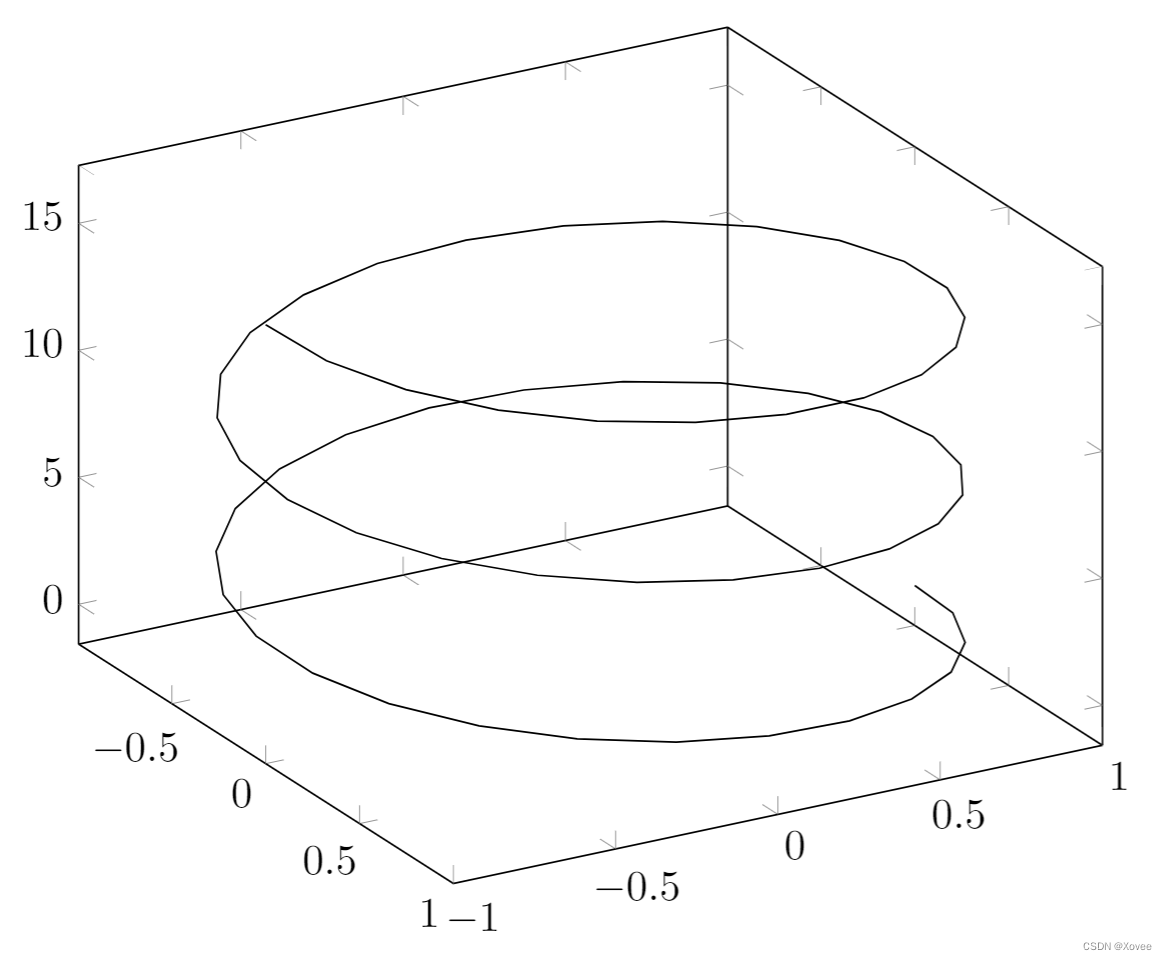
代码解释
samples y=0防止pgfplots将极值加入到螺旋中- 绘制的代码被传递给
\addplot3环境。每个参数函数被定义在单独的大括号中。三个参数被界定在一个小括号中。
参考指南
| 命令/环境 | 描述 | 可选值 |
|---|---|---|
| axis | 普通的线性绘制 | |
| semilogxaxis | x轴对数缩放,y轴正常缩放 | |
| semilogyaxis | y轴对数缩放,x轴正常缩放 | |
| loglogaxis | 均为对数缩放 | |
| axis lines | 改变坐标轴的绘制方式,默认为box | box, left, middle, center, right, none |
| legend pos | 图例的位置 | south west, south east, north west, north east, outer north east |
| mark | 标志的样式。 | , x , +, |, o, asterisk, star, 10-pointed star, oplus, oplus, otimes, otimes*, square, square*, triangle, triangle*, diamond, halfdiamond*, halfsquare*, right*, left*, Mercedes star, Mercedes star flipped, halfcircle, halfcircle*, pentagon, pentagon*, cubes. (cubes only work on 3d plots). |
| colormap | 颜色方案,你可以自定义,也可以使用一些预设的方案 | hot, hot2, jet, blackwhite, bluered, cool, greenyellow, redyellow, violet. |


 795
795

 被折叠的 条评论
为什么被折叠?
被折叠的 条评论
为什么被折叠?
 到【灌水乐园】发言


