


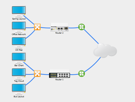
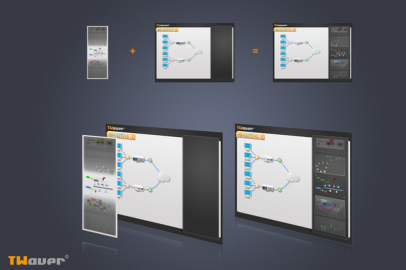
下面我们再通过一个实际的例子具体来看看TWaver Layer的叠加效果,先上最终效果图:
这是一个使用TWaver Java制作的自动布局的例子,有人能看得出这里使用了多少个图层合并而成的吗?
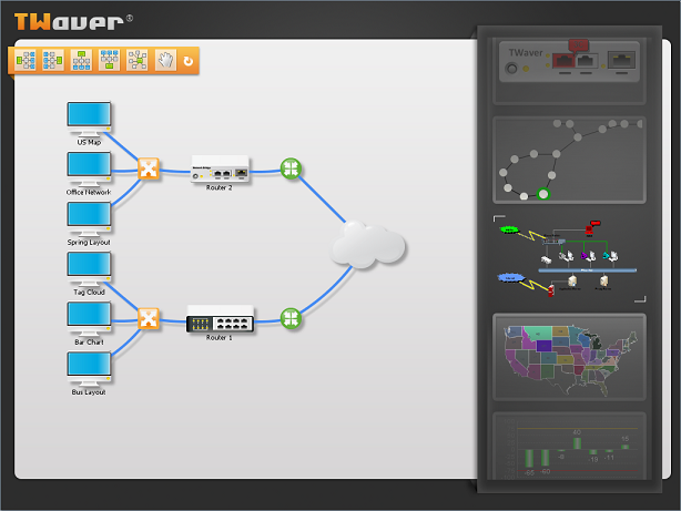
呵呵,我们先来看看整体的一个布局:首先frame中添加了一个LayeroutPanel,panel中放了一个network,network中间部分是用于存放网元,连线,右半部分是scrollPanel
 。
。
一. Network的叠加
我们先来看看中间这个network的图层是如何叠加的
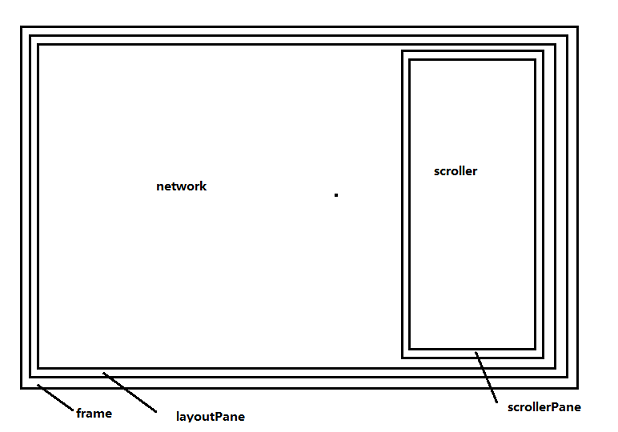
1.阴影层
首先是在network的Cushion上添加了一个网元阴影层,cushion在TWaver的定义中是处于所有图层之下的一层。
Code highlighting produced by Actipro CodeHighlighter (freeware)
http://www.CodeHighlighter.com/
-->
 network.addCanvasCushion(
new
ShadowCushion(
this
));
network.addCanvasCushion(
new
ShadowCushion(
this
));
阴影也可以这样添加。
2.网元层
在默认图层上添加布局的网元
Code highlighting produced by Actipro CodeHighlighter (freeware)
http://www.CodeHighlighter.com/
--> 1
this
.cloud
=
this
.createNode(
"
/demo/layout/images/cloud.png
"
);2
this
.center1
=
this
.createNode(
"
/demo/layout/images/center.png
"
);3
this
.center2
=
this
.createNode(
"
/demo/layout/images/center.png
"
);4
this
.gather1
=
this
.createNode(
"
/demo/layout/images/gather.png
"
);5
this
.gather2
=
this
.createNode(
"
/demo/layout/images/gather.png
"
);6
this
.router1
=
this
.createNode(
"
/demo/layout/images/router1.png
"
,
0
,
"
Router 1
"
);7
this
.router2
=
this
.createNode(
"
/demo/layout/images/router2.png
"
,
1
,
"
Router 2
"
);8
this
.server1
=
this
.createNode(
"
/demo/layout/images/pc.png
"
,
2
,
"
Spring Layout
"
);9
this
.server2
=
this
.createNode(
"
/demo/layout/images/pc.png
"
,
3
,
"
Office Network
"
);10
this
.server3
=
this
.createNode(
"
/demo/layout/images/pc.png
"
,
4
,
"
US Map
"
);11
this
.client1
=
this
.createNode(
"
/demo/layout/images/pc.png
"
,
5
,
"
Bar Chart
"
);12
this
.client2
=
this
.createNode(
"
/demo/layout/images/pc.png
"
,
6
,
"
Tag Cloud
"
);13
this
.client3
=
this
.createNode(
"
/demo/layout/images/pc.png
"
,
7
,
"
Bus Layout
"
);14
this
.createLink(gather1, client1);15
this
.createLink(gather1, client2);16
this
.createLink(gather1, client3);17
this
.createLink(gather2, server1);18
this
.createLink(gather2, server2);19
this
.createLink(gather2, server3);20
this
.createLink(cloud, center1);21
this
.createLink(cloud, center2);22
this
.createLink(router1, center1);23
this
.createLink(router2, center2);24
this
.createLink(router1, gather1);25
this
.createLink(router2, gather2);
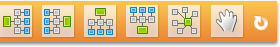
TWaver提供了多种布局的效果,这是一个左树形布局,下面的toolbar上提供了更多的布局方式。
3.背景层
设置network背景图片,背景层也是处于所有数据层之下的一层,但是在cushion层之上
Code highlighting produced by Actipro CodeHighlighter (freeware)
http://www.CodeHighlighter.com/
--> 1
this
.setImageBackground(
"
/demo/layout/images/bottom.png
"
);

4.顶层
添加top的图层节点,并设置图层为1
Code highlighting produced by Actipro CodeHighlighter (freeware)
http://www.CodeHighlighter.com/
--> 1
this
.top
=
this
.createNode(
"
/demo/layout/images/top.png
"
);2
this
.top.setLayerID(
"
top
"
);3
Layer topLayer
=
new
Layer(
"
top
"
);4
topLayer.setMovable(
false
);5
topLayer.setSelectable(
false
);6
this
.getDataBox().getLayerModel().addLayer(
1
, topLayer);

使用一个Node最为最上层的图片,哈哈,这也是TWaver中的一个使用技巧。
5.工具条层
添加toolbar图层并设置为1,这样toolbar的图层会在top层之上
Code highlighting produced by Actipro CodeHighlighter (freeware)
http://www.CodeHighlighter.com/
-->
this
.toolbar
=
this
.createNode(
"
/demo/layout/images/toolbar.png
"
);
this
.toolbar.setLocation(
21
,
68
);
this
.toolbar.setLayerID(
"
toolbar
"
);Layer toolbarLayer
=
new
Layer(
"
toolbar
"
);toolbarLayer.setMovable(
false
);toolbarLayer.setSelectable(
false
);
this
.getDataBox().getLayerModel().addLayer(
1
, toolbarLayer);
工具条也是一张图片哦,哈哈,没想到吧!
工具条的动画效果
从上面分解中可以看出,工具条是叠加在top层之上的,这其中还有一个动画的效果,当鼠标移动到工具条所有的区域范围时,才会出现,移出并会隐藏。
Code highlighting produced by Actipro CodeHighlighter (freeware)
http://www.CodeHighlighter.com/
--> 1

 this
.getCanvas().addMouseMotionListener(
new
MouseMotionAdapter()
this
.getCanvas().addMouseMotionListener(
new
MouseMotionAdapter()
 {
{2

 public void mouseMoved(MouseEvent e) {
3
if(isAdjustingToolbar){4
 return;
5
 }
}6
if(toolbarBounds.contains(e.getPoint())){7
if(!toolbar.isVisible()){8
isAdjustingToolbar = true;9
toolbar.setVisible(true);10
TWaverUtil.animateMove(toolbar, toolbar.getWidth(), 0, new Runnable(){11
public void run() {12
isAdjustingToolbar = false;13
}14
});15
}16
}else{17
if(toolbar.isVisible()){18
isAdjustingToolbar = true;19
TWaverUtil.animateMove(toolbar, -toolbar.getWidth(), 0, new Runnable(){20
public void run() {21
toolbar.setVisible(false);22
isAdjustingToolbar = false;23
}24
});25
}26
}27
}28
 }
);
}
);
6.最终合并效果
最后twaver根据添加的这些图层顺序,就会在network上叠加出一个左半部分的效果,如下:
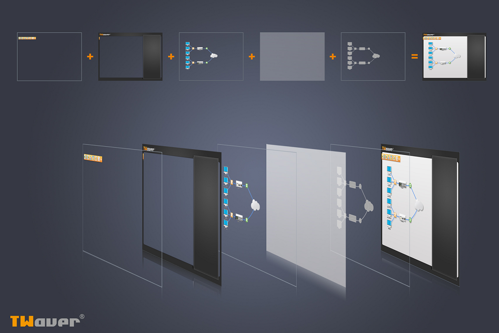
二. ScrollPanel的叠加
看完network中间部分的叠加效果,我们再来看看这张图的右半部分scrollerPanel是如何叠加的
1. 组件层
这是最重要的放置内容面板的一层,里面放置了24个独立的组件。通过设置边框的范围让其只显示中间部分,每个独立的组件都可以单独操作:选中,移动,染色,tooltip…都可以呈现。
Code highlighting produced by Actipro CodeHighlighter (freeware)
http://www.CodeHighlighter.com/
--> 1
for
(
int
i
=
0
; i
<
24
; i
++
)
{2
JComponent component = null;3
int index = i % 8;4
if(index == 0){5
component = new Router1();6
}7
8
if(component != null){9
component.setPreferredSize(CARDSIZE);10
component.setMaximumSize(CARDSIZE);11
component.setMinimumSize(CARDSIZE);12
component.setBounds(XGAP, i*CARDSIZE.height+YGAP, CARDSIZE.width-XGAP*2, CARDSIZE.height-YGAP*2);13
this.add(component);14
}15
16
}
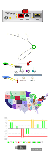
2.相框层
这是一个给每个组件设置相框的一个图层,首先我们需要相框图片
设置成透明效果,将其放置每个组件之上(除了最中间的component之外),最中间的再通过画笔画上上左下右的边框,这样这个相框就完成了
Code highlighting produced by Actipro CodeHighlighter (freeware)
http://www.CodeHighlighter.com/
--> 1
Rectangle rect
=
new
Rectangle(
0
, i
*
CARDSIZE.height, CARDSIZE.width, CARDSIZE.height);2
if
(i
!=
(
this
.currentIndex
+
8
))
{3
g2.drawImage(CARDIMAGE, rect.x, rect.y, rect.width, rect.height, null);4
}
else
{5
rect.grow(-XGAP+4, -YGAP+4);6
g2.setColor(Color.white);7
g2.setStroke(TWaverConst.BASIC_STROKE);8
9
int d = 8;10
g2.drawLine(rect.x, rect.y, rect.x+d*2, rect.y);11
g2.drawLine(rect.x, rect.y, rect.x, rect.y+d);12
13
g2.drawLine(rect.x+rect.width, rect.y+rect.height, rect.x+rect.width-d*2, rect.y+rect.height);14
g2.drawLine(rect.x+rect.width, rect.y+rect.height, rect.x+rect.width, rect.y+rect.height-d);15
}
3.蒙版层
这是最上边的类似于蒙版的一层,通过两张上下透明的图片将其放置在scrollerPane的最上边一层
Code highlighting produced by Actipro CodeHighlighter (freeware)
http://www.CodeHighlighter.com/
--> 1
if
(top)
{2
image = TWaverUtil.getImageIcon("/demo/layout/images/mist1.png");3
}
else
{4
image = TWaverUtil.getImageIcon("/demo/layout/images/mist2.png");5
}
6
JComponent canvas
=
new
JComponent()
{7
public void paintComponent(Graphics g) {8
super.paintComponent(g);9
g.drawImage(image.getImage(), 0, 0, image.getIconWidth(), image.getIconHeight(), null);10
}11
}
;
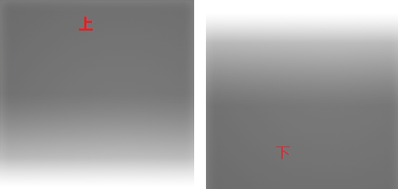
蒙版层上也是有动画效果的,当鼠标点击上或下的蒙版,组件面板会自动上移或下移一个
4.最终叠加效果

这样两张图片一叠加就可以得到我们最开始提供的那种图了。
视频
http://v.youku.com/v_show/id_XMjA0MjM3NDky.html
PS:这是一个网元图层的例子,在实际应用中,用户可以将网元设置在不同的layer上,由此来控制网元上下显示顺序。对于同一层上的图元,被选中的网元会处于其他网元之上。


 1912
1912


 被折叠的 条评论
为什么被折叠?
被折叠的 条评论
为什么被折叠?
 到【灌水乐园】发言


